Chapter 15 Loops
If you want R to do something several times, one of the easiest ways to make it happen is to use a loop: a piece of code which will be repeated a set number of times (it starts at the top, runs through to the bottom and then goes back up to the top - a loop). These have the basic format
for (i in vector) {
    Some instructions
}
What this does is to set up a temporary object called i (you can use other names as well but i is the most common). The first time the loop is run i has the first value in the vector specified in the (i in vector) argument allocated to it. In this case that number is 1. R will then carry out the set of instructions in the braces, and when it’s finished it will move to the next value in the vector, assign that value to i and repeat the instructions . Once i has been given the last value in the vector and the instructions carried out R knows that it’s time to stop repeating the instructions in the loop, and it will go on to evaluate the next set of instructions, if there are any. In other words, R will loop through the set of instructions given in the braces as many times as there are values in the vector.
Most commonly, the vector used in the for(i in vector)... part of a for loop will just be a sequence of numbers such as 1:15 in which case the loop will run 15 times and each time the value of i will be incremented by 1. The vector doesn’t have to be like this, however: if we used for(p in c(1.5, 27, 198))... the loop would run three times, with the value of p being set at 1.5 the first time, 27 the second time and 198 the third. Similarly if we used `for(i in c(“Red,” “Orange,” “Yellow,” “Green”) the loop would run four times with the value of i being set to Red the first time, Orange the second and so on. This flexibility means that it’s posisble to do some pretty clever and subtle things with a well thought out loop.
15.0.1 Simple loops
Here’s a simple example. Let’s say we have a vector of numbers X1 which has 10 numbers (3,5,8,3,1,1,12,7,2,4) and we wish to calculate the cumulative sums for the vector. In other words, for each number we wish to calculate the sum of that number and all of the preceding numbers, so that our new vector X2 would be 3, 3+5, 3+5+8, and so on. We can do this by using a loop of code which calculates this figure for each number in the vector in turn.
# Set up vector for results
X2 <- numeric(10)

# Loop
for (i in 1:10) {
  X2[i] <- sum(X1[1:i])
}

X2
 [1]  3  8 16 19 20 21 33 40 42 46
One of the useful things to know about these loops is that you can refer to i as an object in the code that’s between the braces. You can see how this works in the code above, where we use i as a subscript to make sure that our numbers are going in the right places. We already have a vector set up for our result, called X2. For the first time the loop is run, i=1 and so the instructions in the loop are the equivalent of
X2[1]<-sum(X1[1:1])In other words, the first number in X2 is set to be equal to the sum of the first number in X1. For the second time the loop runs i has had 1 added to it and so it’s now equal to 2, and so the second run of the loop sets the value of the second number in X2 to be equal to the sum of the first and second numbers in X1.
X2[2]<-sum(X1[1:2])For the third run of the loop i is set to 3 and this time it’s the third number in X2 which is set to the sum of the first 3 numbers in X1.
X2[3]<-sum(X1[1:3])This continues until i=10, after which R will stop going back to the beginning of the loop. If there are any more instructions after the loop it will go on to execute them, as in the case of our final instruction above which is to tell us what’s in the X2 object, otherwise it’ll stop. As an aside, if you really want to do this in R you can use a loop, as I’ve done here, but there is also a function cumsum() which will do the same thing for you a lot quicker.
For another example let’s assume that you want to illustrate how the mean of a sample of numbers converges on the true population mean as sample size increases. The example below will start with i=1, meaning that it will generate one random number drawn from a population with mean 0 and standard deviation 1, calculate the mean of that number and store the result as the first number in a vector called output. It will then add one to the counter, meaning that i is now equal to 2, and it will loop through the expression again with i=2, so it will generate two random numbers from a normal distribution with mean zero and standard deviation 1, calculate the mean of the two numbers and store it as the second number in output. Because it’s looped through the instructions in braces again i will get one added again so i=3, three random numbers will be generated and the mean stored as the third number in “output.” This will continue until i=2000, after which R will stop.
output<-numeric(2000)As before, we have to set up a vector for our results before we run our loop.
for (i in 1:2000) {
  output[i]<-mean(rnorm(i,0,1))
}
We can now plot a graph to show how the mean of the sample converges on the mean of the population from which the sample was drawn. Notice how we can use the alpha = argument to make the datapoints semi-transparent, which makes the plot easier to understand. There’s also a line indicating the “true” population mean that the data were drawn from using geom_hline().
library(ggplot2)

output <- data.frame(sample_size = 1:2000, output)

p1 <- ggplot(data = output) +
  aes(x = sample_size, y = output) +
  geom_point(colour = "steelblue", alpha = 0.25) +
  geom_hline(yintercept = 0, size = 0.25) +
  theme_bw()

p1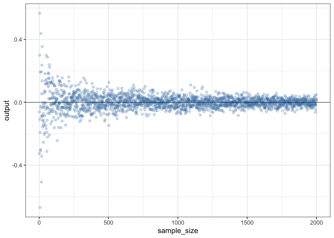
Figure 15.1: How the estimated mean converges on the true mean of a sampled population as the sample size increases
15.0.2 A more complicated for() loop
If you want to draw not just the means but also the 95% confidence intervals it doesn’t take a great deal of adjustment to the code. One difference is that you need a matrix to store the output rather than a vector. I’ve made the largest sample 100 rather than 2000 this time just to keep the plot at the end readable. The reason we have 99 rows rather than 100 in our matrix is that we can’t calculate a confidence interval when n = 1 so we will start our loop at 2.
# Set up output matrix
output <- matrix(data = NA, nrow = 99, ncol = 3)

colnames(output) <- c("N", "Mean", "CI")
The for() loop is now a bit more complicated. For each step we’re setting up an object to store the randomly drawn sample with sample size i, and then we’re calculating the mean and 95% confidence intervals separately. As we’ve seen in previous chapters, one function which we’ll need is the qt() function which returns the quantiles of the t-distribution which we need to get our confidence limits.
for (i in 2:100) {
  X1 <- rnorm(i, 0, 1)
  output[i-1, 1] <- i
  output[i-1, 2] <- mean(X1)
  output[i-1, 3] <- (sd(X1) / sqrt(i)) * qt(0.975, i - 1)
}
What happens here is that each time R runs through the loop the first thing it meets is this instruction
X1 <- rnorm(i, 0, 1)which it carries out by drawing i random numbers from a standard normal distribution, and allocating those numbers as an object called X1. Note that X1 will get overwritten with a new set of numbers each time the loop is run so think of it as just a disposable temporary store for our sampled numbers. The next instruction tells R to write the sample size (which is equal to i) in row i-1 of the first column of the output matrix. We need to write it into row i-1 because we are starting at i=2, but we want to write into the first row of the matrix.
output[i-1, 1] <- iThe mean of X1 is then written to the second column of the output matrix, on the row corresponding to i-1.
output[i-1, 2] <- mean(X1)The final expression in the loop is the calculation of the 95% confidence interval for the mean of the sample of size i, which gets written to row i in the third column of the output matrix. The calculation of the 95% CI looks a bit complicated - it’s explained in the “Visualising your data” section of chapter 12.
output[i-1, 3] <- (sd(X1) / sqrt(i)) * qt(0.975, i - 1)This is the last instruction in the loop, so R will add 1 to i and will run the loop again, until it gets to the maximum value given in the for() command, at which point it will stop. We can quickly check that all has gone well by looking at the top six rows of the output matrix using the head() function.
head(output)
     N     Mean       CI
[1,] 2 -1.31756 10.62894
[2,] 3  0.92393  2.01248
[3,] 4  0.99399  1.14084
[4,] 5  0.16914  1.03308
[5,] 6  0.40750  1.08580
[6,] 7  0.31493  0.59916
How about visualising the relationship between sample size, mean and 95% CI? Here’s some code that will plot the means with error bars. We’ll use ggplot2 this time because geom_errorbar is rather easier than using arrows() to bodge your error bars.
library(ggplot2)

p1 <- ggplot(data = data.frame(output)) +
              aes(x = N, y = Mean) +
              geom_point(colour = "steelblue") +
              geom_errorbar(aes(ymin = Mean - CI, ymax = Mean + CI),
              colour = "steelblue") +
              theme_bw() +
              xlab("Sample size") +
              ylab("Mean and 95% CI")

p1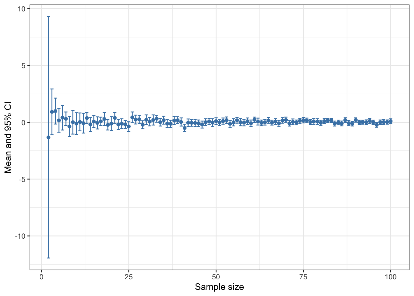
Figure 15.2: Mean and 95% confidence intervals plotted against sample size for 99 vectors sampled from a normal distribution with a mean of zero and a standard deviation of 1
15.1 Optimising your loops
If you’re foolish enough to ask people on the interwebs about R code that involves a loop you might find that just the thought of using a loop in R seems to be regarded as completely unacceptable by some people. The reason for this is that loops can be slow and if you’re doing a lot of intensive calculations this can be a problem, especially if your loop is not optimised. On the bright side, if code your loops properly this problem will largely go away and most of the time it will simply not be an issue. Loops are easy to write and understand so don’t be put off using them by silly internet people.
The first thing to do to make your loop run faster is to be careful about how you store your data. A loop like this:
results <- numeric()

for (i in 1:100000) {
  results[i] <- sqrt(i)
}
Will run very slowly. This is because we start with a results vector of length zero and then add a number to it each time the loop runs. Because of the way memory is managed in R this slows the whole process down. It’s much faster to set your variable up to be the right length, like this.
results <- numeric(100000)

for (i in 1:100000) {
  results[i] <- sqrt(i)
}
Let’s compare the amount of time these two take to run.
system.time({
  results <- numeric()
  for (i in 1:100000) {
  results[i] <- sqrt(i)
}})
   user  system elapsed
  0.027   0.004   0.032
system.time({
  results <- numeric(100000)
  for (i in 1:100000) {
  results[i] <- sqrt(i)
}})
   user  system elapsed
   0.01    0.00    0.01
Don’t worry about the user and system values, elapsed is the total time taken to run the process. You can see that the loop with the results vector starting at the correct length runs about twice as fast as the first one. Finally, a third possibility, using the c() function to build the results vector, is eye-wateringly slow.
system.time({
  results <- c()
  for (i in 1:100000) {
  results <- c(results, sqrt(i))
}})
   user  system elapsed
 20.264   9.554  30.063
Don’t do that.
If you absolutely need the fastest code possible then a lot of the time you can substitute functions from the apply() family and use those instead of a loop. These functions are really fast and while it might make your code a little harder to follow it will run more quickly.
15.2 Writing a mathematical model using a for() loop
for() loops are quite easy to understand and easy to programme, but they can be slow, especially when you need to do a lot of calculations. A lot of the time in R you’re better advised to use functions like apply() and its relatives when you want to do a lot of calculations, but one part of programming that needs something like a for() loop is when you are doing something iteratively: in other words, when the result of one repeat of your operation depends on the output of the previous repeat. One classic example of these is mathematical modelling of populations of animals or other organisms. Here I’m going to show you how you can easily programme a famous model of an insect population and a parasitic wasp which feeds on it. The model is called the Nicholson-Bailey model, and when it’s written down as a set of equations it looks like this.
\[H_{t+1} = \lambda H_{t} e^{-aP_{t}}\] \[P_{t+1} = gH_{t} \{ 1- \left(e^{-aP_{t}}\right) \}\]
This is a mathematical model which predicts the changes in population number over time for an insect host and a parasitic wasp (a “parasitoid”) which attacks the host and develops on it. The model is one which runs as a set of discrete time steps which we assume are equal to the generation time of the host and its parasitoid. If we know the size of the host population (\(H\)) and the parasitoid population (\(P\)P) at one time step these two equations will tell us what the populations of the two insects will be at the next time step. If we iterate this model - run it repeatedly, giving it the numbers from the previous run each time - it should tell us how the host and parasitoid numbers change over time. If you want to know more there is lots of information on the internet about this model, any decent ecology textbook will tell you about it and if you want lots of detail Mills & Getz (1996), Ecological Modelling 92: 121-143 has a good description of this model and many others.
The various parts of the model are:
\(H_t\) is the size of the host population at time \(t\),
\(H_{t+1}\) is the population at the next time step.
\(P_t\) is the size of the host population at time \(t\),
\(P_{t+1}\)is the population at the next time step.
\(\lambda\) is the per capita rate of increase of the host population: the number of new hosts that one host will produce next generation
\(a\) is the “area of attack” of the parasitoid - in other words, the proportion of the host population that it is able to parasitise
\(g\) is the number of new parasitoids produced from each parasitised host. This is often called \(c\) but I’m using \(g\) because \(c\) is the name of a function in R.
This might sound a bit technical and complicated but it is remarkably easy to programme in R using a for() loop. Firstly we have to give our various parameters and variables values.
t<-30
lambda<-2
g<-1
a<-0.05
We’re going to run the model for 30 generations (t<-30). Each host can make 3 new hosts per generation (lambda<-3), but if it’s parasitised it will be made into a single new parasitoid instead (g<-1). The area of attack is set at an arbitrary 0.05. Now we need to tell the model our starting conditions - the initial populations of hosts and parasitoids.
Hzero<-20
Pzero<-5
In this case we’re starting with a population of 20 hosts and two parasitoids.
H<-c(Hzero,numeric(t))
P<-c(Pzero,numeric(t))
Time<-0:t
This sets up three vectors. H has the initial population size of the hosts and then 30 empty slots for the model output to go in, and P is the same except it has the initial size of the parasitoid population. Time records the time step for each pair of values. Now for the actual model.
for (i in 1:t) {
  H[i + 1] <- lambda * H[i] * exp(-a * P[i])
  P[i + 1] <- g * H[i] * (1 - exp(-a * P[i]))
}
output <- cbind(Time, H, P
)
Once we’ve specified our parameters and starting values for the variables, it only takes two lines within a for() loop to programme the actual model. Let’s go through them in detail.
for (i in 1:t) This will run the loop t times. The counter i will have 1 added to it each time the loop runs.
H[i + 1] <- lambda * H[i] * exp(-a * P[i])This calculates the host population at time t+1, using the value of i as the time. The expression on the right of the allocation symbol does the arithmetic, and you can see that it uses the values of H and P at the previous time step to do so. The calculated value for the host population is then stored in the H vector in the slot indexed by the value of i plus one. In other words, for each loop it calculates the host population at the next timestep and stores it in the H vector.
P[i + 1] <- g * H[i] * (1 - exp(-a * P[i]))This does exactly the same, but for the parasitoid population.
output <- cbind(Time, H, P)Finally we produce an output matrix by using cbind() to put our three vectors of number of generations, host population and parasitoid population together. We can use our output matrix plot a graph to show how the populations change over time. To make this easy to draw in ggplot2 we need to stack the data up so that we have host and parastoid populations in a single variable with a second variable (Population) indicating which one it is. We do this by using rbind() to stack the Time, H and P data and then piping the output from that into a data.frame() function where we add the Population variable. This does give us a variable for the number of simulated animals called H which we could change using names() if we wished but so long as we know about it it doesn’t really make a difference.
library(ggplot2)

# Stack data
dat1 <- rbind(output[, 1:2], output[, c(1, 3)]) |>
  data.frame(Population = rep(c("Host", "Parasitoid"), each = 31))

# Set up colour palette
pal1 <- c("#ef8a62", "#67a9cf")

# Plot graph
p1 <- ggplot(data = dat1) +
  aes(x = Time, y = H, colour = Population) +
  geom_line(size = 1) +
  theme_bw() +
  scale_color_manual(values = pal1)

# Print graph
p1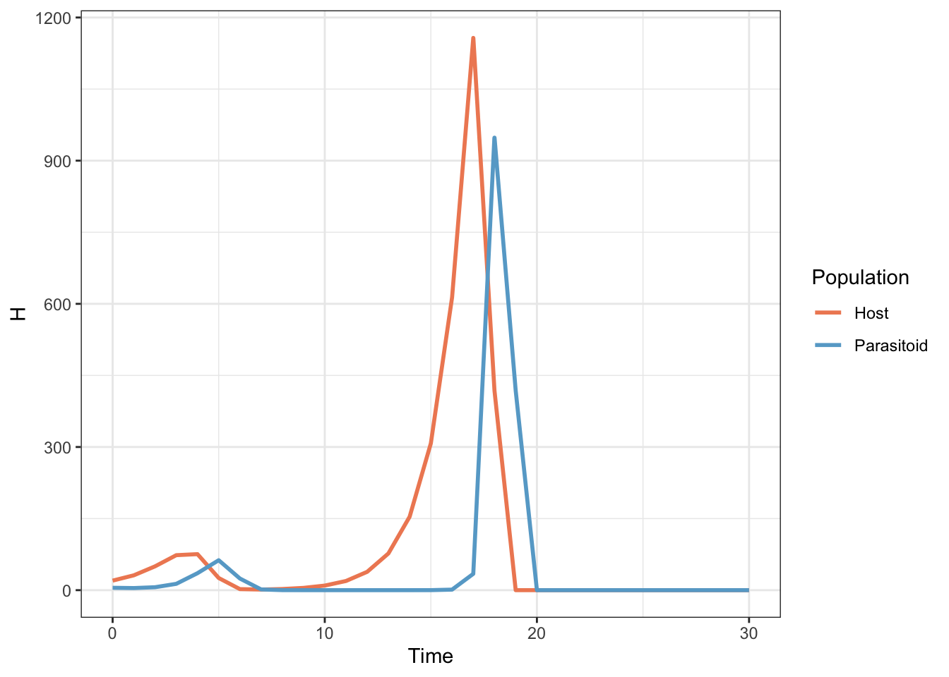
Figure 15.3: Population sizes for a host and parasitoid population as predicted by a Nicholson-Bailey model
The host and parasitoid population undergo a couple of unstable oscillations until both go extinct. This is an important early model of parasitoid-host population dynamics which demonstrated that such systems, and by extension predator-prey systems, tend to be fundamentally unstable. An awful lot of ecological research since then has focussed on finding out what it is that stabilises real predator prey systems which obviously don’t all go extinct in a few generations.
15.3 Other useful loops
15.3.1 while(), repeat() and break
There are a couple of other ways of using loops: these are the while() and repeat() functions. while() will work in much the same way as a for() loop but will carry on repeating so long as a logical expression in the brackets remains true. Let’s say that you have a set of measurements of weight for an animal and you want to calculate the mean of the measurements that were made before the first measurement which recorded a weight greater than 80g. You can do this with a while() loop with the following code.
animal1.wt <- c(56, 55, 61, 68, 67,
                75, 77, 69, 75, 79,
                81, 79, 82, 77, 82,
                81)

cum_weight <- 0
n <- 1


while (animal1.wt[n] < 80) {
  cum_weight <- cum_weight + animal1.wt[n]
  n <- n + 1
}

mean_before_80 <- cum_weight / (n - 1)

mean_before_80
[1] 68.2
repeat() will carry on executing a set of instructions forever unless it’s told to stop, which can be done by telling it to break - this is something that can be used in all the different loop functions to stop a looping operation. We can use the same example as before.
animal1.wt <- c(56, 55, 61, 68, 67,
                75, 77, 69, 75, 79,
                81, 79, 82, 77, 82,
                81)

cum_weight <- 0
n <- 1

repeat {
  if (animal1.wt[n] >= 80) {
    break
  }
  cum_weight <- cum_weight + animal1.wt[n]
  n <- n + 1
}

mean_before_80 <- cum_weight / (n - 1)

mean_before_80
[1] 68.2
This time we have an if() statement (see next chapter) contained in the repeat loop, and R will keep running the loop until either it comes across a number in animal1.wt which is greater than or equal to 80, in which case the if() statement becomes true and break is executed, or if there are no numbers in animal1.wt that meet the inequality the loop will repeat until i becomes greater than the length of animal1.wt, at which point you’ll get an error message.
15.4 Exercises
NB some of these exercises can be done equally well, if not better using other code without loops, but if you’re learning how to write loops then they are nice examples of how they work.
Comparing t-test results as means and standard deviations differ
Set up a matrix (call it something like “mat1”) with 10 columns and 500 rows, with the data being “NA” for the moment
Using a
for()loop, write a set of 10 randomly drawn numbers into each row. The numbers should be drawn from a normal distribution with standard deviation zero. Start with a mean of 0.01 and for each row of the table, increase the mean of the distribution the numbers were drawn from by 0.01. Two hints - remember you can access a complete row of a matrix by using a subscript like mat1[5,] - this will access the 5th row of a matrix called mat1. Second hint - if you want a value that starts at 0.01 and increases by 0.01 for each iteration of the loop, just divide i by 100.Set up a second matrix (“mat2?”) with the same number of rows and columns. Fill it with random numbers as before but this time start with a mean of 5, and decrease the mean of the normal distribution the numbers are drawn from by 0.01 each time.
Now we want to calculate a t-test to compare the mean of each row of mat1 with the mean of the corresponding row of mat2. Ultimately we’d like to draw a graph to show how the p-value varies with the difference in the means the populations were drawn from, so we need the p-value for each t-test. You can do this by making a new vector to store the p-values in, and then using a loop to perform a t-test to compare each row in turn. Remember that you can access the p-value of a t-test if you allocate the t-test output to an object and then use object.name$p.value.
To make our graph nice we need a vector of the same length as our results vector which has the differences between the means of the populations our samples were drawn from, to use as an x-axis. You can do this again with a
for()loop (NB we don’t want the actual means of the samples, we want the means of the populations they came from).Finally, plot a graph of the differences between the means of the populations on the x-axis and the p-values on the y-axis. It’s best to either draw a line graph (type=“l”) or use very small points because you’re plotting quite a bit of data.
If you’re really keen, keep your graph and go back to your script and change the code so that the samples are drawn from populations with standard deviations of 2 rather than one. Run the script again and compare the graphs.
Another population model
In 1973 Maynard-Smith and Slatkin published a mathematical model which describes a single population growing in the absence of any natural enemies, but with varying degrees of intraspecific competition - competition between members of the same species for food or other resources. In particular, this model has a parameter \(b\) which allows you to change the nature of the competition from undercompensating, \((b<1)\) where competition has quite mild effects, to compensating, to overcompensating \((b>1)\), where competition has strong effects - essentially with overcompensating competition if the population is large then most of the individuals will die, rather than just enough individuals to reduce the population down to some equilibrium level. The model looks like this.
\[N_{t+1} = \frac{RN_t}{1 + \left( \alpha NP^t \right)}\]
\(N_t\) is the size of the population at time \(t\),
\(N_{t+1}\) is the population at the next time step.
\(R\) is the amount that the population grows by in the absence of competition
\(b\) is the parameter that determines the extent by which density dependence is under- or over-compensating. Values of \(b\) <1 give undercompensating density dependence, values of \(b\) >1 give overcompensating density dependence
\(\alpha\) is the strength of intraspecific competition, with small values leading to less competition
You can see that, like the previous example of a population model, this one works in discrete time, with the model running as a series of time steps and the size of the population at each time step depending on the population size at the previous step.
- Using a
for()loop, try to write a script that will run this model for you for 50 time steps. Remember that you’ll have to specify your parameter values and the staring size of the population to begin with. I suggest the following values:
\(b = 1\), \(\alpha = 0.001\), \(R=3\), and a staring population of \(N=20\).
Use the output from your model to draw a nice graph showing how population size changes over time.
Now go back to your script and run it again with values of \(b\) ranging from 1 to 8. You should see that the behaviour of the population changes from a steady increase to an equilibrium, to damped oscillations to equilibrium, to cycles and then finally to complex, unpredictable fluctuations - deterministic chaos.
15.5 Solutions to exercises
Comparing t-test results as means and standard deviations differ
- Set up a matrix (call it something like “mat1”) with 10 columns and 500 rows, with the data being “NA” for the moment
mat1 <- matrix(data = NA, nrow = 500, ncol = 10)- Using a for() loop, write a set of 10 randomly drawn numbers into each row. The numbers should be drawn from a normal distribution with standard deviation zero. Start with a mean of 0.01 and for each row of the table, increase the mean of the distribution the numbers were drawn from by 0.01. Two hints - remember you can access a complete row of a matrix by using a subscript like mat1[5,] - this will access the 5th row of a matrix called mat1. Second hint - if you want a value that starts at 0.01 and increases by 0.01 for each iteration of the loop, just divide i by 100.
for (i in 1:500) {
  mat1[i, ] <- rnorm(10, i / 100, 1)
}
NB one thing to note here is that because we’re only using a single instruction this will work equally well without the braces, e.g.
for (i in 1:500)
  mat1[i, ] <- rnorm(10, i / 100, 1)
I generally think it’s best always to use braces with this sort of instruction, at least when you’re learning. This keeps it very clear as to what’s in the loop and what isn’t.
- Set up a second matrix (“mat2?”) with the same number of rows and columns. Fill it with random numbers as before but this time start with a mean of 5, and decrease the mean of the normal distribution the numbers are drawn from by 0.01 each time.
mat2 <- matrix(data = NA, nrow = 500, ncol = 10)

for (i in 1:500) {
  mat2[i, ] <- rnorm(10, 5.1 - i / 100, 1)
}- Now we want to calculate a t-test to compare the mean of each row of mat1 with the mean of the corresponding row of mat2. Ultimately we’d like to draw a graph to show how the p-value varies with the difference in the means the populations were drawn from, so we need the p-value for each t-test. You can do this by making a new vector to store the p-values in, and then using a loop to perform a t-test to compare each row in turn. Remember that you can access the p-value of a t-test if you allocate the t-test output to an object and then use object.name$p.value.
results <- numeric(500)

for (i in 1:500) {
  t.output <- t.test(mat1[i, ], mat2[i, ], var.equal = TRUE)
  results[i] <- t.output$p.value
}- To make our graph nice we need a vector of the same length as our results vector which has the differences between the means of the populations our samples were drawn from, to use as an x-axis. You can do this again with a for() loop (NB we don’t want the actual means of the samples, we want the means of the populations they came from).
diff <- numeric(500)

for (i in 1:500) {
  diff[i] <- (5.1 - i / 100) - (i / 100)
}- Finally, plot a graph of the differences between the means of the populations on the x-axis and the p-values on the y-axis. It’s best to either draw a line graph (type=“l”) or use very small points because you’re plotting quite a bit of data.
Using base R graphics
plot(diff,
     results,
     type = "l",
     xlab = "Difference between means of source populations",
     ylab = "p-value")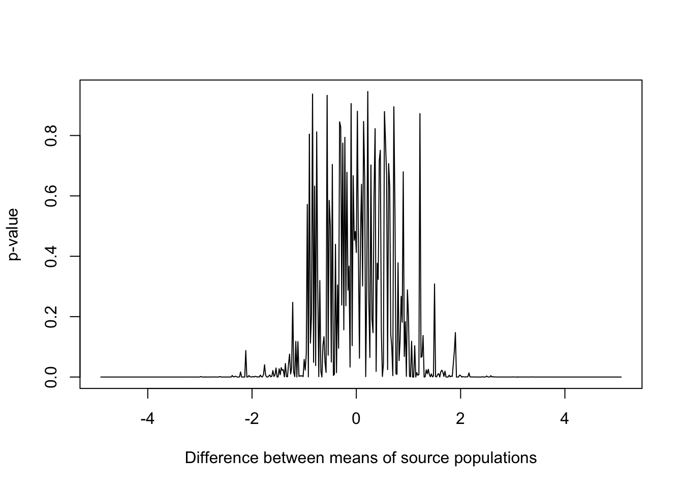
Figure 15.4: p-values for samples drawn from populations with varying differences in mean and standard deviation equal to 1
Using ggplot2
p1 <- ggplot(data = data.frame(diff, results)) +
  aes(x = diff, y = results) +
  geom_line() +
  theme_bw() +
  xlab("Difference between means of source populations") +
  ylab("p-value")

p1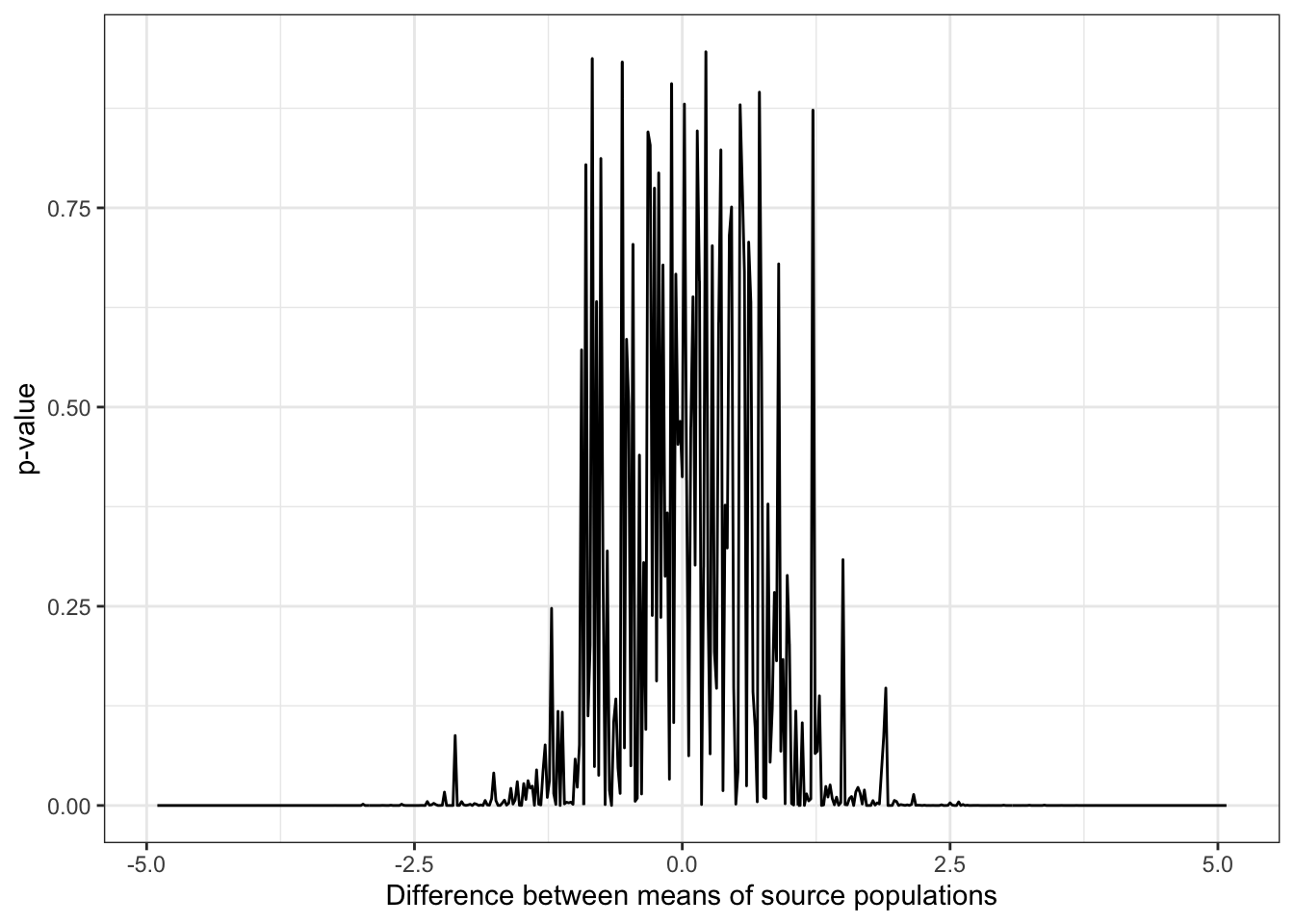
Figure 15.5: p-values for samples drawn from populations with varying differences in mean and standard deviation equal to 1
- If you’re really keen, keep your graph and go back to your script and change the code so that the samples are drawn from populations with standard deviations of 2 rather than one. Run the script again and compare the graphs.
mat1 <- matrix(data = NA, nrow = 500, ncol = 10)

for (i in 1:500) {
  mat1[i, ] <- rnorm(10, i / 100, 2)
}

mat2 <- matrix(data = NA, nrow = 500, ncol = 10)

for (i in 1:500) {
  mat2[i, ] <- rnorm(10, 5.1 - i / 100, 2)
}

results <- numeric(500)

for (i in 1:500) {
  t.output <- t.test(mat1[i, ], mat2[i, ], var.equal = TRUE)
  results[i] <- t.output$p.value
}


diff <- numeric(500)
for (i in 1:500) {
  diff[i] <- (5.1 - i / 100) - (i / 100)
}

plot(diff,
     results,
     type = "l",
     xlab = "Difference between means of source populations",
     ylab = "p-value")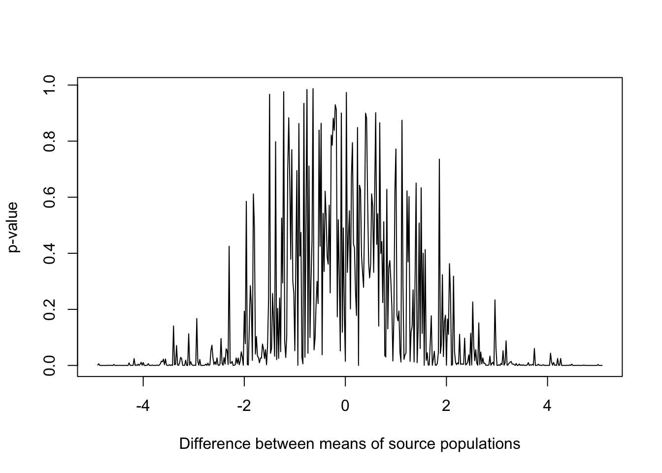
Figure 15.6: p-values for samples drawn from populations with varying differences in mean and standard deviation equal to 2
Another population model
In 1973 Maynard-Smith and Slatkin published a mathematical model which describes a single population growing in the absence of any natural enemies, but with varying degrees of intraspecific competition - competition between members of the same species for food or other resources. In particular, this model has a parameter \(b\) which allows you to change the nature of the competition from undercompensating, \((b<1)\) where competition has quite mild effects, to compensating, to overcompensating \((b>1)\), where competition has strong effects - essentially with overcompensating competition if the population is large then most of the individuals will die, rather than just enough individuals to reduce the population down to some equilibrium level. The model looks like this.
\[N_{t+1} = \frac{RN_t}{1 + \left( \alpha NP^t \right)}\]
\(N_t\) is the size of the population at time \(t\),
\(N_{t+1}\) is the population at the next time step.
\(R\) is the amount that the population grows by in the absence of competition
\(b\) is the parameter that determines the extent by which density dependence is under- or over-compensating. Values of \(b\) <1 give undercompensating density dependence, values of \(b\) >1 give overcompensating density dependence
\(\alpha\) is the strength of intraspecific competition, with small values leading to less competition
You can see that, like the previous example of a population model, this one works in discrete time, with the model running as a series of time steps and the size of the population at each time step depending on the population size at the previous step.
- Using a
for()loop, try to write a script that will run this model for you for 50 time steps. Remember that you’ll have to specify your parameter values and the staring size of the population to begin with. I suggest the following values:
\(b = 1\), \(\alpha = 0.001\), \(R=3\), and a staring population of \(N=20\).
t <- 50
Nzero <- 20
alpha <- 0.001
b <- 1
R <- 3

N <- c(Nzero, numeric(t))
Time <- 0:t
These instructions set up the starting value of the population (Nzero) and the parameter values.
for (i in 1:t) {
  N[i + 1] <- R * N[i] / (1 + (alpha * N[i]) ^ b)
}
output <- cbind(Time, N)
This runs the loop, and calculates the population size for each cycle of the loop. The population sizes are stored in the vector N and then finally we put them together with the time step numbers to generate a matrix called output.
- Use the output from your model to draw a nice graph showing how population size changes over time.
Using base R graphics
plot(
  output[, 1],
  output[, 2],
  type = "l",
  xlab = "Generations",
  ylab = "Population",
  font.lab = 2,
  col = "steelblue"
)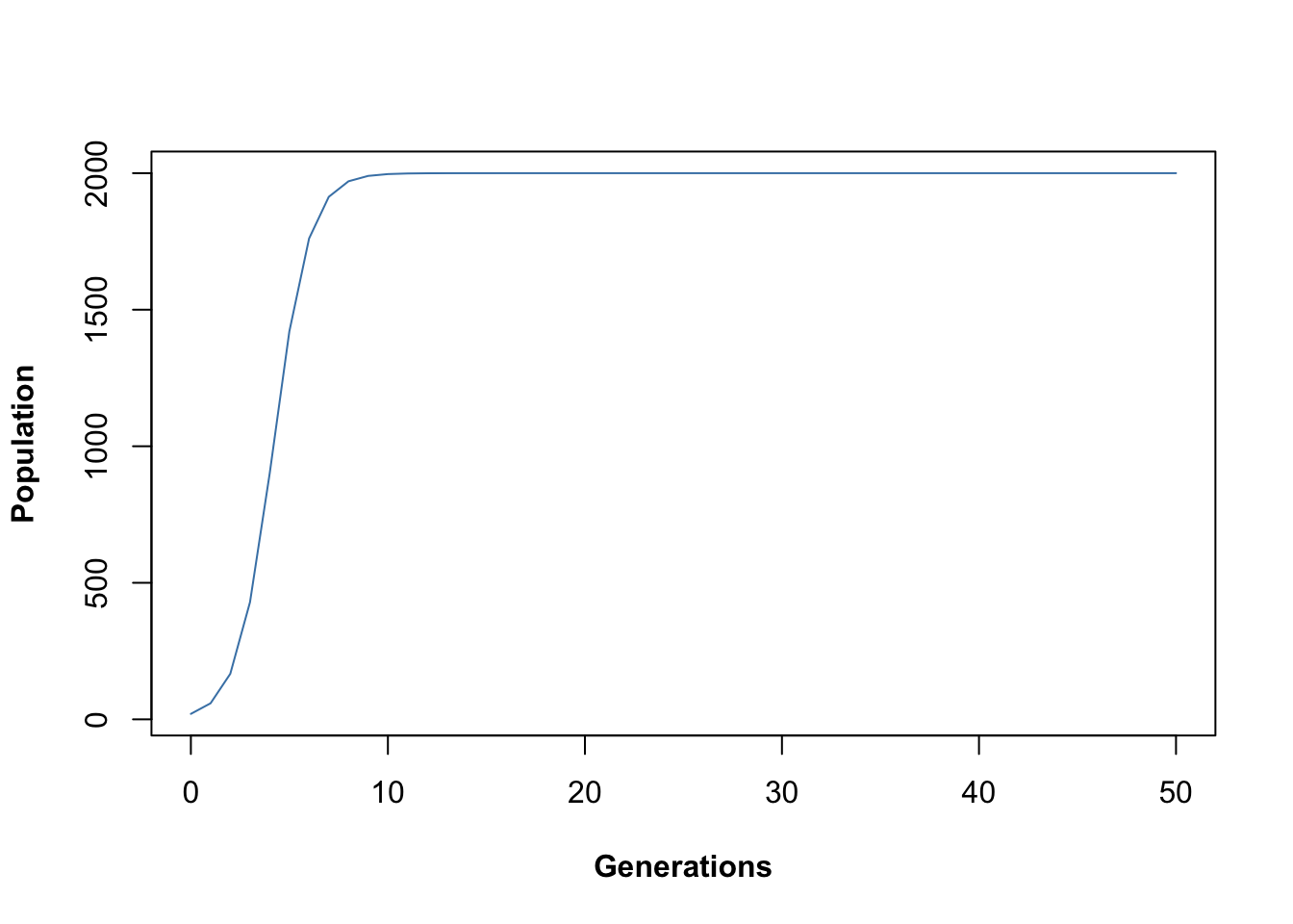
Figure 15.7: Time series output from Maynard-Smith and Slatkin discrete time logistic population model
Using ggplot2
library(ggplot2)

p1 <- ggplot(data = data.frame(output)) +
  aes(x = Time, y = N) +
  geom_line(colour = "steelblue") +
  theme_bw() +
  xlab("Generations") +
  ylab("Population")

p1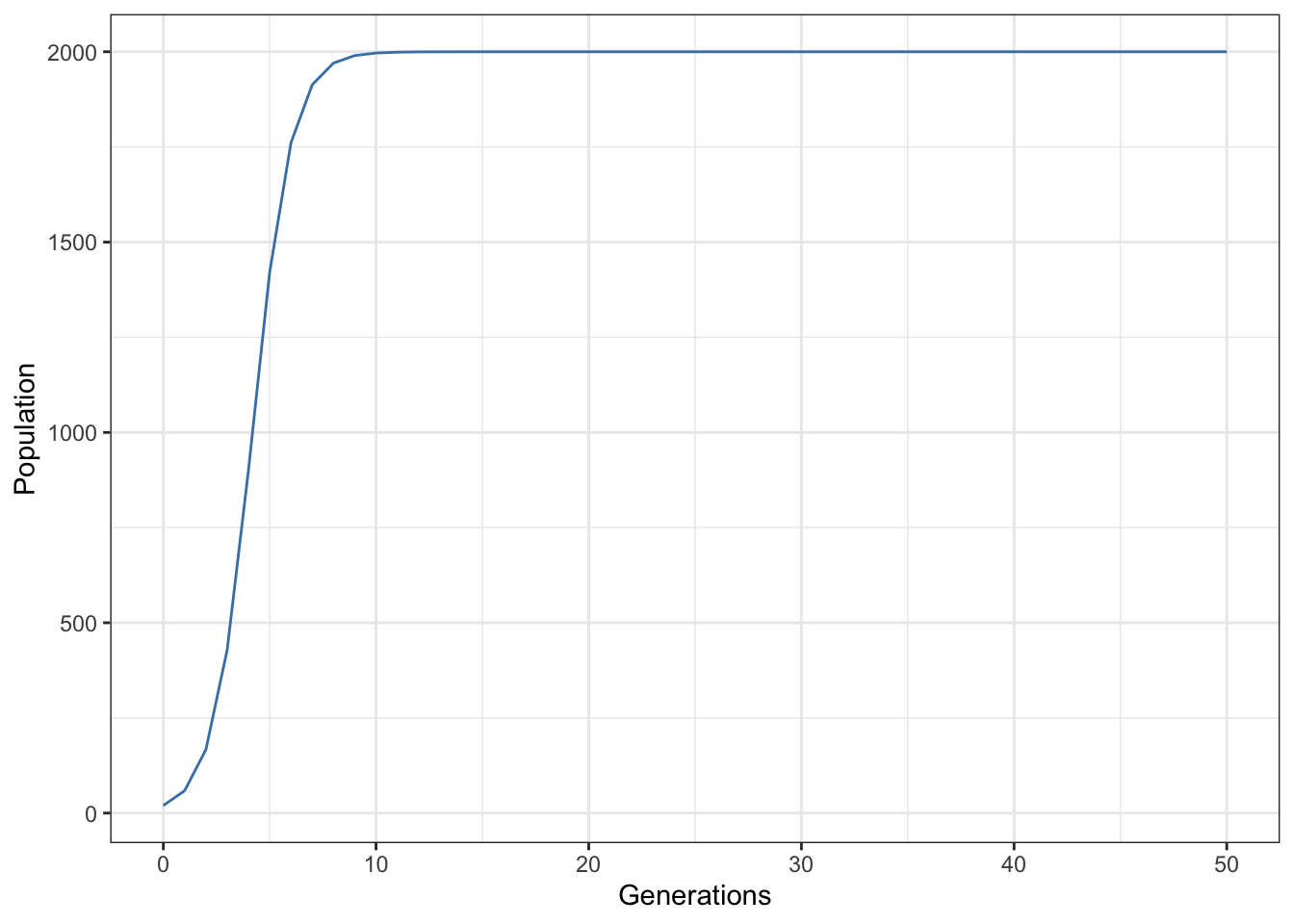
Figure 15.8: Time series output from Maynard-Smith and Slatkin discrete time logistic population model
- Now go back to your script and run it again with values of \(b\) ranging from 1 to 8. You should see that the behaviour of the population changes from a steady increase to an equilibrium, to damped oscillations to equilibrium, to cycles and then finally to complex, unpredictable fluctuations - deterministic chaos.
All you have to do for this is to change the value of \(b\) and run the script again. I’ll leave this up to you.