Chapter 9 Graphics in R
When it comes to drawing graphs, using R gives you the same benefits and costs that you get when analysing data. Everything is done through a command-line interface that can be difficult to use and sometimes counterintuitive. Whereas with other software you get a nice GUI and can just point and click until you achieve what it is you’re after, if you’re drawing graphs in R you might have to do some research first to find out how to draw the graph you’re after. That initial difficulty, however, is more than counterbalanced by the huge benefits of using R as your platform for data visualisation: R is almost infinitely flexible and can draw an extraordinary range of graphs, and you’ll find that in many cases the default options are very good starting points; unlike those in a certain popular spreadsheet application, for example, they have been designed by people possessed of both brains and colour vision. Generating a script when you draw your graph means that you can easily return and edit your graph, and if you want to draw a similar graph with different data you can re-use your script with a few edits. Finally, you can use other peoples’ scripts. There are plenty of online resources with examples of graphs produced in R, and many of these have the code used to draw the graph associated with them. If you find an example of the sort of graph you want to make, you can use the code that’s already there as the basis of your own script. Have a look at the R Graph Gallery, a web resource set up for exactly this purpose, for an idea of the range of options available.
9.1 Base graphics versus ggplot2 versus lattice versus whaaat???
As a budding R user, your life has been made more complicated by the presence of a number of different options for creating graphics in R. Firstly, there is the graphics system which is built into R which is called base graphics. There are then two main alternative systems, lattice and ggplot2, which work very differently to the base system. Of these, ggplot2 has become the most well-known, and many people are now using it exclusively. Despite what you might read on Twitter the base R graphics system is a sophisticated and powerful system which can easily generate publication-quality graphs, but because ggplot2 is now so widely used I don’t think it’s possible to be a fully functional R user nowadays without knowing at least its fundamentals. In this (rather long) chapter we’ll take an in-depth look at base graphics, and then we’ll move on to looking at ggplot2 in the next. The coverage of ggplot2 is not as comprehensive as it is for base graphics for the simple reason that there is a lot of excellent, free online material which you can access to help you with ggplot2.
What should you read? My advice is that if you’re sure you want to stick to base graphics then read this chapter. If you know that you want to work in ggplot2 then I would suggest reading the first few sections of this chapter, up to and including the section on colours, and then moving on to the ggplot2 chapter. If you’re not sure then maybe dip into both and see which you prefer.
9.2 Base graphics example: UFO reports again
We’ll start off with looking at an example of how to produce a graph in R. In the previous chapter we looked at a script which drew a graph for you: the plot of UFO reports by month since 1900. Let’s have another look at that script and go through the code. Here it is again.
# Script to read data on UFO reports and plot the data since 1900
# Audrey Bloggs 25th December 2022

# Load data from website
UFO <- read.csv("Data/UFO_data.csv",
     stringsAsFactors = FALSE)

# Convert 'Reports' variable to date
UFO$Reports <- as.Date(UFO$Reports, format = "%d/%m/%Y")

# Trim off dates before 1900 which have a different format and convert to NA
UFO <- UFO[which((!is.na(UFO$Reports))), ]

# Check the data structure
str(UFO)

# Plot the data
plot(UFO$Count ~ UFO$Reports,
     type = "l",
     col = "steelblue",
     xlab = "Year",
     ylab = "Number of UFO reports by month",
     main  = "UFO reports by month since 1900")
The first two thirds of the script are devoted to importing the data, cleaning it up and checking that everything’s gone well, and then we have the plot() function call which actually draws the graph. plot() is a particularly flexible and powerful R function, and it can produce a wide range of different outputs depending on the nature of the data or R objects that we feed to it. Our complete function call looks like this.
plot(UFO$Count ~ UFO$Reports,
     type = "l",
     col = "steelblue",
     xlab = "Year",
     ylab = "Number of UFO reports by month",
     main  = "UFO reports by month since 1900")
Just like other functions in R we have a series of arguments within the brackets, with each argument separated from the previous one by a comma. I’ve got each argument after the first on a separate line, which makes it easier to see what’s happening in this piece of code. The first argument that we’re giving to our plot() function tells it where to find the data to plot. In this case we’re giving it two data variables, a numeric variable, UFO$Count and a date variable UFO$Reports, and they are separated by a tilde ~. The tilde is an important symbol in R. This is the first time you’ve met it, but you’ll see it a lot in defining formulas for statistical tests. You can think of it as meaning “is explained by” or as something which separates a dependent variable from an independent variable, or a response variable from an explanatory variable: if we think that one variable depends on the value of the other then the former would be the dependent or response variable and the latter the independent or explanatory variable. In this case the number of UFO reports depends on the year: there is clearly a big effect of year in determining the number of reports logged, but the year deosn’t depend on the number of reports. No-one is going to say “there have been 215 UFO reports, so we will call this year 2003.” Conventionally we put a dependent variable on the y-axis and an independent one on the x-axis, and this is what R will do.
If we just use the first argument, UFO$Count ~ UFO$Reports and none of the rest then R will go for the default option for a graph with continuous variables for both the x- and the y-axis, and draw a scatterplot with each data point represented by an open circle.
plot(UFO$Count ~ UFO$Reports)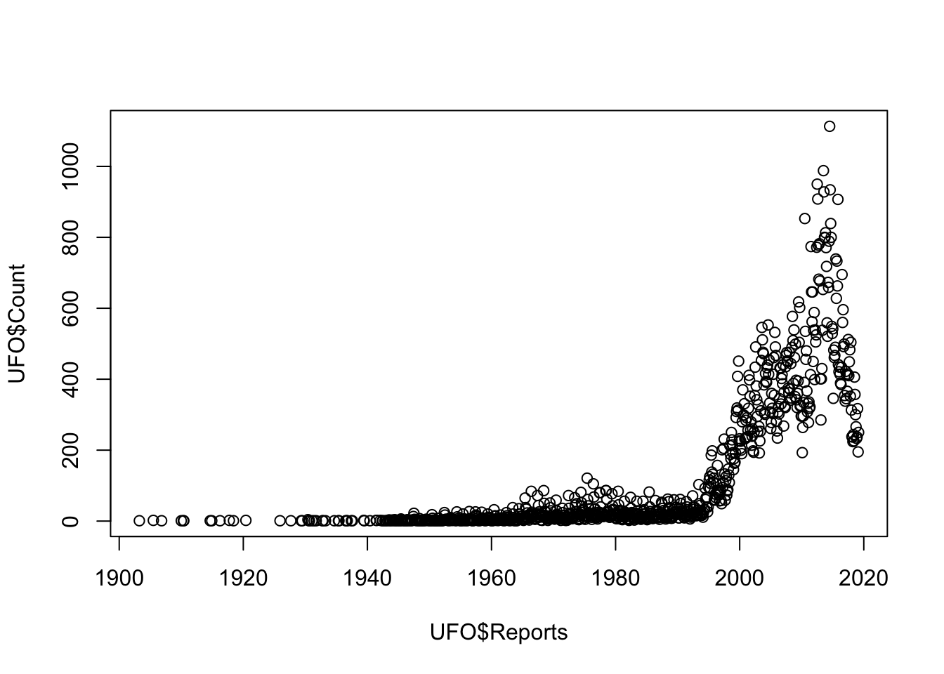
Figure 9.1: Scatterplot of UFO reports by year
That’s not really what we’re after and doesn’t really show the important patterns in the data. We can tell R to draw a line connecting each data point instead of the scatterplot by adding the type = 'l' argument:
plot(UFO$Count ~ UFO$Reports,
     type = "l")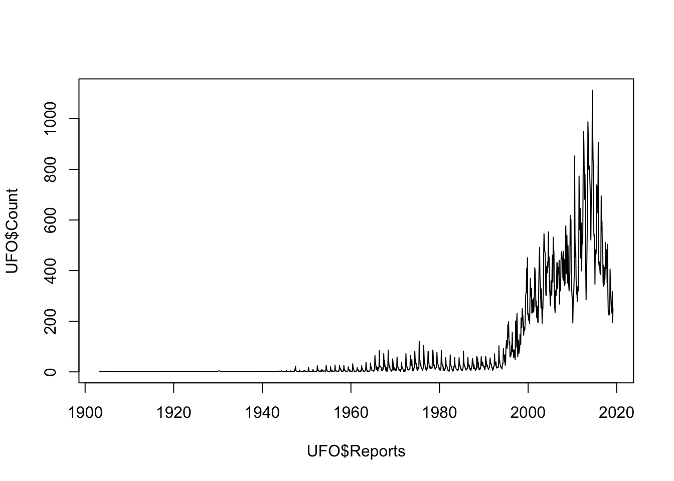
Figure 9.2: Line plot of UFO reports by year
which gives something much closer to what we’re after. We can change the colour of the line using the col = "steelblue" argument, xlab = "Year" sets the axis label for the x-axis, ylab = "Number of UFO reports by month" does the same for the y-axis and finally main = "UFO reports by month since 1900" gives us a main title for the graph…
plot(UFO$Count ~ UFO$Reports,
     type = "l",
     col = "steelblue",
     xlab = "Year",
     ylab = "Number of UFO reports by month",
     main  = "UFO reports by month since 1900")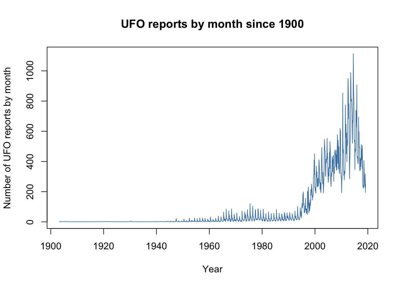
… and with remarkably little fuss we have a nice, publication quality graph displaying our data. This example shows us the basics of producing graphs in R: the plot() function produces a particular kind of graph depending on the data that you feed it, but you can then modify the look of the graph and change things like the axis labels by using further arguments to your plot() function call. It’s worth pointing out here that these arguments are often called graphical parameters when we’re referring to arguments that change the appearance of a graph, but they work in the same way as arguments for other types of function. We’ll talk a little more about graphical parameters later on in the chapter.
9.3 Scatterplots
Let’s look at scatterplots in rather more detail. We’ll draw a scatterplot and then specify the shape and colour of the datapoints according to some classification, then finally we’ll add some fitted lines to our data. The dataset we’ll be using is from a paper published in the Journal of Evolutionary Biology by John Fitzpatrick and coauthors11 on the subject of how brain size in pinnipeds (seals, walruses and sea lions) relates to their mating system. The fundamental question they were addressing is whether brain size varies between seals where the males defend groups of females (“harems”), and species where males pair up with single females.
The dataset is online and you can load it straight into R from the web by running this line of code.
pinniped <- read.csv("Data/Pinniped_brains.csv")As always, we want to know whether our dataset has imported properly so we check using the str() function.
str(pinniped)
'data.frame':   33 obs. of  11 variables:
 $ Species        : chr  "Monachus schauinslandi" "Monachus monachus" "Mirounga angustirostris" "Mirounga leonina" ...
 $ Male_brain     : num  370 480 700 1431 535 ...
 $ Female_brain   : num  NA 480 640 899 638 ...
 $ Male_mass      : num  173 260 2275 3510 450 ...
 $ Female_mass    : num  272 275 488 566 447 ...
 $ Harem          : num  1 1 13 48 3 1 1 1 1 1 ...
 $ Small_intestine: int  1030 870 3820 12100 2700 790 2530 2190 2520 2164 ...
 $ Gestation      : int  330 330 230 225 263 248 255 276 234 270 ...
 $ Lifespan       : num  360 284 244 276 300 ...
 $ Lactation      : int  38 42 26 23 50 30 17 29 4 24 ...
 $ Dive_duration  : num  12 NA 62 120 82 9.8 10.8 NA 52 25 ...
All good: we have quite a few variables including a character vector of species names, male and female brain mass (g), male and female body mass (Kg) and the average harem size, where 1 indicates each male is only mating with a single female at a time and values greater than 1 tell us that males, if they are able, will guard females in groups.
Let’s plot male brain mass against body mass to start with.
plot(pinniped$Male_brain~pinniped$Male_mass)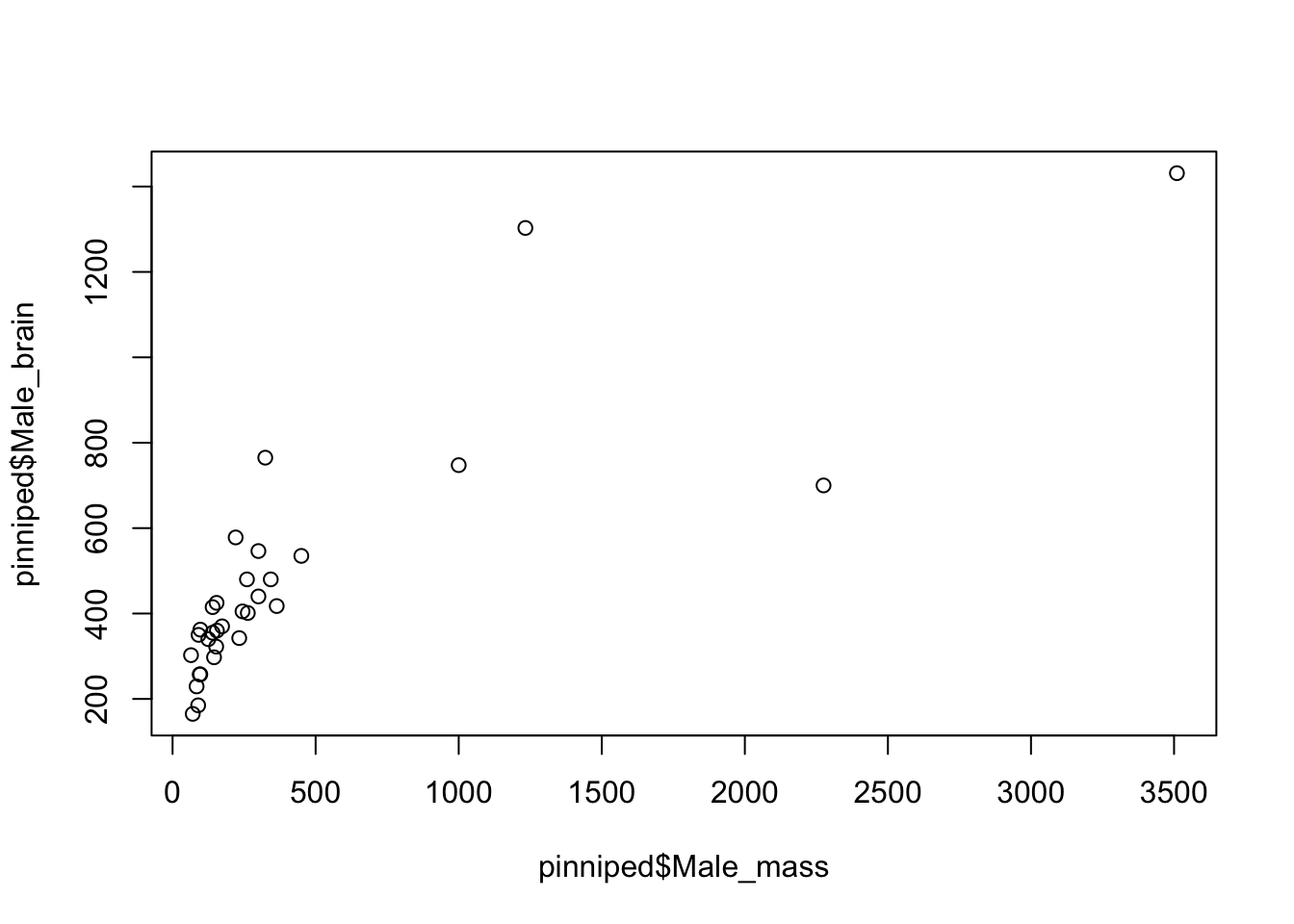
Figure 9.3: Brain mass versus body mass for 33 species of male pinniped
This plot is showing us that there is some sort of relationship between brain mass and body mass, but it is difficult to tell much from it because both the brain mass and body mass data are squished down into the bottom left corner. This is because both of these variables are positively skewed: there are lots of seals and their relatives with body mass between about 50 and about 500Kg, but then there are a few which are much heavier up to Mirounga leonina, the Southern Elephant Seal, which is an absolute chonker with males weighing in at about 3.5 metric tonnes. We need to do something to spread the data out more evenly, and usually when dealing with this sort of positively skewed data we’d plot the log transformed data rather than the raw data. There are two easy ways to do this in R: you can generate new variables which are the logged values that you want to plot, or you can use an argument within the plot() function call to tell it to plot the data on a log scale.
Here is the first option.
#Generate new variables with the log transformed data
log_Male_brain <- log(pinniped$Male_brain)
log_Male_mass <- log(pinniped$Male_mass)

#plot our new variables
plot(log_Male_brain~log_Male_mass)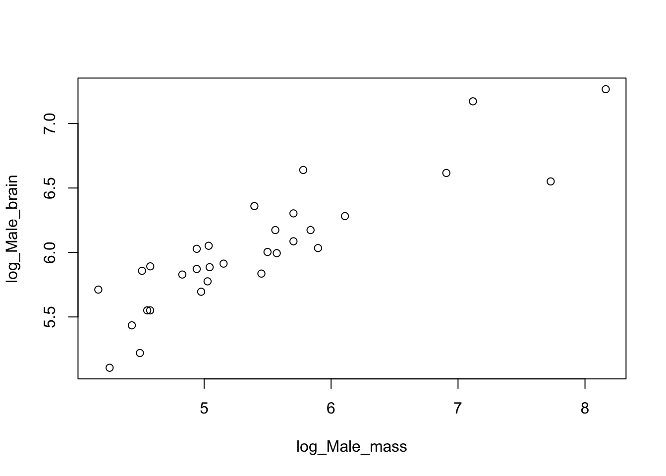
Figure 9.4: Log brain mass versus log body mass for 33 species of male pinniped
You can see that log transforming these data gives us a nice looking plot with the data spread out so that we can see any patterns that might be there. How about the other alternative?
plot(pinniped$Male_brain ~ pinniped$Male_mass,
     log  = "xy")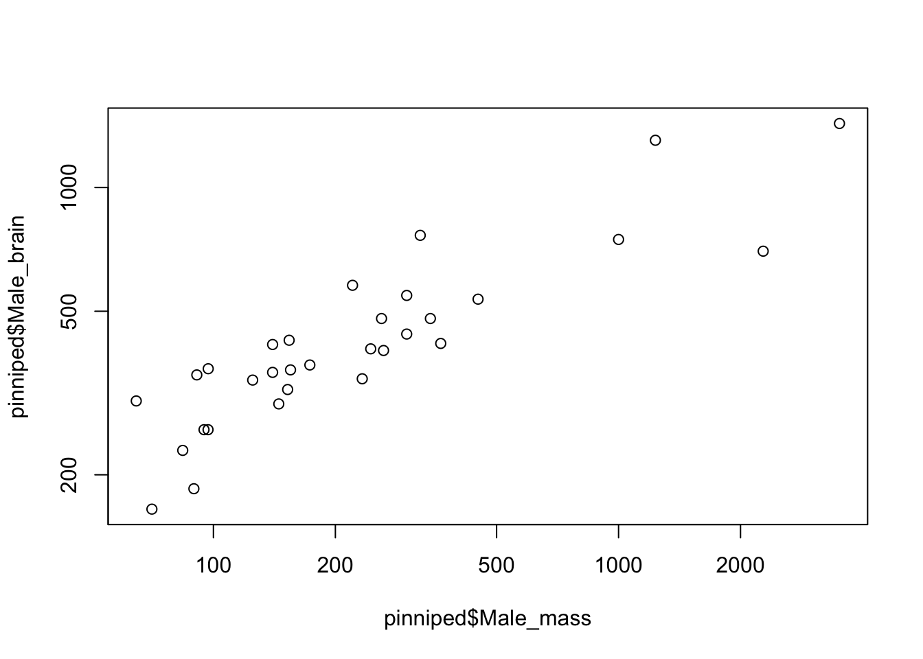
Figure 9.5: Brain mass versus body mass for 33 species of male pinniped, plotted on log scaled axes
The positioning of the points is exactly the same, but the numbers on the axes are different. What’s happened here is that instead of log-transforming the data we’ve plotted the untransformed data on axes that are on log scales —– you can see this by looking at the numbers on the x-axis in particular, where the distance from 100 to 200 is about the same as the distance from 1000 to 2000. If you only wanted the y-axis plotted on a log scale you could use log = "y" and if you only wanted the x-axis on a log scale then log = "x" would do.
Which of these options for plotting logged data you use is up to you and the best option will depend on the context. I generally prefer the latter, since you retain the original units for your axes which makes it easier to understand what each data point represents.
Talking of units, the axis labels on our plot are not especially informative, so let’s fix that by telling the plot() function what we want our axis labels to be. We can do that using the xlab = and ylab = arguments.
plot(pinniped$Male_brain ~ pinniped$Male_mass,
     log  = "xy",
     xlab = "Body mass (Kg)",
     ylab = "Brain mass (g)")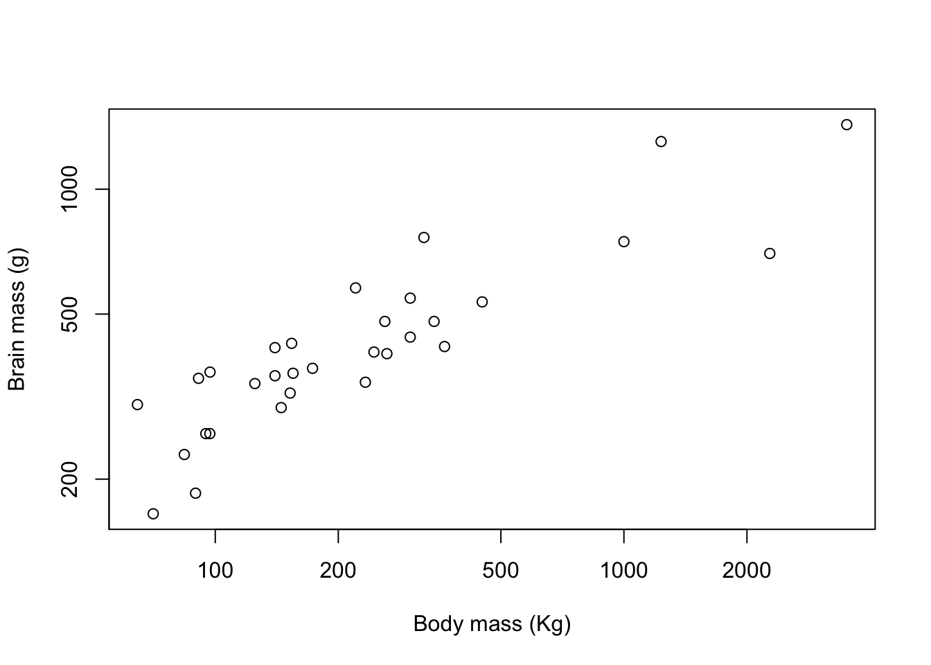
Figure 9.6: Brain mass versus body mass for 33 species of male pinniped plotted on log scaled axes
Good. This is now looking like a graph that we might start to think about publishing. You can see how the default options for things like axis limits and plot symbols are clean and well chosen in base R graphics. We’ve not finished though: we want to change our graph so that the viewer can differentiate between species with “harem” mating systems and other species.
The Harem variable in our data set tells us the average size of the group of females that a male will defend for each species, so if Harem = 1 then we can classify a species as a non-harem one, and if Harem > 1 then we can classify a species as one with a harem mating system. We can then use subscripting to allocate a specific colour or plot symbol to the data points for harem or non-harem species.
9.4 Plot symbols
We can get R to draw different plot symbols by using the pch = graphical parameter. R has a set of built in symbols that are represented by the numbers 1 to 25. Here they are:
Click here to see the code
# Set up variables
X1 <- rep(1:5, 5)
Y1 <- rep(5:1, each = 5)
sym <- 1:25

# Plot the graph
plot(
  X1,
  Y1,
  pch = sym,
  cex = 1.2,
  xlab = "",
  ylab = "",
  xaxt = "n",
  yaxt = "n",
  xlim = c(0.3, 5.7),
  ylim = c(0.3, 5.7)
)

# Add text
text(x = X1 - 0.3, y = Y1, labels = sym)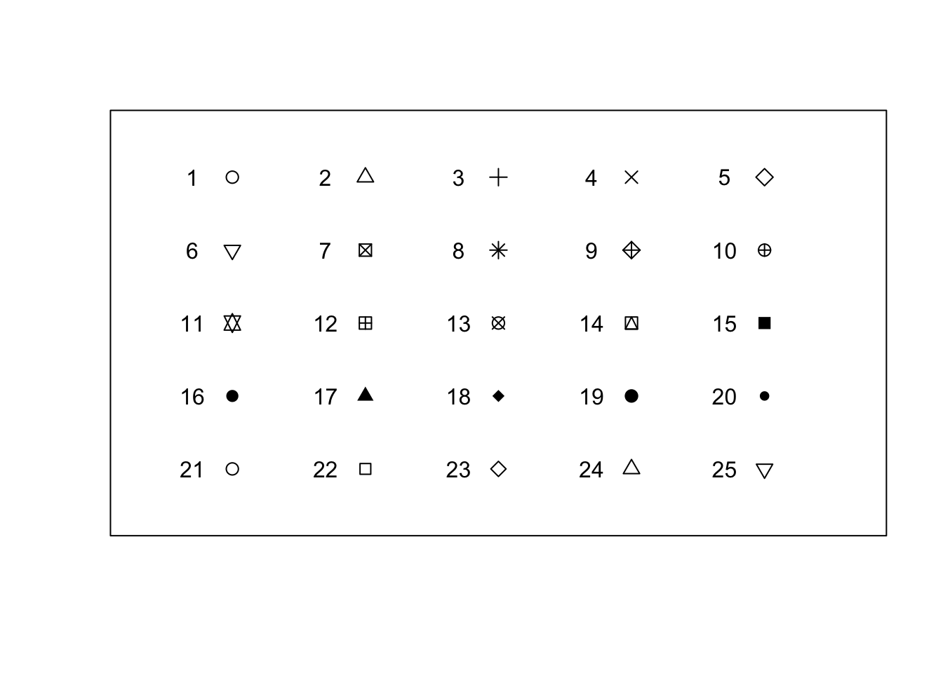
Figure 9.7: Plot symbols used in R
So if we’d like to plot our data with filled circles instead of open ones, we can set pch = 16 as one of our graphical arguments, like this.
plot(pinniped$Male_brain ~ pinniped$Male_mass,
     log  = "xy",
     xlab = "Body mass (Kg)",
     ylab = "Brain mass (g)",
     pch = 16)
Figure 9.8: Brain mass versus body mass for 33 species of male pinniped plotted on log scaled axes using closed circles as plot symbols
9.5 Colours
The colour or colours that your plot symbols are drawn with (or the colours of the boxes in a boxplot, or the bars in a histogram or bar plot) can be set in R by using the col parameter, and other parameters such as bg, col.axis, col.lab set the colours for other parts of the plot: these examples will allow you to change the background colour and the colours of the axes and the axis labels respectively. For a full list of these take a look at ?par which will bring up a description of all of the graphical parameters. The actual colours to be used can be named in a confusing variety of different ways, but for the beginner the easiest thing to do is simply to use the name: “red,” “blue,” “green” or “lightblue” or “darkgreen.” In fact, R has a rather surprising number of named colours that you can use, and an even more surprising range of names, from “aliceblue” through “darkgoldenrod2,” “hotpink1,” “lemonchiffon3” to “tomato4.” The function colours(), or colors() if you prefer the American spelling will produce a list of all 657 named colours in R. Appendix 1 has a series of charts showing each colour with its name.
If you’re familiar with how colours are described in computers then you can use the RGB hexadecimal code for the colour: this begins with a hash symbol and then has two numbers for the red channel (computers think in hexadecimal to each one is 0-9 and the A-F), two for the green and two for the blue, so #0000FF is blue, #FF0000 is red, #000000 is black and #FFFFFF is white. We’ll talk about using these hex codes a little later when we discuss using alpha channels to make elements of your graph semi-transparent.
If we wanted to change the colours of our plot symbols from the default black option we just need to add another argument specifying the exact colour we want. If we wanted aquamarine4 as our plot colour then our code would look like this.
plot(pinniped$Male_brain ~ pinniped$Male_mass,
     log  = "xy",
     xlab = "Body mass (Kg)",
     ylab = "Brain mass (g)",
     pch = 16,
     col = "aquamarine4")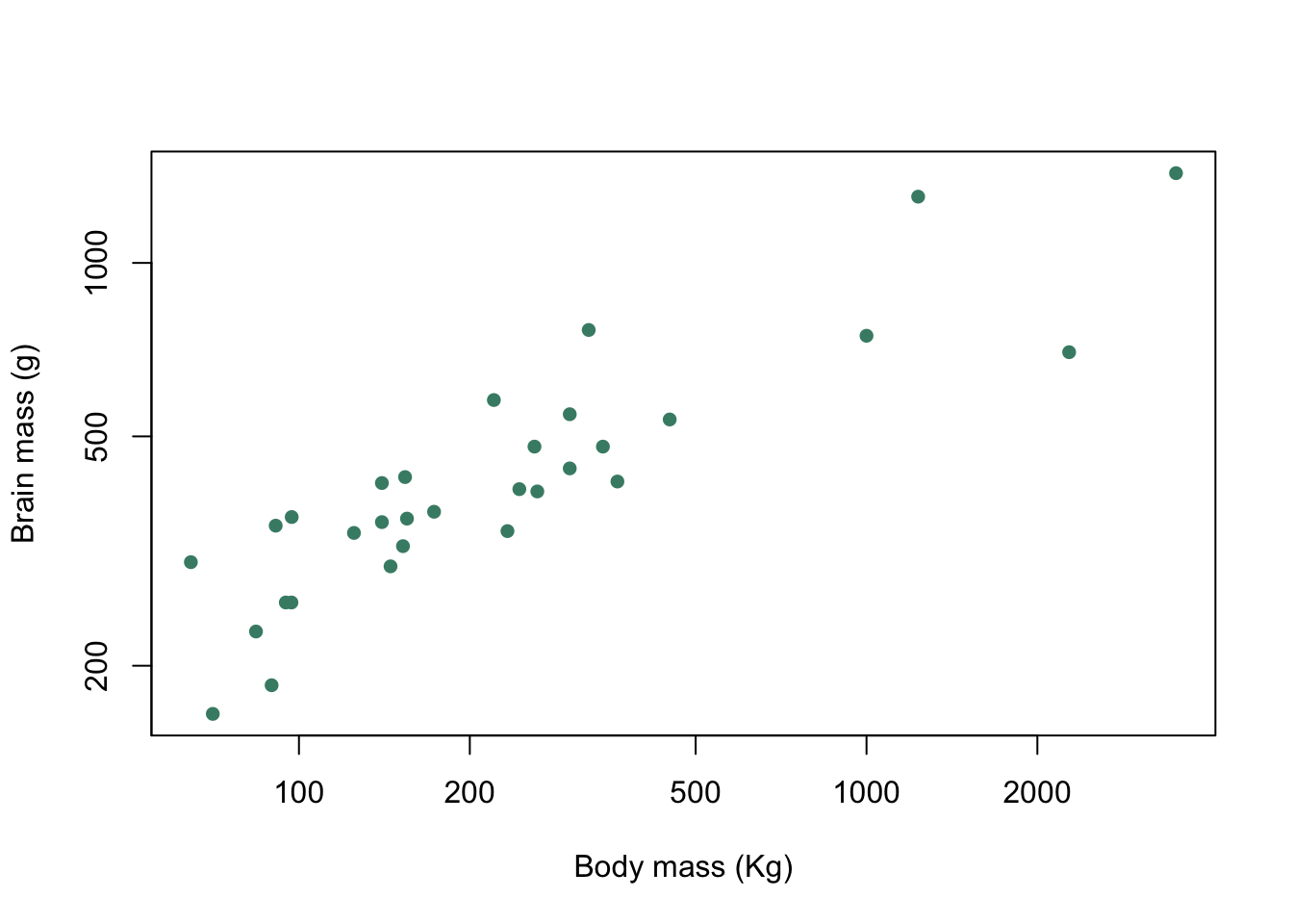
Figure 9.9: Brain mass versus body mass for 33 species of male pinniped plotted on log scaled axes with both plot symbol and colour specified
9.6 Plotting multiple symbols or colours
One of the most important uses of colour or plot symbols is to distinguish between different classes of data, and this is something that we can do in R: if we have a variable which classifies our data into groups, then we can use that to tell R which colours or symbols to use. Using our data on pinnipeds, we can divide our species into harem breeders, where males defend groups of more than one female during the mating season, and non-harem breeders where each male is only associated with a single female. The variable Harem gives us the number of females that a male might be associated with and we can use this to set up a new factor called Mating_system which has two levels, Harem for males who will seek to defend more than one female and Non harem for males who only associate with a single female at a time.
Mating_system <- factor(ifelse(pinniped$Harem == 1, "Non harem", "Harem"))Here we’ve used the ifelse() function which takes a logical statement, in this case whether the value of Harem is equal to one, and returns one value, in this case "Non harem", if the logical statement is true and a second value ("Harem") if the statement is false. Now we can plot our data and indicate to the viewer which mating system is associated with each data point. Firstly we’ll do this with colours, and then with different plot symbols.
To indicate how our points are classified we need a vector of colours for R to use in our plot. This example has only two but if you have more groups you just need more colours in your vector.
colours <- c("aquamarine4", "chocolate2")Now we have a vector of colours and a factor which classifies our data. How do we use these to generate a plot with each data point colour coded by the factor levels? The answer lies in some clever use of subscripts. colours is a character vector and we can retrieve the first or second value by using a subscript:
colours[2]
[1] "chocolate2"
returns the second value in the vector. If we have a second vector of numbers which correspond to the useable subscripts for our colours vector then we can use this to generate a new vector of colour names:
example <- c(1,1,2,1,2,2,1)
colours[example]
[1] "aquamarine4" "aquamarine4" "chocolate2"  "aquamarine4" "chocolate2"
[6] "chocolate2"  "aquamarine4"
which returns a vector with seven colour names, each corresponding to the relevant value in our example vector. Now let’s go back to our Mating_system factor. This has two levels, Harem and Non harem and these levels will be coded by R as 1 for Harem, which coes first alphabetically, and 2 for Non harem which comes second. If, therefore, we use Mating_system as a subscript for colours it should return "aquamarine4" for each value of Non harem in Mating_system and "chocolate2" for each value of Harem. Let’s try that out.
colours[Mating_system]
 [1] "chocolate2"  "chocolate2"  "aquamarine4" "aquamarine4" "aquamarine4"
 [6] "chocolate2"  "chocolate2"  "chocolate2"  "chocolate2"  "chocolate2"
[11] "aquamarine4" "chocolate2"  "chocolate2"  "chocolate2"  "chocolate2"
[16] "chocolate2"  "chocolate2"  "chocolate2"  "aquamarine4" "aquamarine4"
[21] "aquamarine4" "aquamarine4" "aquamarine4" "aquamarine4" "aquamarine4"
[26] "aquamarine4" "aquamarine4" "aquamarine4" "aquamarine4" "aquamarine4"
[31] "aquamarine4" "aquamarine4" "aquamarine4"
Et voilà! we can generate a vector of colours which we can include in our plot() function call with only a very brief piece of code.
plot(pinniped$Male_brain ~ pinniped$Male_mass,
     log  = "xy",
     xlab = "Body mass (Kg)",
     ylab = "Brain mass (g)",
     pch = 16,
     col = colours[Mating_system])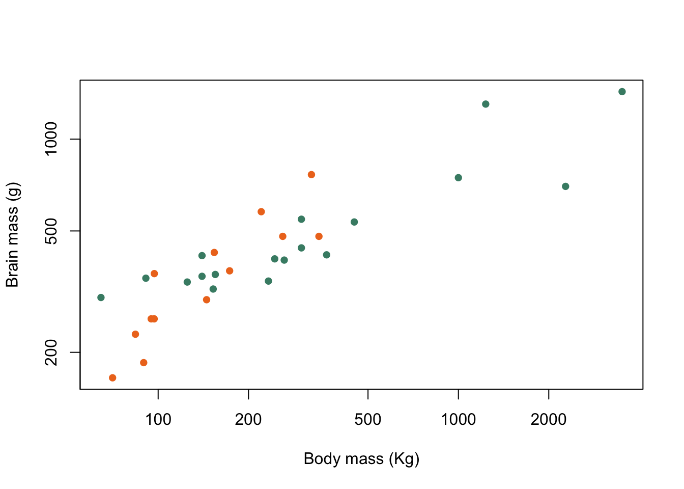
Figure 9.10: Brain mass versus body mass for 33 species of male pinniped plotted on log scaled axes, orange symbols indicate non-harem breeders and green indicate harem breeders
There we are. Now, if I were given chocolate that colour to eat I’d be rather dubious, but aside from that we’ve achieved our goal.
We can vary the plot symbol using the exact same logic. If we wanted to indicate mating system by using a filled circle (plot symbol 16) for Harem and a filled triangle (plot symbol 17) for Non harem we need to set up a vector containing these two numbers:
symbols <- c(16,17)and then we can use this in our plot() function call with a subscript in the same way that we did for colours.
plot(pinniped$Male_brain ~ pinniped$Male_mass,
     log  = "xy",
     xlab = "Body mass (Kg)",
     ylab = "Brain mass (g)",
     pch = symbols[Mating_system])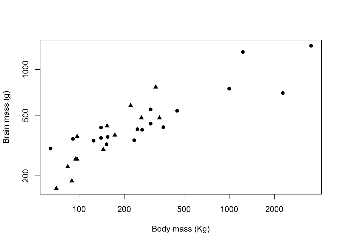
Figure 9.11: Brain mass versus body mass for 33 species of male pinniped plotted on log scaled axes, triangles indicate non-harem breeders and circles indicate harem breeders
9.7 Colour palettes in R
You don’t have to choose your own colours for your plots. R has a number of built-in selections of colours which are known as “palettes.” There is a default palette which is a vector of 8 different colours which can be found using the palette() function.
palette()
[1] "black"   "#DF536B" "#61D04F" "#2297E6" "#28E2E5" "#CD0BBC" "#F5C710"
[8] "gray62"
If you’re just interested in a quick look at your data then you can just use code like this where I’ve specified our Mating_system factor for the col = argument, and R will use the first two colours in the default palette.
plot(pinniped$Male_brain ~ pinniped$Male_mass,
     log  = "xy",
     xlab = "Body mass (Kg)",
     ylab = "Brain mass (g)",
     pch = 16,
     col = Mating_system)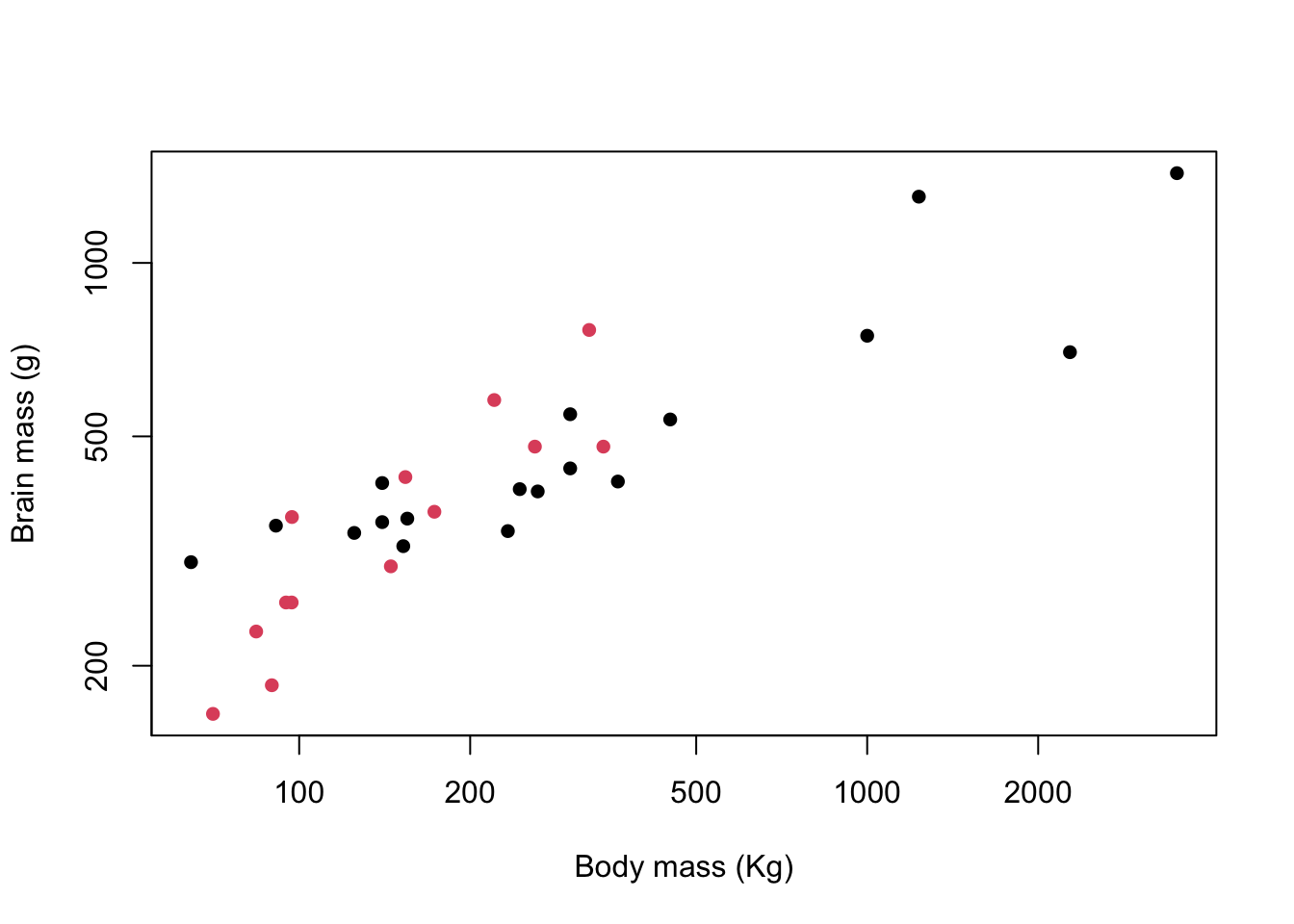
Figure 9.12: Brain mass versus body mass for 33 species of male pinniped plotted on log scaled axes, colour coded for mating system
That doesn’t look too bad but you might not want to use it for a presentation or a publication. The default R palette has something of a bad reputation and the potential combinations of bright red, green and blue is enough to give most people a headache, not to mention the possible problems for people with red-green colourblindness. There will be a new and less offensive default palette coming to R soon but at the time of writing this hasn’t been implemented yet. The good news though is that there are a lot of other palettes now available in a base R installation as part of the grDevices package, and there are also some really nice ones available as installable packages. The ncl.pals() function will give you a list of what’s available in your base installation so long as it’s a fairly recent one.
hcl.pals()
  [1] "Pastel 1"      "Dark 2"        "Dark 3"        "Set 2"
  [5] "Set 3"         "Warm"          "Cold"          "Harmonic"
  [9] "Dynamic"       "Grays"         "Light Grays"   "Blues 2"
 [13] "Blues 3"       "Purples 2"     "Purples 3"     "Reds 2"
 [17] "Reds 3"        "Greens 2"      "Greens 3"      "Oslo"
 [21] "Purple-Blue"   "Red-Purple"    "Red-Blue"      "Purple-Orange"
 [25] "Purple-Yellow" "Blue-Yellow"   "Green-Yellow"  "Red-Yellow"
 [29] "Heat"          "Heat 2"        "Terrain"       "Terrain 2"
 [33] "Viridis"       "Plasma"        "Inferno"       "Rocket"
 [37] "Mako"          "Dark Mint"     "Mint"          "BluGrn"
 [41] "Teal"          "TealGrn"       "Emrld"         "BluYl"
 [45] "ag_GrnYl"      "Peach"         "PinkYl"        "Burg"
 [49] "BurgYl"        "RedOr"         "OrYel"         "Purp"
 [53] "PurpOr"        "Sunset"        "Magenta"       "SunsetDark"
 [57] "ag_Sunset"     "BrwnYl"        "YlOrRd"        "YlOrBr"
 [61] "OrRd"          "Oranges"       "YlGn"          "YlGnBu"
 [65] "Reds"          "RdPu"          "PuRd"          "Purples"
 [69] "PuBuGn"        "PuBu"          "Greens"        "BuGn"
 [73] "GnBu"          "BuPu"          "Blues"         "Lajolla"
 [77] "Turku"         "Hawaii"        "Batlow"        "Blue-Red"
 [81] "Blue-Red 2"    "Blue-Red 3"    "Red-Green"     "Purple-Green"
 [85] "Purple-Brown"  "Green-Brown"   "Blue-Yellow 2" "Blue-Yellow 3"
 [89] "Green-Orange"  "Cyan-Magenta"  "Tropic"        "Broc"
 [93] "Cork"          "Vik"           "Berlin"        "Lisbon"
 [97] "Tofino"        "ArmyRose"      "Earth"         "Fall"
[101] "Geyser"        "TealRose"      "Temps"         "PuOr"
[105] "RdBu"          "RdGy"          "PiYG"          "PRGn"
[109] "BrBG"          "RdYlBu"        "RdYlGn"        "Spectral"
[113] "Zissou 1"      "Cividis"       "Roma"
This long list is in fact an implementation of the colour palettes available in the colorspace package for R, and these are themselves a mix of palettes from a variety of sources: for example the Viridis palette is from the eponymous Viridis package.
I personally find a lot of these built-in colour palettes to be rather uninspiring and I prefer to use palettes from the RColorBrewer package. RColorBrewer gives you an R implementation of the palettes available on the Color Brewer website. The website is oriented towards cartographers but the palettes are useful for all sorts of data visualisations. The package will need to be installed if you don’t already have it so you’d need to run install.packages("RColorBrewer").
The palettes in RColorBrewer and elsewhere are usually grouped into “sequential,” “diverging” and “qualitative” palettes. Sequential ones are suited for data on an ordered scale and tend to have a single underlying colour which is presented at varying degrees of lightness. Here are the available palettes from RColorBrewer:
library(RColorBrewer)
display.brewer.all(type = "seq")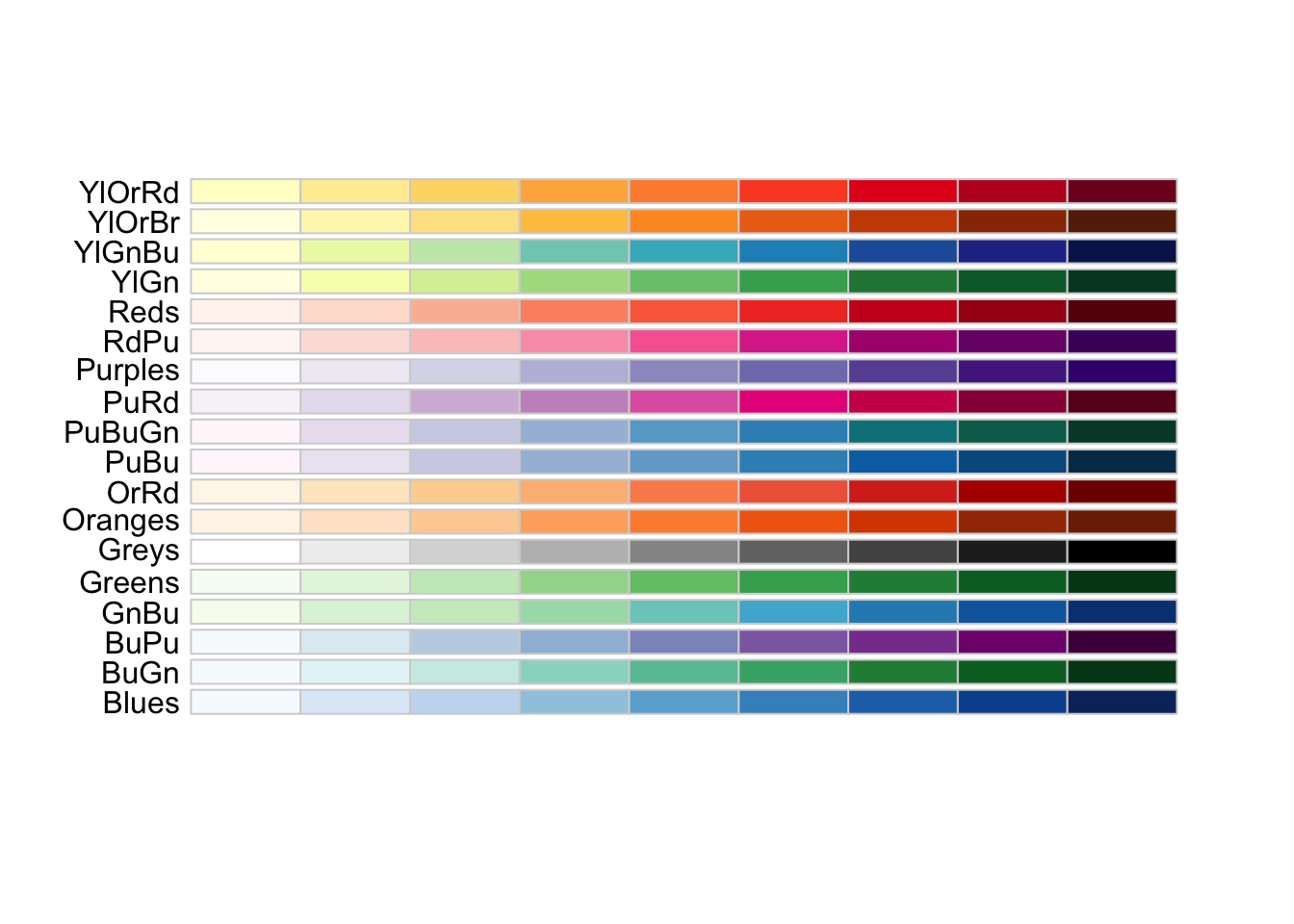
Diverging palettes, like the sequential ones are suited for data where there is some sort of order but these palettes have contrasting colours for high and low values and (usually) pale shades for mid-range values.
display.brewer.all(type = "div")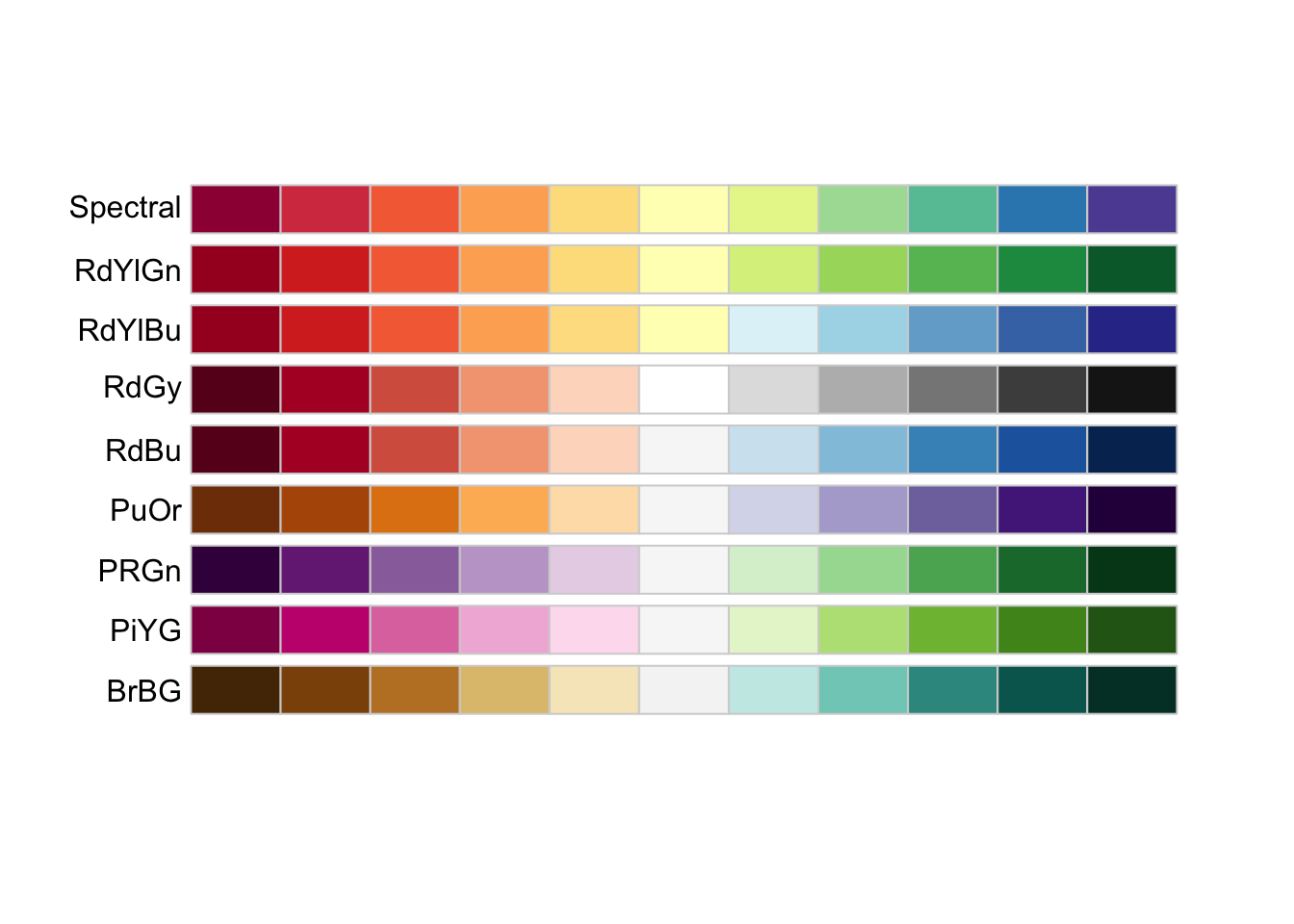
Finally, qualitative palettes do not have any implied ordering and are best for representing data where the differences between data points are themselves not ordered.
display.brewer.all(type = "qual")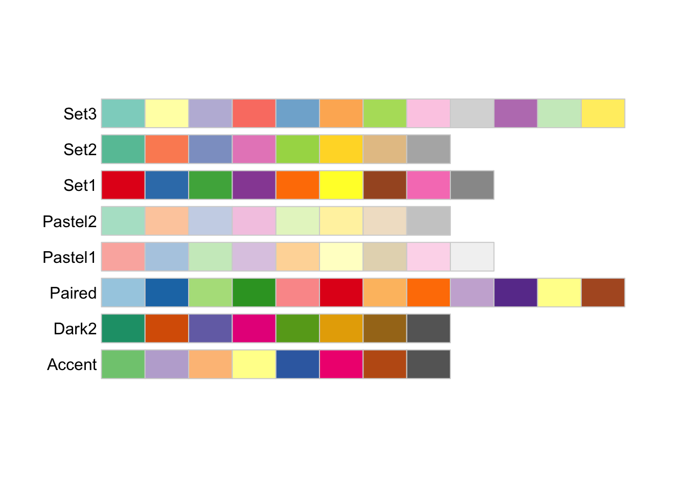
These palettes have a variety of numbers of colours, and chances are that you’ll want to use a different number from the default. You can’t use more than the maximum, but you can easily generate and visualise sub-palettes with fewer colours present. As an example, if you wanted a palette based on the Dark2 palette but with seven colours only you can use the display.brewer.pal() function to visualise it and the brewer.pal() function to generate a new object with the appropriate hex codes.
display.brewer.pal(n = 7, name = 'Dark2')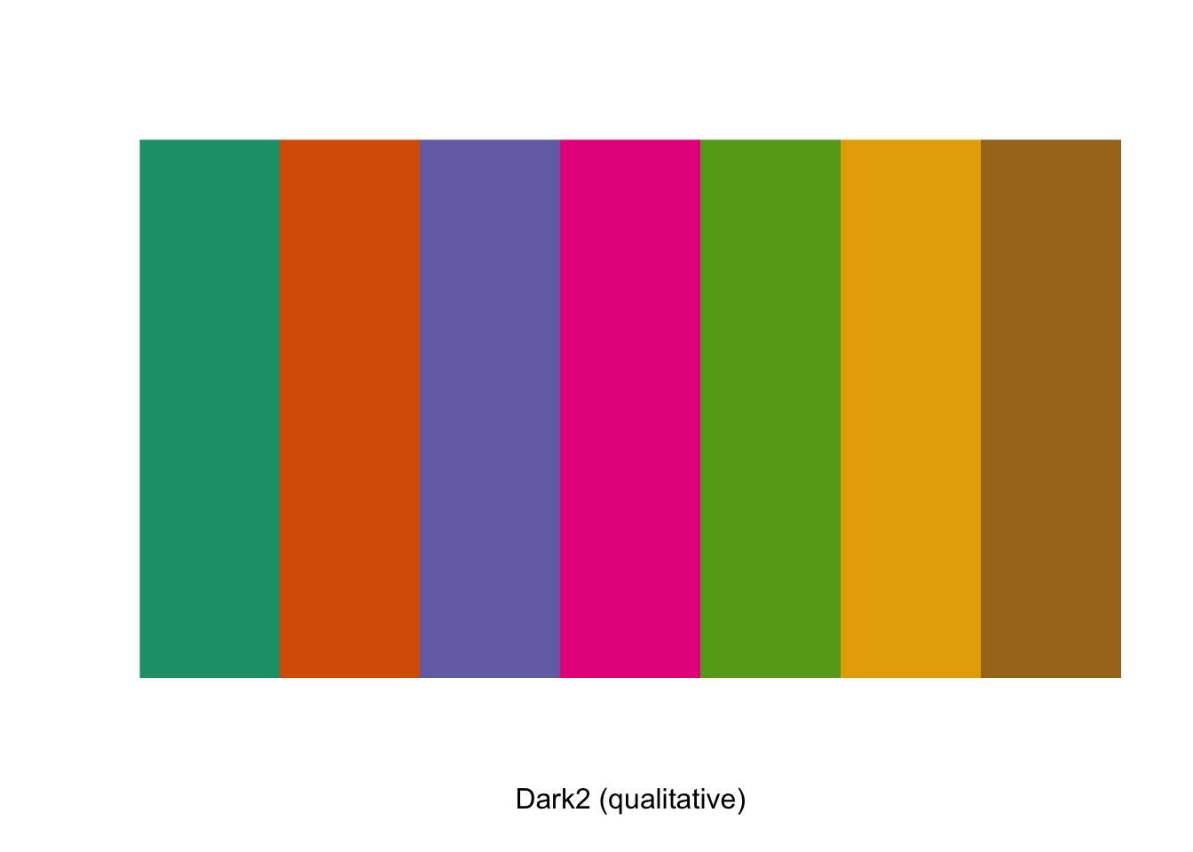
palette1 <- brewer.pal(n=7, name = "Dark2")giving us a character vector called palette1 with seven elements which are the hex codes for our colours.
palette1
[1] "#1B9E77" "#D95F02" "#7570B3" "#E7298A" "#66A61E" "#E6AB02" "#A6761D"
Let’s use this palette to plot a graph. The World_bank_data_2014.csv dataset contains a wide variety of data on economics and development measured in 2014 for 186 countries around the World, as published by the World Bank. Two variables are the percentage of the surface area which are classified as forested (Forest_area) and the annual rainfall in mm (Precipitation). Let’s plot these out, and colour code our data points by region (which happens to have seven values…)
First of all we need to load the data. I’m running R4.0 so I’ll need to specify the variables that I’d like to use as factors.
WB <- read.csv("Data/World_bank_data_2014.csv")
WB$Region <- as.factor(WB$Region)
WB$Income_group <- as.factor(WB$Income_group)

str(WB)
'data.frame':   186 obs. of  22 variables:
 $ Country_Name              : chr  "Afghanistan" "Angola" "Albania" "Andorra" ...
 $ Country_Code              : chr  "AFG" "AGO" "ALB" "AND" ...
 $ Region                    : Factor w/ 7 levels "East Asia & Pacific",..: 6 7 2 2 4 3 2 3 1 2 ...
 $ Income_group              : Factor w/ 4 levels "High income",..: 2 3 4 1 1 4 4 1 1 1 ...
 $ Population                : int  33370794 26941779 2889104 79213 9214175 42669500 2912403 92562 23475686 8546356 ...
 $ Land_area                 : num  652860 1246700 27400 470 71020 ...
 $ Forest_area               : num  2.07 46.51 28.19 34.04 4.53 ...
 $ Precipitation             : int  327 1010 1485 NA 78 591 562 1030 534 1110 ...
 $ Population_density        : num  51.1 21.6 105.4 168.5 129.7 ...
 $ Capital_lat               : int  33 -13 41 43 24 -34 40 17 -35 47 ...
 $ GNP_per_Cap               : int  630 5010 4540 NA 44330 12350 4140 12730 65150 50370 ...
 $ Population_growth         : num  3.356 3.497 -0.207 -1.951 0.177 ...
 $ Cereal_yield              : num  2018 888 4893 NA 12543 ...
 $ Under_5_mortality         : num  73.6 92.9 10 3.4 7.9 12 15.1 7.6 4 3.8 ...
 $ Renewables                : num  19.314 50.797 38.69 19.886 0.146 ...
 $ CO2                       : num  0.294 1.29 1.979 5.833 22.94 ...
 $ PM25                      : num  59 33 18.9 10.8 38 ...
 $ Women_in_parliament       : num  27.7 36.8 20 50 17.5 36.6 10.7 11.1 26 32.2 ...
 $ GINI_index                : num  NA NA NA NA NA 41.7 31.5 NA 35.8 30.5 ...
 $ Govt_spend_education      : num  3.7 NA NA 3 NA ...
 $ Secondary_school_enrolment: num  52.6 NA 97.7 NA NA ...
 $ School_gender_parity      : num  0.654 NA 0.977 NA NA ...
Now that we have our data a little housekeeping is in order. We’re going to want to add a legend ot our plot in the right hand margin so we need to adjust the sizes of the figure margins using par(mar = c(5,4,4,12)). The vector of numbers is the size of the margins in the order of bottom, left, top, right and it would normally be set at c(5,4,4,2) + 0.1 so we’re making the right hand margin much bigger than it would normally be.
par(xpd = TRUE) sets R so that we can plot our legend in the margin: normally in base graphics it would be restricted to inside the plotting area.
Now that we’ve done that we can plot our graph, add the legend and then finally set our two parameters back to their default values. It’s always a good idea to do this because if you don’t then you’ll inevitably forget and then you’ll end up wondering why your graph looks odd.
par(mar = c(5,4,4,13))
par(xpd = TRUE)

plot(WB$Forest_area ~ WB$Precipitation,
     col = palette1[WB$Region],
     pch = 16,
     xlab = "Precipitation (mm per year)",
     ylab = "Forest area (%)")

legend(x=3500, y=80,
       col = palette1,
       pch = 16,
       legend = levels(WB$Region),
       bty = "n",
       title = "Region")

par(mar = c(5,4,4,2) + 0.1)
par(xpd = FALSE)
Before we look at our final plot, let’s just run through those plot() and legend() function calls and see what all the arguments do.
plot(WB$Forest_area ~ WB$Precipitation,
     col = palette1[WB$Region],
     pch = 16,
     xlab = "Precipitation (mm per year)",
     ylab = "Forest area (%)")
This is the function call that plots the graph. We start off by giving plot() the names of two continuous variables (Forest_area and Precipitation), both from the WB data frame. These are separated by a tilde ~ which means “the one on the left of the tilde as explained by the one on the right”… so plot() will draw us a scatterplot with Forest_area on the y-axis and Precipitation on the x-axis.
Next comes col = palette1[WB$Region], which determines the colours used in the plot. We’ve already set up palette1 which is a vector of seven colours derived from the RColorBrewer Dark2 palette. Using the factor Region from the WB data frame as a subscript generates a vector of colours corresponding to the factor levels, as we saw above. Finally we have three fairly simple arguments. pch = 16 sets the plot symbol to be a filled circle, and xlab = and ylab = set the two axis labels.
This plots our graph. Moving on to the legend() function call, this is one of a number of R functions which you can use to draw things like lines, text or more data on to an existing graph and we’ll discuss these in detail in the next chapter. For the moment, I’ll just quickly run you thorugh what the various arguments are doing.
legend(x=3500, y=80,
       col = palette1,
       pch = 16,
       legend = levels(WB$Region),
       bty = "n",
       title = "Region")
The x=3500, y=80 arguments are telling R where to put the top left corner of the legend. The units are the same as those that the graph is plotted in, which makes life a bit easier. Note that 3500 is outside the range of the x-axis, so we’re asking R to plot the legend next to the graph rather than inside the graph box, which is why we have to set par(xpd = TRUE).
col = palette1 tells legend() which colours to include, and pch = 16 tells it which plot symbol to use. legend = levels(WB$Region) is the code which tells legend() what text to use. In this case the levels() function will give us the names of the levels of the WB$Region factor, and this is the information we’d like on the legend. Two final arguments are bty = "n" — bty stands for “box type” and setting this to “n” means that there isn’t a box drawn around the legend, and finally title = "Region" specifies a title for the legend.
Here’s the final graph:
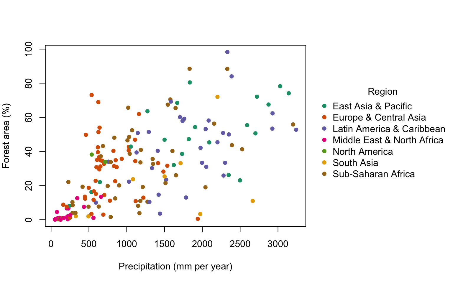
This is an interesting graph. You can see that there is a strong but messy relationship between total precipitation and forest cover, so almost all of the nations with high forest cover also have relatively high precipitation. There are, however, some nations with high precipitation but rather low forest cover. The colour coding lets us see which regions fall where on this graph, so high ofrest cover and high precipitation nations are mostly from the East Asia & Pacific and Latin America & Caribbean regions. The Middle East and North Africa has, of course, a lot of desert and a generally very low rainfall and these nations can all be seen clustering close to the origin.
9.8 Using transparency in your graphs
Something that you can do if you wish to dip your toe into the waters of hexadecimal colour coding is use colours which are transparent, so parts of the graph that are plotted underneath them can show through. This can be useful if, for example, you wish to produce a figure with two histograms plotted on top of each other so that the shapes of two frequency distributions can be compared. We can illustrate this with some results data from the 2012 Ironman Triathlon World Championship in Hawaii. This is a race in which the participants swim for 3.8km, cycle for 180km and then run a marathon. We’ll look at these data again in the chapter on correlation, but for the moment we’ll look at the relationship between swim times and bike times for all competitors.
IMH<-read.table("Data/IMH2012.txt")
str(IMH)
'data.frame':   1879 obs. of  6 variables:
 $ Gender  : chr  "M" "M" "M" "M" ...
 $ Category: chr  "PRO" "PRO" "PRO" "PRO" ...
 $ Swim    : num  0.858 0.921 0.86 0.922 0.861 ...
 $ Bike    : num  4.59 4.61 4.59 4.56 4.6 ...
 $ Run     : num  2.8 2.79 2.88 2.91 2.95 ...
$ Overall : num 8.31 8.39 8.4 8.45 8.48 ...plot(
IMH$Swim,
IMH$Bike,
pch = 16,
col = "aquamarine4",
xlab = "Swim split (hours)",
ylab = "Run split (hours)"
)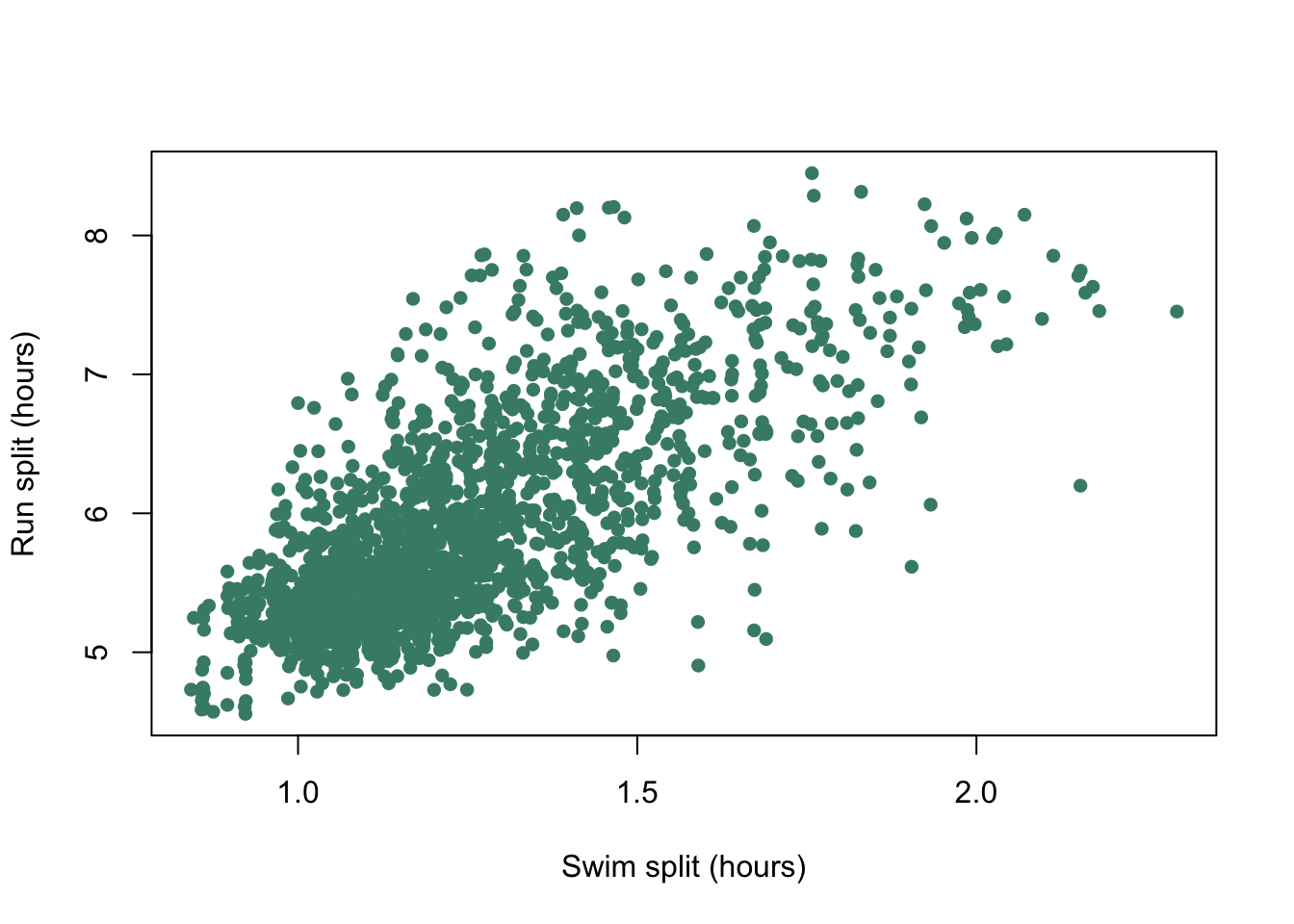
Figure 9.13: Run split plotted against bike split for each individual competitor at the 2012 Hawaii Ironman Triathlon.
We have lots of data points and they all plot on top of each other making it difficult to work out what the patterns in the data really are. If we add an element of transparency to those points it might make the graph easier to interpret.
To add transparency we need to find out the hexadecimal values for the colours we’d like to use, which we can find using a function called col2rgb(), which gives the RGB values for a named colour. We have to tell R that we want the values given as hexadecimal rather than base 10, which we do with the as.hexmode() function.
as.hexmode(col2rgb("aquamarine4"))
      [,1]
red   "45"
green "8b"
blue  "74"
Our hexadecimal value for aquamarine4 is “#458b74.” To make this transparent we add an extra two digits to the right hand side of this number, which determine how see-through it will be. Low values mean that most of what is drawn below will show through, so if we gave this “alpha channel” number as 32 then 32/255 or 12.5% of the top value will be seen. Alternatively, if we gave it as CC (the alpha channel is also specified in hexadecimal) then 204/255 or 80% of the colour drawn on the top will be seen. We’ll use 64 which means that roughly 25% of the top colour will be used.
plot(
  IMH$Swim,
  IMH$Bike,
  pch = 16,
  col = "#458b7464",
  xlab = "Swim split (hours)",
  ylab = "Bike split (hours)"
)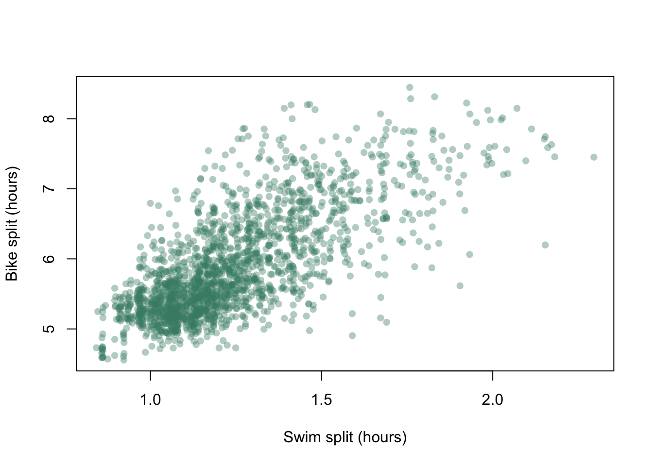
Figure 9.14: Bike split plotted against swim split for each individual competitor at the 2012 Hawaii Ironman Triathlon with transparency added to the data points.
This gives us a very different graph. Rather than the focus being on the overall shape of the point scatter we can now see some structure within, and the dense cluster of points in the lower left corner of the plot is much clearer.
9.9 Histograms and multiple plots in the same window
R doesn’t only draw scatterplots, of course. When you have continuous data of any sort then you might well want to draw a frequency histogram which will show the shape of the dataset. The R function which draws histograms is hist() and if you’re just doing some exploratory analysis this is a super-speedy way of having a look at the shape of your data.
Here are two examples:
par(mfrow = c(1,2))

hist(WB$CO2,
     xlab = expression(paste("CO"[2], " production per capita (tonnes)")),
     main = "")

hist(WB$Population_growth,
     xlab = "Population growth (%)",
     main = "")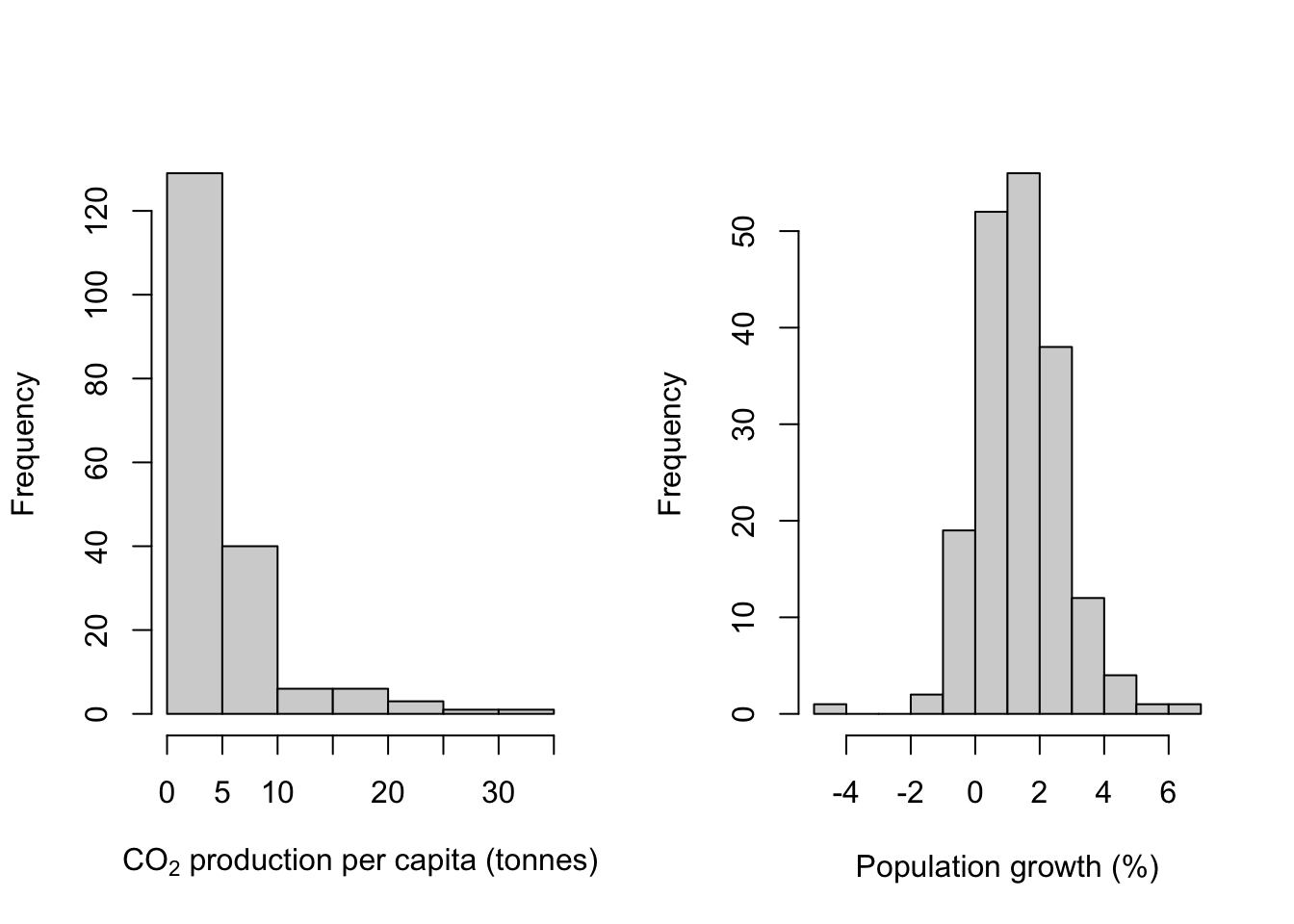
par(mfrow = c(1,1))I’ve introduced a couple of new things here in addition to the hist() function calls. Firstly there is the use of par(mfrow = c(1,2)) as the first line of code. This allows us to draw more than one plot: the actual number is determined by the numbers that the paramter os set to. The first value (1 in this case) is the number of rows and the second is the number of columns: so here I’m telling R to give me a graphics device into which I can draw two plots side-by-side. par(mfrow = c(2,1)) would give one above the other and par(mfrow = c(2,2)) would give four plots arranged in a square. R will fill the graphics device in as new plot() or similar instructions arrive, so in this ase the first histogram goes on the left side and the second on the right. If we were to use a third hist() function R would clear the graphics device and draw the new one on the left, leaving the right hand slot blank.
Two important things must you know about setting the mfrow parameter to anything other than c(1,1). Firstly, once you have plotted a second (or third…) plot you cannot add anything more to the first (or second…). So if you are planning to add a line or some text, or a legend (see the next chapter for details of how to do this), you have to do it before the next plot is drawn. Secondly, it’s really good practice always to reset the parameter to c(1,1) whenever you’ve finished, otherwise you can just get in a mess.
ONe other thing that’s new is the somewhat complex code the the x-axis label of the first histogram which is there to get the subscript in CO2 this is a bit of a complex sunject and for the moment let’s just say that without something like this it’s difficult to get things like subscripts and mathematical symbols in axis labels. More in the next chapter.
Now that we’ve covered that, let’s look at those histograms. We’ve fed R some continuous data, R has divided our data into a series of intervals (e.g. intervals defined by 0,5,10,15,20 etc. for CO2 production) and then counted the number of data points which fall into each interval. The number of intervals (or “bins” as they are usually called) is determined by an internal algorithm which is meant to find a good number to show the shape of the data, but you will often want to have more or fewer than the default option: as an example, in this case the algorithm has decided to have 12 bins for the population growth data but only 7 for the CO2 production data despite the sample sizes being the same. If we wanted to have the same number of bins for both histograms we could use the breaks = argument to force hist() into drawing what we want. Here we’re going to use the seq() function to generate 13 equally spaced values with the lowest being 0 and the highest 35. This will give us a histogram with 12 equally sized bins for CO2 production.
We’re also going to make the histograms look a little better by colouring the bars usng the col = parameter.
par(mfrow = c(1,2))

hist(WB$CO2,
     breaks = seq(from = 0, to = 35, length = 13),
     col = "aquamarine4",
     xlab = expression(paste("CO"[2], " production per capita (tonnes)")),
     main = "")

hist(WB$Population_growth,
     col = "aquamarine4",
     xlab = "Population growth (%)",
     main = "")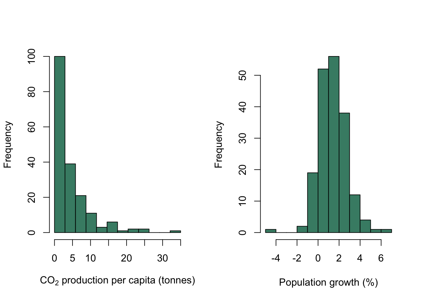
par(mfrow = c(1,1))The default option fot hist() is to draw a histogram showing the numbers in each bin. If you want what many people would regard as a true frequency histogram then rather than the numbers for each bin you wuld want to plot the histogram with the frequencies nornalised to 1, so that the values for all bins summed together add up to 1. This can be done by setting the freq = argument to FALSE.
You can also draw histograms with bins of different widths if you want: let’s say that you wanted to put all the countries with CO2 production below 5 tonnes per year into a single bin, and then have the rest binned in intervals of 1 tonne each. Here’s that histogram drawn with freq = FALSE so the area of all the bars adds up to 1.
break1 <- c(0, seq(from = 5, to = 35, by = 1))

hist(WB$CO2,
     breaks = break1,
     freq = FALSE,
     col = "steelblue",
     xlab = expression(paste("CO"[2], " production per capita (tonnes)")),
     main = "")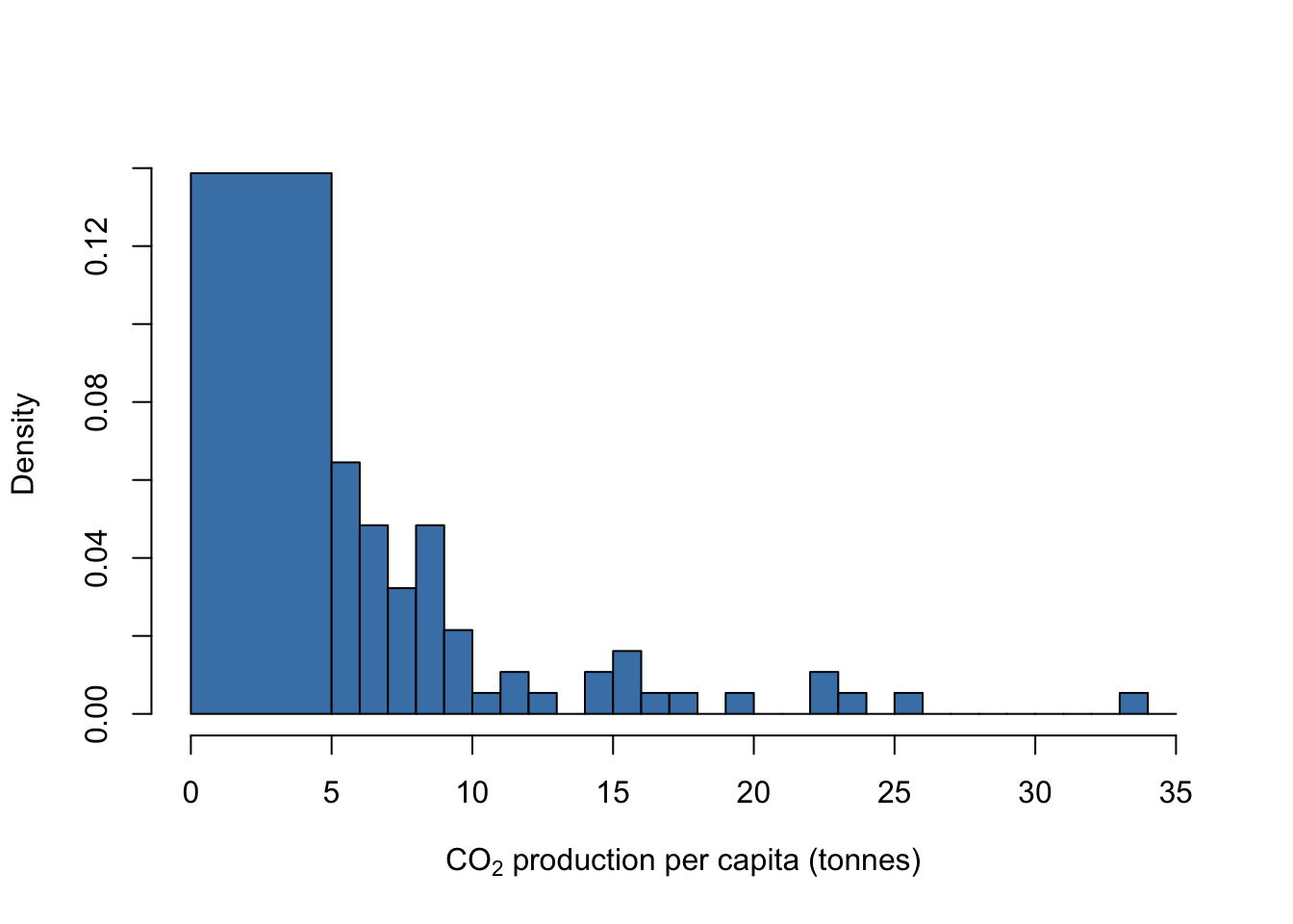
9.10 Boxplots
One of the most useful and common types of graph is the boxplot - a method of plotting data which shows not only the central tendency but also the amount of dispersion in your data. R can do this in one of two ways. Firstly, you can use the boxplot() function, which will draw either a boxplot of a single continuous variable or a continuous variable against the levels of a factor or even more than one factor.
Here are the boxplots corresponding to the CO2 and population growth data which we drew some histograms of in the previous section.
par(mfrow = c(1,2))

boxplot(WB$CO2,
        ylab = expression(paste("CO"[2], " production per capita (tonnes)")))

boxplot(WB$Population_growth,
        ylab = "Population growth (%)")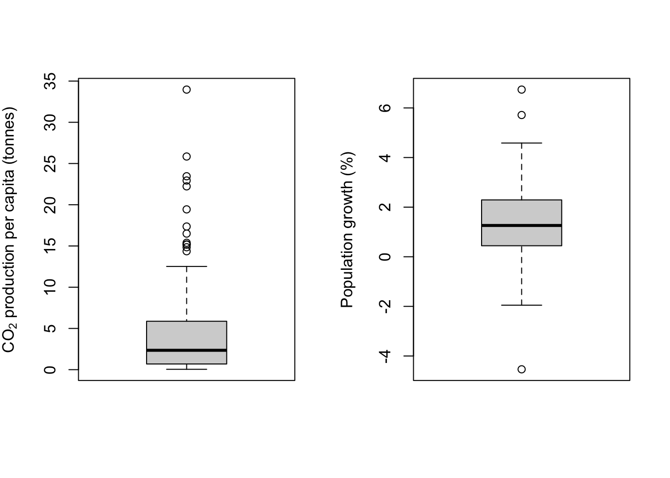
par(mfrow = c(1,1))One thing to note is that whereas hist() festoons its outputs with axis labels and titles to the point where you usually have to go out of your way to get rid of them, boxplot() has no truck with such tomfoolery and will only add these fripperies if you ask it to do so. Welcome to R.
If you’ve not seen a boxplot before they can be a little hard to understand, but they are a really good way to visualise the distribution of data in a particular variable. The heavy line is the median, so it’s telling you where the middle value is. The box shows the interquartile range —– the lower boundary is the 1st quartile, below which are the 25% lowest data values, and the upper boundary is the 3rd quartile, above which are the 25% highest values. Between these boundaries you will find 50% of all the values in your dataset.
Next, the lines extending from the box. These are often called the “whiskers,” and indeed you’ll sometimes hear these plots referred to as “box-and-whisker plots.” This is where it gets a bit harder. For the upper whisker, a line is drawn from the 3rd quartile to the last point which is less than 1.5 times the interquartile range from the 3rd quartile. The same is done with the lower whisker, with the line extending to the last data point which is less than 1.5 times the interquartile range from the 1st quartile. This might sound a bit mad but these values do have some meaning. If the data beng described are from a normal distribution, then roughly speaking 24.5% (actually 24.65%) of the data should be within the regions delimited by the whiskers, and roughly 1% of the data (actually 0.7%) should fall outside the whiskers.
Datapoints which fall outside the whiskers are plotted individually and are often referred to as “outliers.” Be very careful when using this word: in my opinion it’s not really appropriate to call data points that are simply rare but expected members of the expected distribution of data “outliers” since they have a perfectly good right to be there.
In the example above you can see that the boxplots show us the shape of the distribution very clearly. The CO2 data are strongly positively skewed and you can see that the boxplot is strongly asymmetrical, with the lower whisker, 1st quartile and median all squished together at the bottom of the plot and the part of the plot above that being stretched upwards. There are also a whole lot of data points which fall outside the upper whisker, which is exactly what we’d expect from a skewed distribution. None of these “outlier” data points are unexpected given the shape of the frequency distribution and there’s no reason to think that any of them are in any way anomalous. The population growth data is approximately normal and you can see the symmetrical boxplot with only three datapoints outside the whiskers, which is entirely reasonable for >100 data points coming from something close to a normal distribution.
To draw a boxplot with a continuous variable divided by the levels of a factor, then input a formula into boxplot():
boxplot(WB$CO2 ~ WB$Income_group)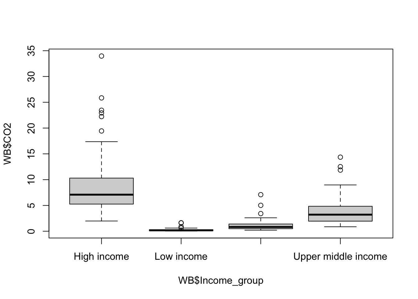
Figure 9.15: CO2 production per capita by income group
This gives us a boxplot showing the CO2 production per capita of each country in our dataset by income group. The overall pattern is hardly a surprise… nonetheless we could make the graph a bit clearer. It need some axis labels, and it would be nice to have our factor levels in a more sensible order. Maybe we might want to shade the boxes as well.
WB$Income_group <- factor(
  WB$Income_group,
  levels = c(
    "Low income",
    "Lower middle income",
    "Upper middle income",
    "High income"
  )
)

boxplot(
  WB$CO2 ~ WB$Income_group,
  xlab = "Income group",
  ylab = expression(paste(CO[2], " production per capita (tonnes)")),
  col = "grey70",
  cex.axis = 0.8
)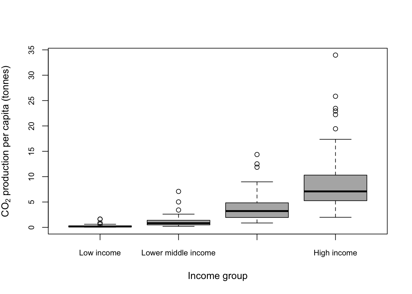
Figure 9.16: Boxplot showing CO2 production per capita by income group with income group ordered from low to high
boxplot() will also plot graphs with more complex combinations of factors. Let’s say that we want to look at the way that income relates to CO2 production, but we’d like to divide our data up by region to see if the effect of income varies goegraphically. A plot with four income levels for each of the seven regions would be prohibitively complex, but we could divide income simply into “high” and “low.”
Income <- as.factor(ifelse(WB$Income_group == "High income" | WB$Income_group == "Upper middle income", "High income", "Low income"))We’ve already set our Income_group factor so that the levels are ordered from low to high, so if we convert the factor to a numeric variable then our two lower income groups will have the values 1 and 2 and our higher income groups will have the values 3 and 4. We can then use the ifelse() function to generate a new vector with “Low income” if Income_group gives us a number 1 or 2 and “High income” if it is three or four. Finally we’re using the factor() function to convert this to a factor. Now we can use this in a boxplot() function call to draw a plot of CO2 output conditioned on region and on income.
boxplot(WB$CO2 ~ Income * WB$Region, col = "grey70")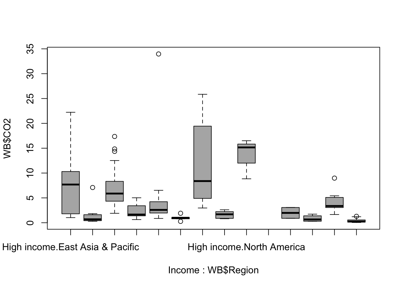
Figure 9.17: Boxplot of national carbon dioxide production per capita by region and income group
Hmmm. It’s worked but it’s not a useable plot at the moment. The x-axis labels are a mess and it’s impossible to work out which regions and incomes are represented by what. The plot is also a bit hard to read because the skewed nature of the data means that a lot of our boxes and whiskers are squished down along the x-axis.
Let’s remedy the easier things by log10 transforming the data and by colour coding our boxes depending on income. We can also switch the axis labelling to vertical by setting the parameter las = 2 which might make things a little easier.
palette1 <- c("cadetblue4", "orange")

boxplot(log10(WB$CO2) ~ Income * WB$Region,
        col = palette1,
        las = 2)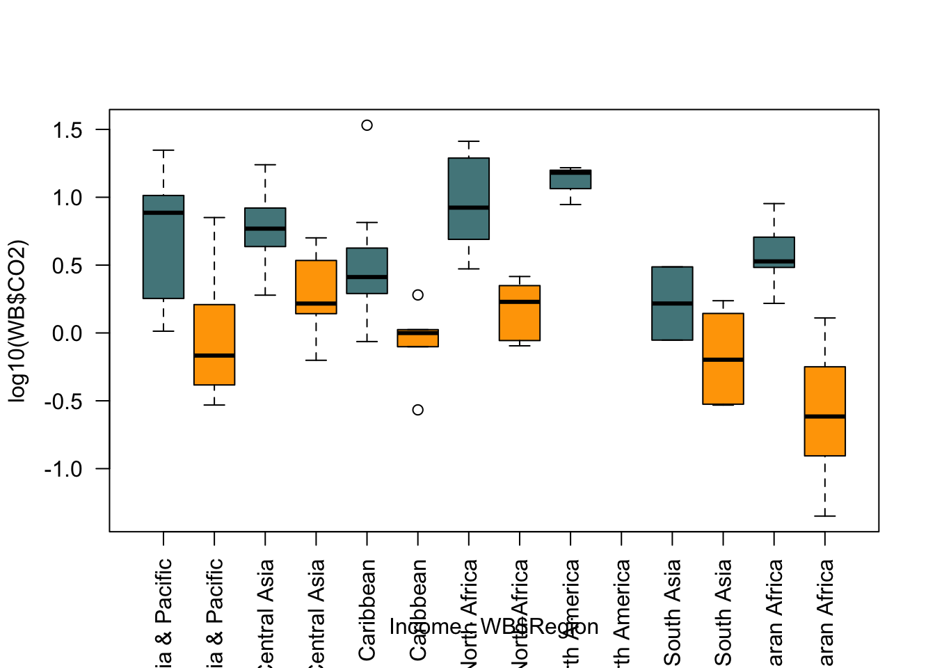
Well, some of that worked and some didn’t. We’ve got our log transformation and our colour coding, but the axis is still a disaster and we also need a legend to tell the reader what the colours mean.
par(mar = c(9.5,5,2,6))

boxplot(log10(WB$CO2) ~ Income * WB$Region,
        col = palette1,
        xaxt = "n",
        xlab = "",
        ylab = expression(paste(Log[10] , CO[2], " Production (tonnes)", sep = " ")))

axis(side = 1,
     at = seq(1.5, 13.5, by = 2),
     labels = levels(WB$Region),
     las = 2,
     cex.axis = 0.8)

par(xpd = TRUE)

legend(x = 15, y = 1.5,
       legend = c("High", "Low"),
       fill = palette1,
       bty = "n",
       title = "Income")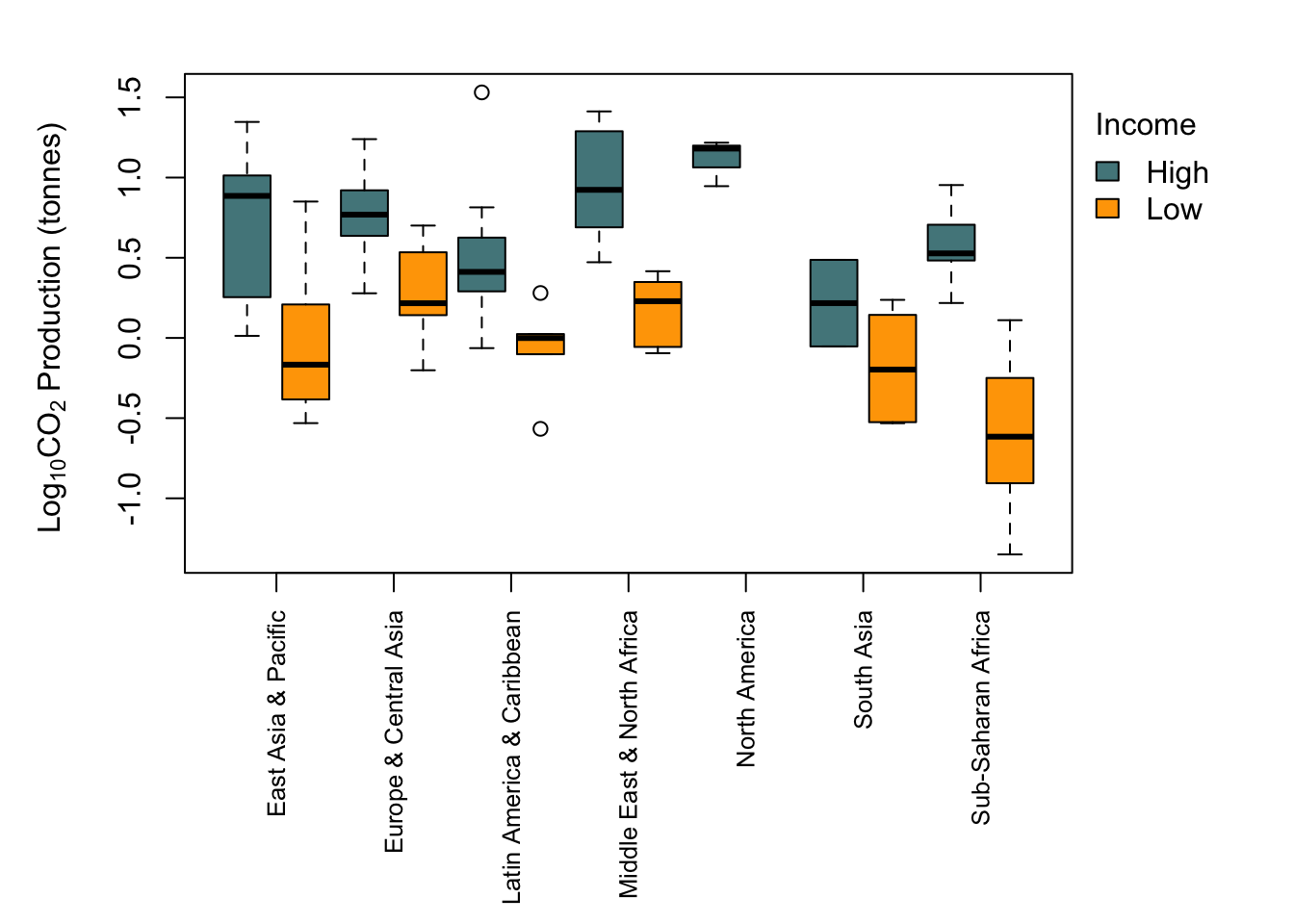
9.11 Bar charts
The bar chart is one of the most common types of graphic that you’ll see used to show patterns in data. As with boxplots, R has a specific function for drawing these: barplot(). The output is perhaps a little eccentric but it can easily be made more conventional. Here’s an example using the data on CO2 production by income group that we saw when we were looking at boxplots. We want to plot the mean CO2 production per capita for each group so we need to calculate this before we do anything else. We’ll use the tapply() function to do this.
CO2_means <- tapply(WB$CO2, WB$Income_group, mean)

CO2_means
         Low income Lower middle income Upper middle income         High income
            0.31712             1.21814             4.05665             9.46772
Let’s see what we get if we just feed this to barplot().
barplot(CO2_means)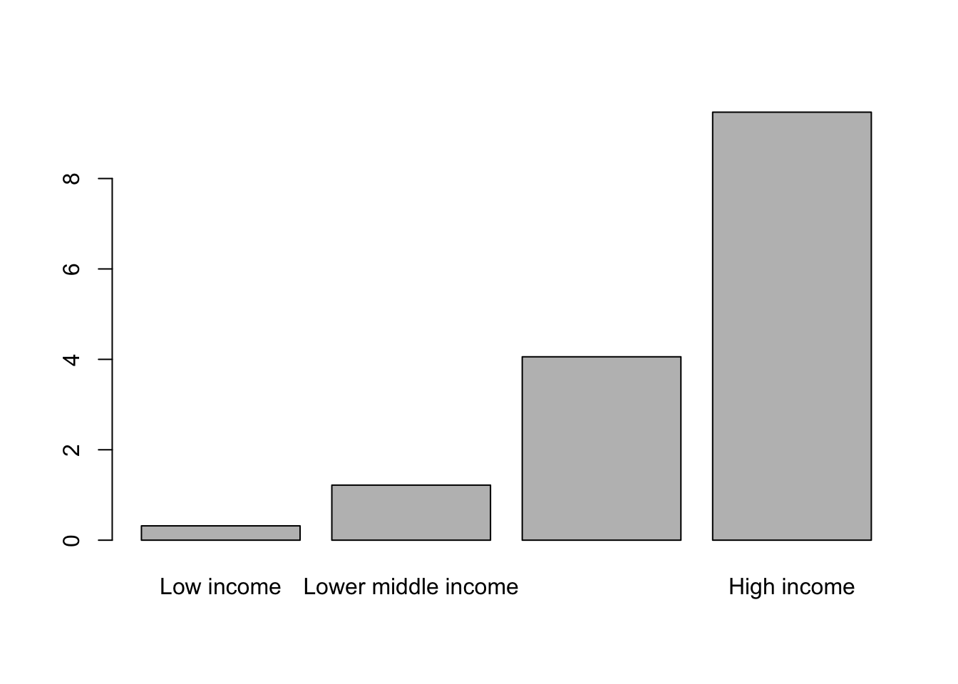
Figure 9.18: Barplot of mean carbon dioxide production per capita by income group
Overall it’s not bad but could obviously be better, especially with regards to the x-axis labels. We can fix the x-axis labels by making them smaller and losing the word “income” from each to make them more concise.
names(CO2_means) <- c("Low", "Lower middle", "Upper middle", "High")

barplot(CO2_means,
        cex.axis = 0.7,
        cex.lab = 0.9,
        cex.names = 0.7,
        xlab = "Income group",
        ylab = expression(paste(Log[10] , CO[2], " Production (tonnes)", sep = " ")))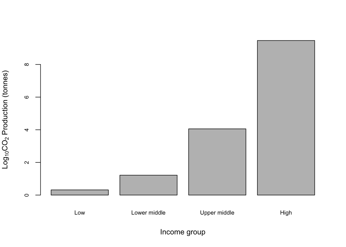
Not bad. Let’s run through that code and see what it all does.
names(CO2_means) <- c("Low", "Lower middle", "Upper middle", "High")
Changes then names for each entry in the CO2_means object. barplot() uses these names for the x-axis names so this changes them in the plot as well.
barplot(CO2_means,
Tells barplot() where to find the data.
   `cex.axis = 0.7,
    cex.lab = 0.9,
    cex.names = 0.7,`
Adjusts the sizes of the numbers on the y-axis (cex.axis), the axis labels (cex.lab) and the names on the x-axis (cex.names). Recall that cex is short for Character EXpansion so a value of 1 is keep the default size, 0.5 is plot at half the default size and 2 is twice the default size.
   `xlab = "Income group",
    ylab = expression(paste(Log[10] , CO[2], " Production (tonnes)", sep = " ")))`
These two arguments specifiy the text for the axis labels and as before we’re using a somewhat complex expression() function call to give us a proper subscript in CO2.
One thing that might be causing concern here is the lack of a “proper” x-axis with a line and tickmarks. If you need one you can add one using axis().
barplot(CO2_means,
        cex.axis = 0.7,
        cex.lab = 0.9,
        cex.names = 0.7,
        xlab = "Income group",
        ylab = expression(paste("Mean ", CO[2], " Production (tonnes)", sep = " ")))

ticks <- barplot(CO2_means, plot = FALSE)

axis(side = 1, at = ticks, labels = FALSE)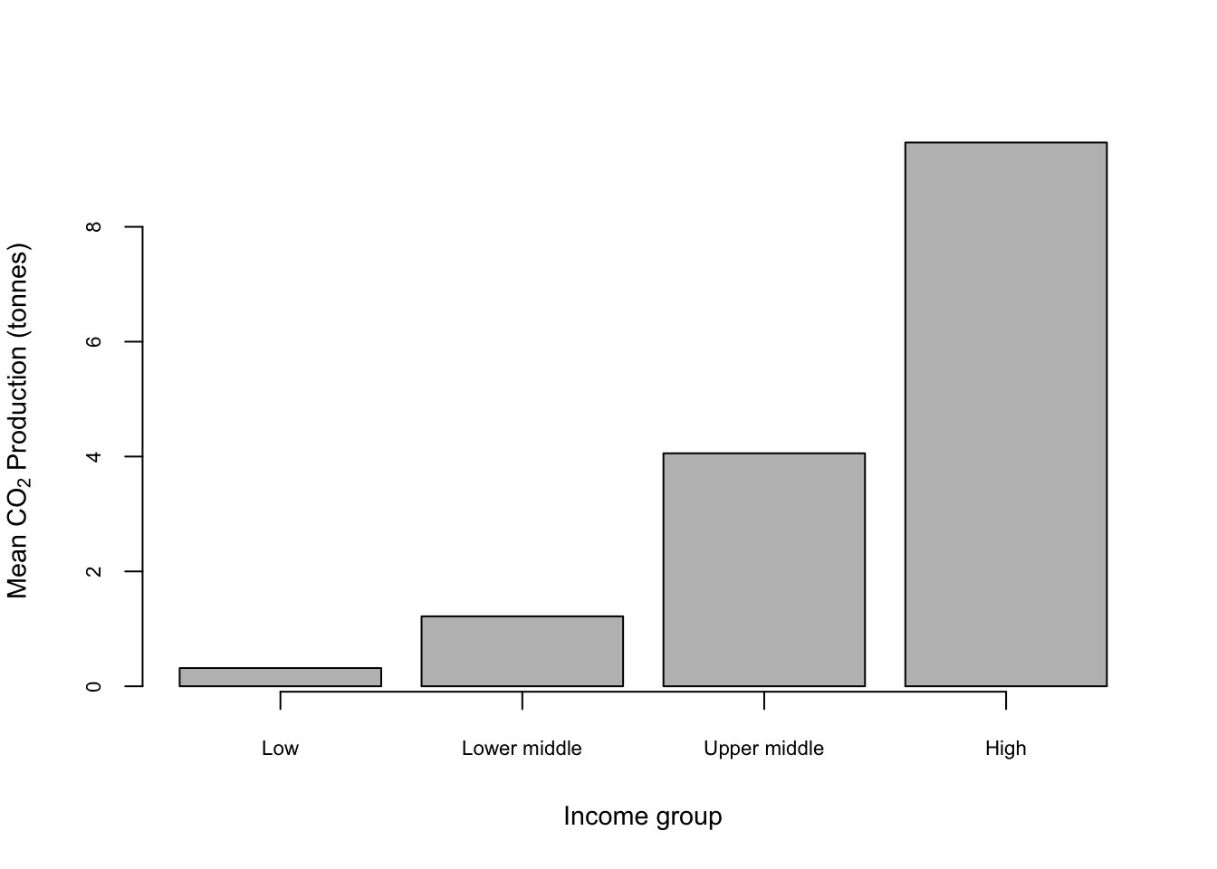
Here axis(side = 1, at = ticks, labels = FALSE) draws in an axis on the x-axis only (side = 1) with no labels etc. The trick with drawing an axis for a bar plot is that the location of the centres of the bars is not obvious: it’s not 1,2,3 & 4 as you might expect. To extract the locations we’ve used
ticks <- barplot(CO2_means, plot = FALSE)
which takes advantage of the fact that if you save the output of a barplot() call to an object what it saves is in fact the locations of the bar centres and nothing else (of course). The plot = FALSE argument stops it drawing the barplot in your graphics window unnecessarily.
9.11.1 More complex barplots
Lots of people like making complicated bar charts with groups of different means displayed together. If you’re one of these people (I am not) you will want to know how to do this in R. Let’s generate a more complicated set of means using the “income” factor which we used when making boxplots, so we’ll have a mean CO2 production figure for high and low income countries in each of our regions.
income <- factor(ifelse(as.numeric(WB$Income_group) <3, "Low income", "High income"))

CO2_means2 <- tapply(WB$CO2, INDEX = list(income, WB$Region), mean)

CO2_means2
            East Asia & Pacific Europe & Central Asia Latin America & Caribbean
High income              7.8760                6.6059                    4.1153
Low income               1.3309                2.4207                    1.0050
            Middle East & North Africa North America South Asia
High income                    11.7631          13.5    1.97681
Low income                      1.6521            NA    0.83957
            Sub-Saharan Africa
High income            4.32719
Low income             0.37091
There is one missing value, this is because there are no “Low income” nations in the North America region. What we want is a bar chart with two bars side by side for each region. Let’s see what barplot() makes of our matrix.
barplot(CO2_means2,
        beside = TRUE,
        legend = TRUE)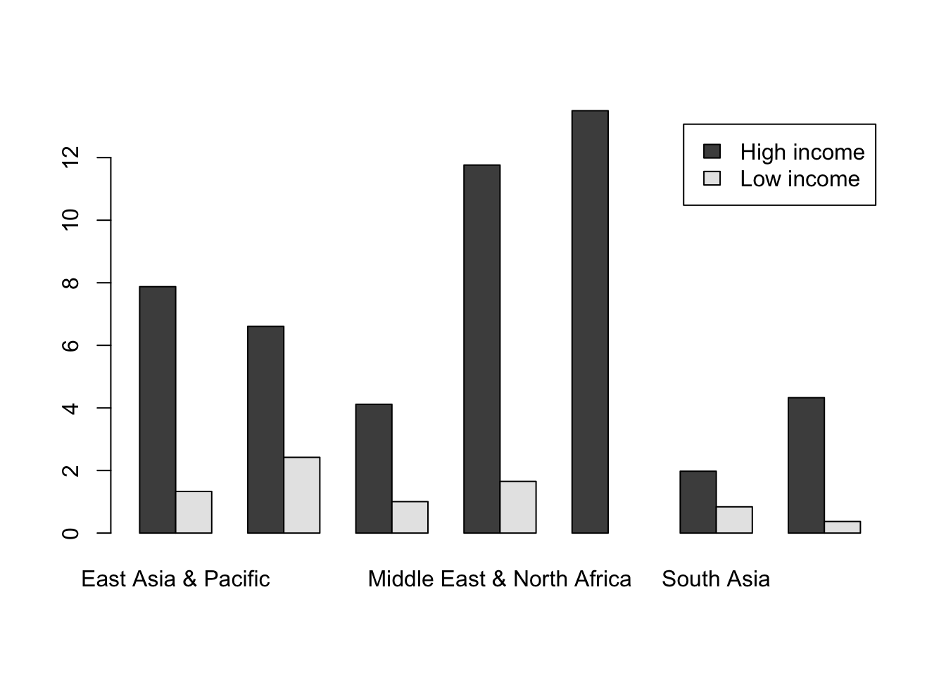
Two things to look at in the code are the extra arguments I’ve added to the barplot() function call. beside = TRUE means that the bars are plotted next to each other: the alternative with beside = FALSE is a stacked bar chart, which (in my opinion at least) is rarely useful. Secondly we have legend = TRUE. barplot() is one of the few (maybe the only?) plotting functions in Base R which will automatically generate a legend for you. YOu can see this in the top right of our figure.
Note that if the grouping is not what you want (in this case if the bars were grouped by income not region) you can switch them by using the t() function which will transpose our matrix, or in other words flip it on its side. This is because barplot() uses the columns in a matrix of data for grouping, so barplot(t(CO2_means2), ... would give the other grouping.
OK, let’s finish up by making this a publication-quality chart. We need to deal with the labels for the x-axis as we did when we plotted a similar chart using boxplot(), by rotating the x-axis labels and enlarging the lower margin. We’re going to shrink the text size and add an axis, and we’re going use the same colour scheme that we used for our boxplot.
#Set up colour palette
palette1 <- c("cadetblue4", "orange")

#Alter the margins
par(mar = c(9.5,5,2,6))

#Find where the ticks should be for the x-axis
ticks <- barplot(CO2_means2, beside = TRUE, plot = FALSE)
ticks <- colMeans(ticks)

#Draw the graph
barplot(CO2_means2,
        beside = TRUE,
        legend = TRUE,
        col = palette1,
        las = 2,
        cex.axis = 0.8,
        cex.names = 0.8,
        cex.lab = 0.9,
        ylab = expression(paste("Mean ", CO[2], " Production (tonnes)", sep = " ")))

#Add the axis
axis(side = 1, at = ticks, labels = FALSE)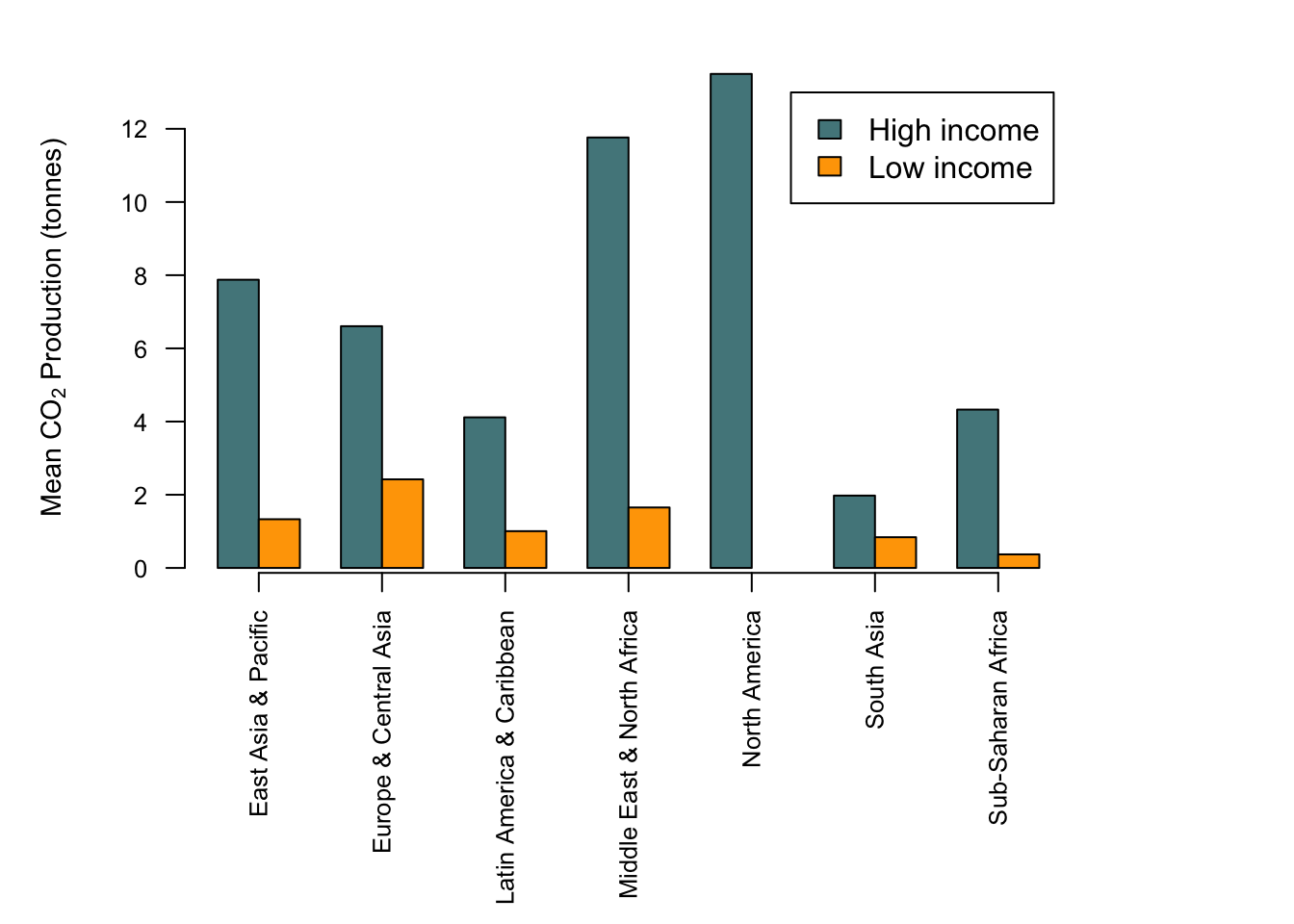
All should be relatively clear, but you might be wondering about this:
#Find where the ticks should be for the x-axis
ticks <- barplot(CO2_means2, beside = TRUE, plot = FALSE)
ticks <- colMeans(ticks)
Why use colMeans() here? The answer is that the first line ticks <- barplot(CO2_means2, beside = TRUE, plot = FALSE) will return a matrix with the location of each bar. We want the middle of each group of bars, and since each group is a coloumn we can just take the mean value of each column to get that middle point. This point will come up again when we add some error bars to this graph in the next chapter.
9.12 Other types of plot
In addition to plot(), there are lots of other functions for drawing graphs, and you can produce just about any sort of plot you can imagine using R. We’ve already seen barplot() in action, here are some further examples.
9.12.1 Histogram with overlaid probability density estimate
We’ve already seen that is an argument for the hist() function called “freq” which is normally set to NULL, but if set to FALSE will draw a frequency histogram with the y axis scaled not to count but to the relative frequency density, such that the total area under the graph=1. A probability density estimate can then be obtained using density(), which computes a kernel density estimate for the variable in question. Here is a frequency histogram for the data on forest cover from our World Bank dataset with a density estimate overlaid.
hist(WB$Forest_area,
     breaks=15,
     col="Cadetblue4",
     ylab="Relative frequency",
     xlab = "Forest area (percentage of total)",
     freq=F)

lines(density(WB$Forest_area, na.rm = TRUE))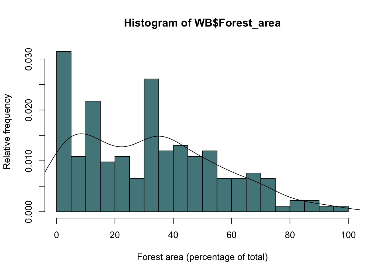
Figure 9.19: Frequency histogram of forest cover by country with probability density estimate drawn as a line.
We can increase or decrease the amount of smoothing in the density estimate by using the “adjust” argument.
hist(WB$Forest_area,
     breaks=15,
     col="Cadetblue4",
     ylab="Relative frequency",
     xlab = "Forest area (percentage of total)",
     freq=F)

#Less smoothing
lines(density(WB$Forest_area, na.rm = TRUE, adjust = 0.5),
      lty = 2,
      lwd = 2)

#More smoothing
lines(density(WB$Forest_area, na.rm = TRUE, adjust = 0.2),
      lty = 3,
      lwd = 2)
Figure 9.20: As the previous figure but with two probability density estimates showing different amounts of smoothing
Here I’ve plotted two kernel density estimates. The first one has the amount of smoothing reduced from the default by half (adjust=0.5), giving a line that closely follows the distribution of the data, and the second has the amount of smoothing set to twice the default (adjust=2), giving a much smoother line. Two further points to note are firstly that I set the type of line using the lty= parameter and increased the line width using lwd = 2, and secondly the location of the various arguments. Because the adjust= argument is used in the density() function it’s kept within the brackets associated with the function, whereas the lty= and lwd= arguments go with the lines() function so it’s inside the outer set of brackets. Easy to get confused if you don’t think about which arguments are associated with which functions.
9.12.2 Pie graph
Before you draw a pie graph, please read the help file for the pie() function, in particular the part beginning “Pie charts are a very bad way of displaying information….” If you still want to draw a pie graph, please go directly to your nearest decent library and read the whole of Edward Tufte’s brilliant and beautiful book, The Visual Display of Quantitative Information (published by Graphics Press USA, 2nd edition 2001, ISBN 978-0961392147). That should teach you the error of your ways. If, however, you still want to draw a pie graph for some reason (perhaps you’re a journalist or a politician and want to disguise the patterns in some data) the you can use the pie() function. Here’s an example with made up data:
chart.numbers<-c(15,108,220,22,170)
names(chart.numbers)<-c("Bar", "2D Pie", "3D Pie", "Scatter", "Doughnut")
chart.numbers2<-c(119,12,280,5)
names(chart.numbers2)<-c("Bar", "2D Pie", "Scatter", "Doughnut")
par(mfrow=c(1,2))
pie(chart.numbers)
text(0,1, "Frequencies of graphs in marketing material", cex=0.6, font=2)
pie(chart.numbers2)
text(0,1, "Frequencies of graphs in research papers", cex=0.6, font=2)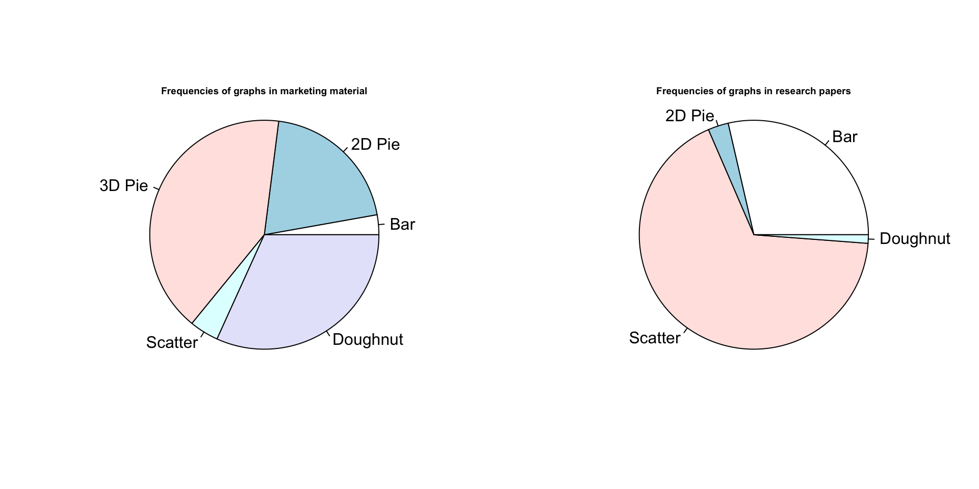
Figure 9.21: Pie graphs. Nothing more to say.
There you are. The default colours are a bit meh but I can’t be bothered to fix them.
9.12.3 3D scatterplot
More data visualisations that are filed in the “best avoided” drawer. In general it’s best to try to avoid presenting your data in “3D” graphs if at all possible because there are inevitable distortions that appear when you try to show a 3D cloud of points or surface in 2D, and the patterns in the data can appear very different depending on the angle of view. Nonetheless, there are times when it’s hard to find an alternative, and if you can’t avoid it there are a number of functions in R to draw 3D graphs. Here we’ll use the scatterplot3d() function from the scatterplot3d package. Some other useful 3D plotting functions are in the lattice package, including cloud() which also plots 3D scatterplots and wireframe() which draws a surface.
Some simulated data:
X variable is random and uniformly distributed between 0 and 12
x1<-runif(25, min=0, max=12) y variable is random and normally distributed with a mean of 15 and a standard deviation of 3
y1<-rnorm(25, mean=15, sd=3) Some randomly distributed error for our z variable
err1<-rnorm(25,0,2) Calculate the z variable
z1<-0.8*x1+1.5*y1+err1 Plot the graph. Setting type to “h” gives us drop lines from each data point.
scatterplot3d(x1, y1, z1, type="h", pch=16) 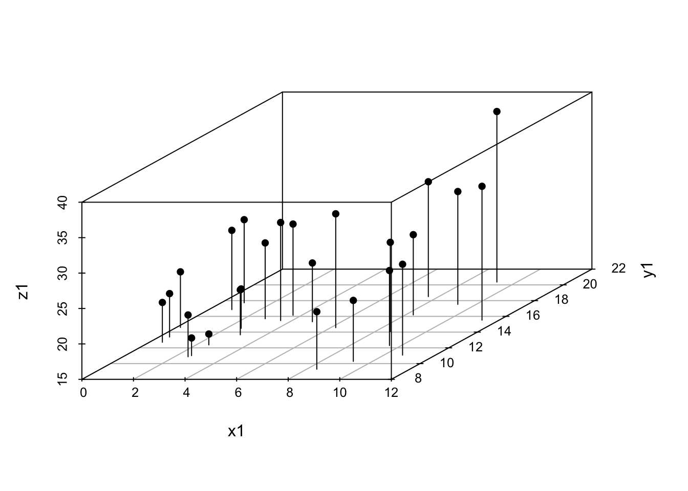
Figure 9.22: 3D scatterplot example
9.12.4 Contour plot
The earwig Forficula auricularia is known to occur in two male morphs, a “brachylabic” morph with small forceps and a “macrolabic” morph with large forceps which is thought to pursue a more aggressive strategy for competing with rival males and acquiring mates (see Tomkins and Brown 2004, Nature 431 1099-1103 for more details). The graph below is a scatterplot of forceps length (on the y-axis) against pronotum width (a measure of overall body size) on the x-axis for an earwig population on Brownsman Island in the Farne Islands archipelago, the data being kindly supplied to me by Joe Tomkins. We can see some form of structure in this scatterplot, but it might help our visualisation of what’s going on if we drew a contour plot showing where the densest groups of points are.
plot(earwig$fcp~earwig$pron,
     xlab = "Pronotum width (mm)",
     ylab = "Forceps length (mm)")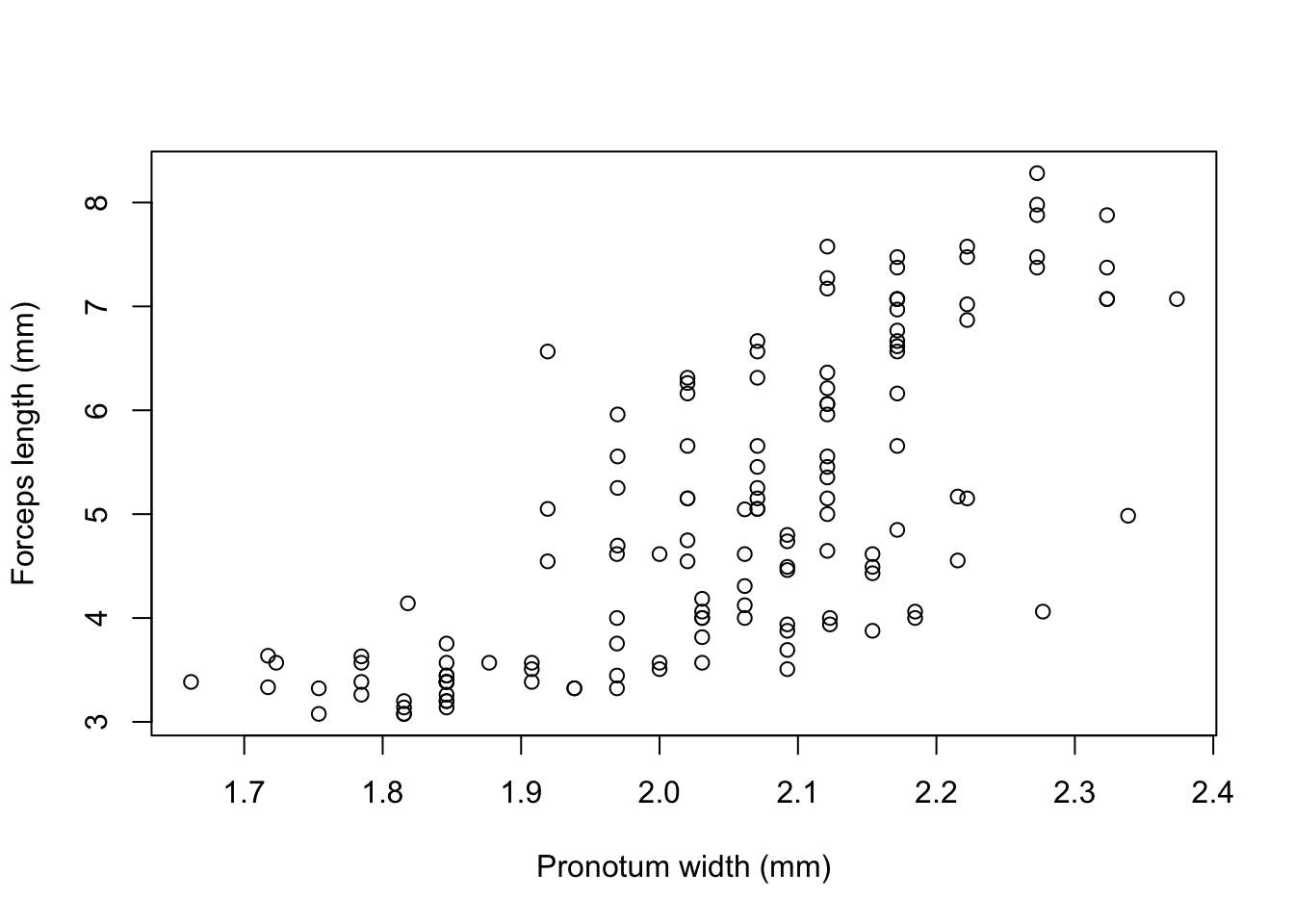
Figure 9.23: Scatterplot of forceps length versus pronotum width for the earwig Forficula airicularia
To estimate the density of this 2D dataset we can use the kde2d() function from the MASS package, which fits a 2D kernel density estimator to the data.
library(MASS)
earwig.density<-kde2d(earwig$pron, earwig$fcp, n=200)
Having calculated the density estimator we can then draw a contour plot using the contour() function.
contour(earwig.density, xlab="Pronotum width (mm)", ylab="Forceps length (mm)")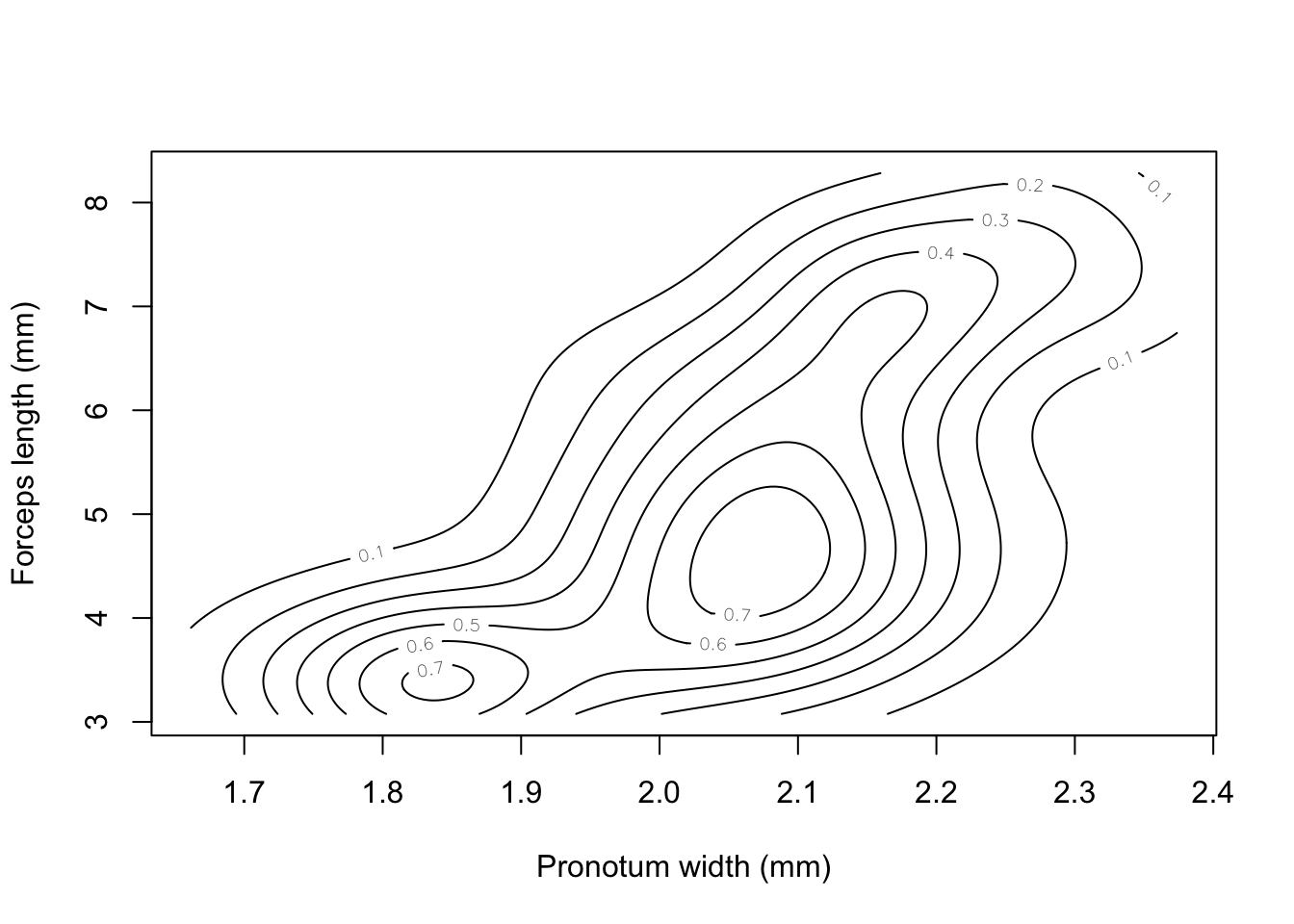
Figure 9.24: Contour plot of earwig forceps length versus pronotum width
We can overlay the data points onto the plot using points() —– more on this in the next chapter.
points(earwig$pron, earwig$fcp, pch=16, cex=0.6)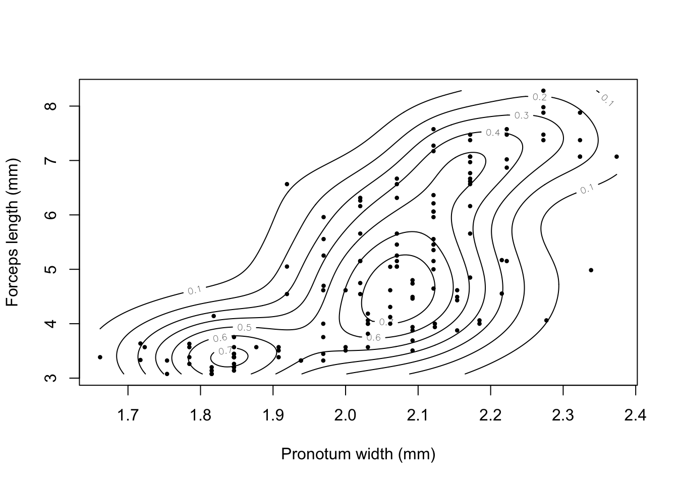
Figure 9.25: Contour plot of earwig forceps length versus pronotum width with individual data points added.
I’m not sure if this graph really helps us understand the allometry of forceps length in male earwigs on Brownsman Island, but at least it looks nice.
9.13 Adding elements to an existing graph
All the examples we’ve looked at in detail so far use arguments within the plot() function call to change the appearance of our graph, but we’ve also seen an example of using the legend() function to add something extra to an existing graph. R has quite a few functions which, like legend() can draw new elements onto existing graphs. These include:
| Function | Purpose |
|---|---|
points() |
Draws points onto a plot |
lines() |
Draws lines |
abline() |
Draws a line specified by intercept and slope |
polygon() |
Draws a shape |
arrows() |
Draws arrows on a plot |
text() |
Adds text |
mtext() |
Adds text in the plot margins |
legend() |
Adds a legend |
axis() |
Adds an axis |
title() |
Adds a title or subtitle |
These functions will all add elements to the plot which is currently displayed in the graphics window, so you have to be a little careful about where you put the code. The best option is to use a script and have these functions directly after the plot() function call. Let’s look at some examples.
9.13.1 Simple regression lines
Let’s go back to our data on pinnipeds. If we plot the log of male brain size against the log of male mass then we see a positive relationship (big animals have bigger brains) that could be described reasonably well by a straight line:
pinniped <- read.csv("Data/Pinniped_brains.csv",
                     stringsAsFactors = FALSE)

plot(log(pinniped$Male_brain) ~ log(pinniped$Male_mass),
     xlab = "Log male mass (Kg)",
     ylab = "Log male brain mass (g)")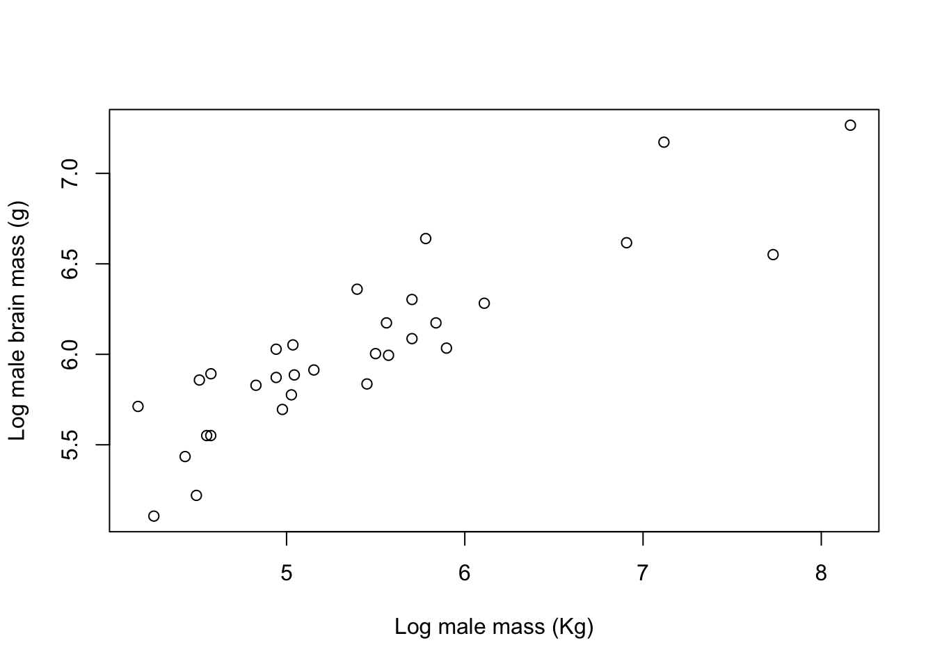
Figure 9.26: Log of brain size plotted against the log of body mass for male pinnipeds from 33 species
We can generate the slope and intercept of a fitted linear regression line using the lm() function. If you don’t know what this is don’t worry, the analysis is explained in chapter XX: for the moment all you need to know is that it’s a way of generating a best-fit line.
lm(log(pinniped$Male_brain) ~ log(pinniped$Male_mass))

Call:
lm(formula = log(pinniped$Male_brain) ~ log(pinniped$Male_mass))

Coefficients:
            (Intercept)  log(pinniped$Male_mass)
                  3.672                    0.435
So our intercept is 3.672 and our slope is 0.435. If we want to add this line to our plot we can use the abline() function which takes an intercept (“a”) and a slope (“b”) and draws a line:
plot(log(pinniped$Male_brain) ~ log(pinniped$Male_mass),
     xlab = "Log male mass (Kg)",
     ylab = "Log male brain mass (g)")

abline(a = 3.672, b = 0.435,
       lwd = 2,
       col = "darkblue")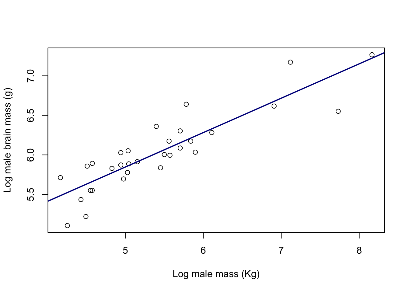
Figure 9.27: Log of brain size plotted against the log of body mass for male pinnipeds from 33 species. Line is a fitted linear regression.
Looking at that abline() call in a bit more detail you can see firstly that I’ve specified the slope and intercept with the a = and b = arguments. I’ve then asked for the line width to be twice the default width (lwd = 2) and finally I’ve used the col = "darkblue" argument to set the colour of the line.
abline() will actually take the coefficients directly from lm() if you are fitting a simple linear regression, either if you save the output from lm() and then give that to abline() as an argument or if you just put the whole lm() call within the abline() function call. So either of the following would have produced an identical line to the one we generated above:
# Save linear regression output as object "X1"
X1 <- lm(log(pinniped$Male_brain) ~ log(pinniped$Male_mass))

# Use object X1 in abline()
abline(X1,
      lwd = 2,
      col = "darkblue")


# Calculate linear regression directly within abline() function call
abline(lm(log(pinniped$Male_brain) ~ log(pinniped$Male_mass)),
      lwd = 2,
      col = "darkblue")
abline() will also add vertical or horizontal lines to a plot: if you use the h = argument then it will draw a horizontal line at the point on the y-axis specified, and v = will draw a vertical line at the point specified on the x axis. You can also use a vector of numbers if you want multiple horizontal or vertical lines.
The lty = parameter specifies the type of line drawn. Here are the various options:
Click here to see the code
par(mar = c(1,4,1,1))
plot(
  1:8,
  1:8,
  type = "n",
  bty = "n",
  xaxt = "n",
  yaxt = "n",
  xlab = "",
  ylab = ""
)
abline(h = 2:7, lty = 6:1)
axis(
  side = 2,
  at = 7:2,
  labels = c("lty = 1", 2, 3, 4, 5, "lty = 6"),
  tick = FALSE,
  lwd = 0,
  las = 1
)
par(mar = c(5,4,4,2) + 0.1)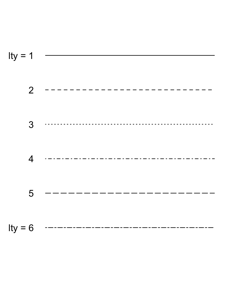
Figure 9.28: The different line types available in base R graphics
9.13.2 Multiple regression lines
You might recall from the last chapter that we divided our pinniped species by mating system into harem breeders, where males defend groups of females in the mating season, and non-harem breeders, where males only associate with a single female. We plotted our data with colours defined by a new factor that we generated called Mating_system and it looked as though the relationship between log brain size and log body mass in males varied somewhat between the two groups. Let’s look at that plot again.
Mating_system <-
  factor(ifelse(pinniped$Harem == 1, "Non harem", "Harem"))

colours <- c("aquamarine4", "chocolate2")

plot(
  log(pinniped$Male_brain) ~ log(pinniped$Male_mass),
  xlab = "Log body mass (Kg)",
  ylab = "Log brain mass (g)",
  pch = 16,
  col = colours[Mating_system]
)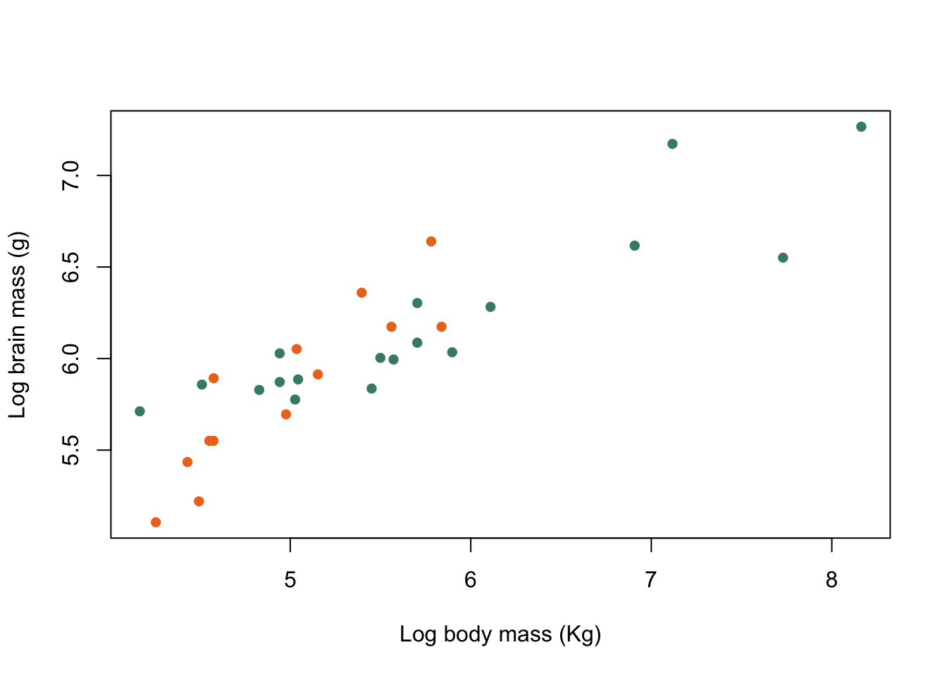
Figure 9.29: Brain mass versus body mass for 33 species of male pinniped plotted on log scaled axes, orange symbols indicate non-harem breeders and green indicate harem breeders
Maybe it would be helpful to draw in separate fitted lines for both mating systems. First we need to calculate the slopes and intercepts of the two fitted lines. If we were doing this as part of a formal analysis we’d do it all in one go with a general linear model with the mating system as a factor in the model, but for the sake of simplicity here we’ll just run two linear regressions and use the subset = argument to specify which mating system we’re using.
#Linear regression for harem breeders
harem_mod <-
  lm(log(Male_brain) ~ log(Male_mass),
     data = pinniped,
     subset = Mating_system == "Harem")

#Linear regression for non harem breeders
non_harem_mod <-
  lm(log(Male_brain) ~ log(Male_mass),
     data = pinniped,
     subset = Mating_system == "Non harem")

#Slope and intercept for harem breeders
coef(harem_mod)
   (Intercept) log(Male_mass)
       4.00515        0.37765

#Slope and intercept for non-harem breeders
coef(non_harem_mod)
   (Intercept) log(Male_mass)
       2.07789        0.75439
Now we can add these fitted lines to our plot. One option, and by far the easiest, is to use abline().
plot(log(pinniped$Male_brain) ~ log(pinniped$Male_mass),
     xlab = "Log body mass (Kg)",
     ylab = "Log brain mass (g)",
     pch = 16,
     col = colours[Mating_system])

abline(harem_mod, col = colours[1], lwd = 2)
abline(non_harem_mod, col = colours[2], lwd = 2)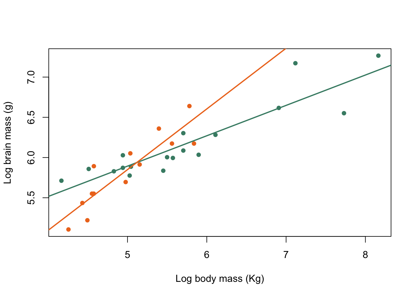
Figure 9.30: Brain mass versus body mass for 33 species of male pinniped plotted on log scaled axes, orange symbols indicate non-harem breeders and green indicate harem breeders. Lines indicate fitted linear regressions.
That’s OK… but not fantastic. The fitted lines go across the whole of the graph and in the case of the non-harem breeders especially end up a long way outside the limits of the data we’ve fitted them to. It would be much better to only draw the lines within the minima and maxima of the data we’ve used. There are a variety of ways to do this: we can use the clip() function to make sure that abline() draws within the area we want, or we can draw our fitted lines using the lines() function. The latter is probably the most common way to do this so we’ll do it first but it’s also a bit more complicated than using clip(). lines() draws lines between specified x and y coordinates on a plot, so we need to know the minimum and maximum x values for our two groups of data and then calculate the y values for the lines corresponding to those data points. We can extract these values using the min() and max() functions, or we can do it in one go with the summary() function.
We need to remember to use log() to transform our data and also to use a subscript to specify that we only want the data points for which Mating_system == "Harem" is TRUE.Here’s what we get from summary():
summary(log(pinniped$Male_mass[Mating_system == "Harem"]))
   Min. 1st Qu.  Median    Mean 3rd Qu.    Max.
   4.17    4.94    5.50    5.69    6.00    8.16
So we can generate a vector with the minimum and maximum values for x for harem breeders
harem_x <- c(4.17, 8.16)For non-harem breeders:
summary(log(pinniped$Male_mass[Mating_system == "Non harem"]))
   Min. 1st Qu.  Median    Mean 3rd Qu.    Max.
   4.26    4.56    5.01    5.03    5.52    5.84

non_harem_x <- c(4.26, 5.84)
Now we need to calculate the corresponding y values and we can draw our lines. We know that the equations for our two lines are
harem_y <- coef(harem_mod)[1] + coef(harem_mod)[2] * harem_x
non_harem_y <- coef(non_harem_mod)[1] + coef(non_harem_mod)[2] * non_harem_x
Now we can use ‘lines()’ to draw the two regression lines onto our plot.
plot(log(pinniped$Male_brain) ~ log(pinniped$Male_mass),
     xlab = "Log body mass (Kg)",
     ylab = "Log brain mass (g)",
     pch = 16,
     col = colours[Mating_system])

lines(x = harem_x, y = harem_y, col = colours[1], lwd = 2)
lines(x = non_harem_x, y = non_harem_y, col = colours[2], lwd = 2)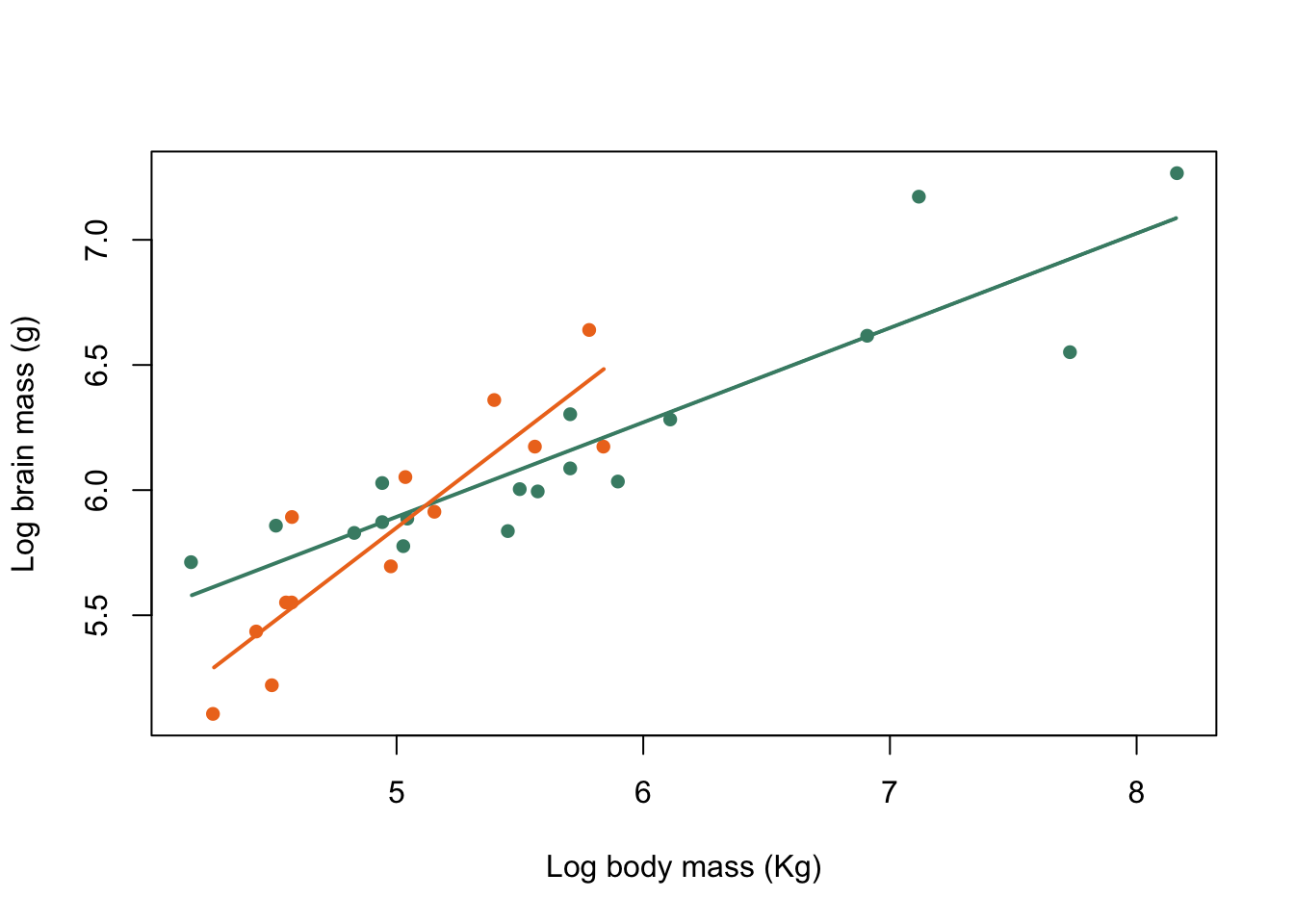
Figure 9.31: Brain mass versus body mass for 33 species of male pinniped plotted on log scaled axes, orange symbols indicate non-harem breeders and green indicate harem breeders. Lines indicate fitted linear regressions.
That’s a much more acceptable plot than the previous version and we are not extrapolating our lines beyond the limits of the data that they are calculated from. How about using clip() and abline() to do the same thing? What you need to know here is that clip() sets the area of the graph on which it is possible to draw things like lines, points and text. This is normally simply defined by the limits of the x- and y-axes, but we can define our own area if necessary. clip() takes four arguments, x1, x2, y1 and y2 which are the lower and upper limits of the clip region in x- and y-coordinates respectively, and you need to supply all of them: there are no defaults. We already have the minimum and maximum x-values calculated for harem and non-harem breeders, and for the y-values we’ll just use a small minimum and a big maximum since we’re not concerned about those as limits for our line. We have to set a different clip area for each line, of course.
plot(log(pinniped$Male_brain) ~ log(pinniped$Male_mass),
     xlab = "Log body mass (Kg)",
     ylab = "Log brain mass (g)",
     pch = 16,
     col = colours[Mating_system])

clip(x1 = harem_x[1], x2 = harem_x[2], y1 = 4, y2 = 8)
abline(harem_mod, col = colours[1], lwd = 2)

clip(x1 = non_harem_x[1], x2 = non_harem_x[2], y1 = 4, y2 = 8)
abline(non_harem_mod, col = colours[2], lwd = 2)
Figure 9.32: Brain mass versus body mass for 33 species of male pinniped plotted on log scaled axes, orange symbols indicate non-harem breeders and green indicate harem breeders. Lines indicate fitted linear regressions.
There we go, the exact same graph as before but generated in a rather different way. One thing that’s really important to remember when using clip() is that the clipping region will stay as the area you’ve specified if you want to add anything else, say a legend, to your plot. If you want to return to the default clipping area you can use this code:
do.call("clip", as.list(par("usr")))par("usr") gives the original clipping region of the graph as defined by the x- and y-axis minima and maxima. do.call() is a function which will execute a specified function from the name of the function and a list of the arguments to be passed to it, so we use as.list() to convert the output from par("usr") to a list and use the do.call() function with “clip” as the first argument. The alternative would be to do something like this:
x1 <- par("usr")
clip(x1 = x1[1], x2 = x1[2], y1 = x1[3], y2 = x1[4])
which is maybe a bit clunkier but also simpler and will do exactly the same.
9.13.3 Legends
Our plot needs a legend to let the reader know what the colour coding means. We’ve already seen one example of adding a legend in the previous chapter, but let’s take another look.
plot(log(pinniped$Male_brain) ~ log(pinniped$Male_mass),
     xlab = "Log body mass (Kg)",
     ylab = "Log brain mass (g)",
     pch = 16,
     col = colours[Mating_system])

clip(harem_x[1], harem_x[2], 4,8)
abline(harem_mod, col = colours[1], lwd = 2)

clip(non_harem_x[1], non_harem_x[2], 4,8)
abline(non_harem_mod, col = colours[2], lwd = 2)

do.call("clip", as.list(par("usr")))

legend("topleft",
  legend = c("Harem", "Non harem"),
  col = colours,
  pch  = 16,
  lty = 1,
  lwd = 2,
  bty = "n",
  title = expression(bold("Mating system")))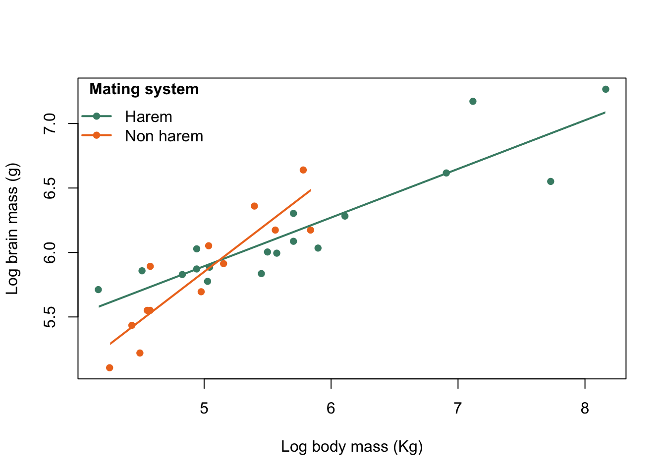
Figure 9.33: Brain mass versus body mass for 33 species of male pinniped plotted on log scaled axes, colour coded for mating system with legend
The first piece of code plots the data, then the second adds the legend. It’s got quite a few arguments so let’s run through them individually. "topleft" tells legend() where to put the legend. There are a number of options for this so "bottomright" would put it in the bottom right hand corner and "top" would place it in the middle of the top. You can find all the options if you look in the “Details” section of the legend() help file.
If you want to be specific about where your legend goes you can use x and y coordinates instead of text descriptions — you might remember that in the previous chapter we used this along with setting par(xdp) = TRUE) to add a legend to the right of the plot area. Lots of the R functions which add elements to graphs use coordinates, and it’s straightforward to use them because they are on the same scale that the points are plotted on. legend() puts the top left corner of the legend at the specified point so if you replaced legend("topright",... with legend(x = 4.01, y = 7.35,... you’d get a very similar result.
The confusingly-named argument legend = gives the text that goes in the legend, in this case as a character vector with two elements. legend() will generate a legend with one entry for each element in the vector, so in this case we’ll get two entries. col = colours tells it what colours to associate with each entry, and then we specify both a plot symbol (pch = 16) and a line type and width (lty = 1, lwd = 2). This gives us both a line and a plot symbol in the appropriate colour. If we’d only specified a plot symbol or a line type then we’d only have got one of the two.
bty = "n" means that we have a legend without a box drawn around it. Finally we give a title for the legend: title = expression(bold("Mating system")). If we just wanted this in standard text we would simply have input title = "Mating system" but it looks better to have this in bold. Consequently we’re using the expression() function which gives us a lot of control over our text, and allows us to have the title in bold.
As an aside, for “normal” text on a plot such as axis labels we can specify bold or italic using one of the font... parameters as an argument, so if you want the axis labels in bold then ..., font.lab = 2 will do the trick, or if you want the main title in italics then ...., font.main = 3. This doesn’t work for text in a legend, however, so we have to use more complex methods.
9.13.4 Curves
9.13.4.1 Adding a curve using curve()
Very often, of course, relationships between two variables are best described by a curve rather than a straight line. We’re going to abanodon the seals and sealions for a while because of a lack of suitable curves and go back to our World Bank data. Here’s the relationship between a country’s CO2 emissions in metric tonnes per capita and the GNP per capita. Both of these are plotted on a log10 scale.
logCO2 <- log10(WB$CO2)
logGNP <- log10(WB$GNP)

plot(logCO2 ~ logGNP,
     col = "steelblue",
     xlab = "Log GNP per capita",
     ylab = "Log Carbon dioxide emissions per capita")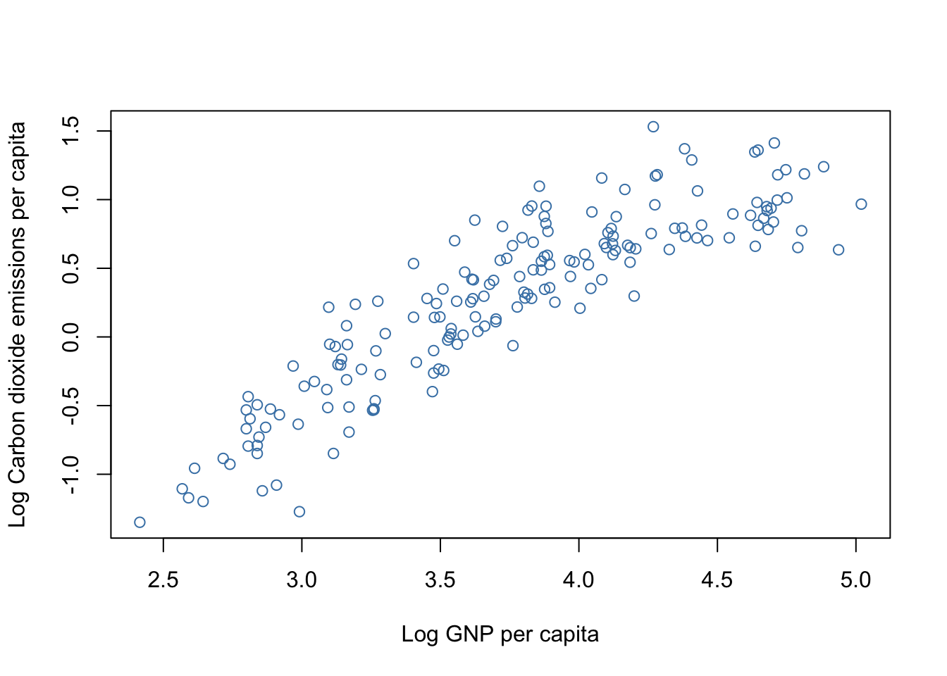
Figure 9.34: CO2 emissions per capita versus GNP per capita by country
There’s a clear decrease in the slope of the relationship as GNP per capita increases. There are a variety of possible ways to describe such a relationship but one of the simplest is to use a second order polynomial also known as a quadratic equation. These take the form
\[ y = \beta _{1} + \beta_{2}x + \beta_{3}x^{2} \] and have the big advantage that since they are mathematically linear we can estimate them using a linear model rather than one of those tricksy non-linear ones.
# Fit model
poly1 <- lm(logCO2 ~ logGNP + I(logGNP^2))

# Show coefficients
coef(poly1)
(Intercept)      logGNP I(logGNP^2)
   -7.97986     3.53398    -0.34562
We’re not going to worry about the details of the model or whether it is statistically significant for the moment, we’re just using it to produce estimates of our three coefficients. Now we know the formula for our curve, which is
\[ log_{10} \mathrm{CO}_{2} = -7.98 + 3.53 \times log_{10} \mathrm{GNP} - 0.346 \times log_{10} \mathrm{GNP} ^{2} \]
we can add it onto our graph. R being R of course there are many ways to do this: we can draw it in with lines(), we can draw it in with points() if we tell points() to draw a line,12 and we can add it to the plot using curve().
Here’s the last option, using curve().
# Plot graph
plot(logCO2 ~ logGNP,
     col = "steelblue",
     xlab = "Log GNP per capita",
     ylab = "Log Carbon dioxide emissions per capita")

# Add curve
curve(-7.98 + 3.53 * x -0.346 * x^2,
      lwd = 2,
      col = "cadetblue4",
      add = TRUE)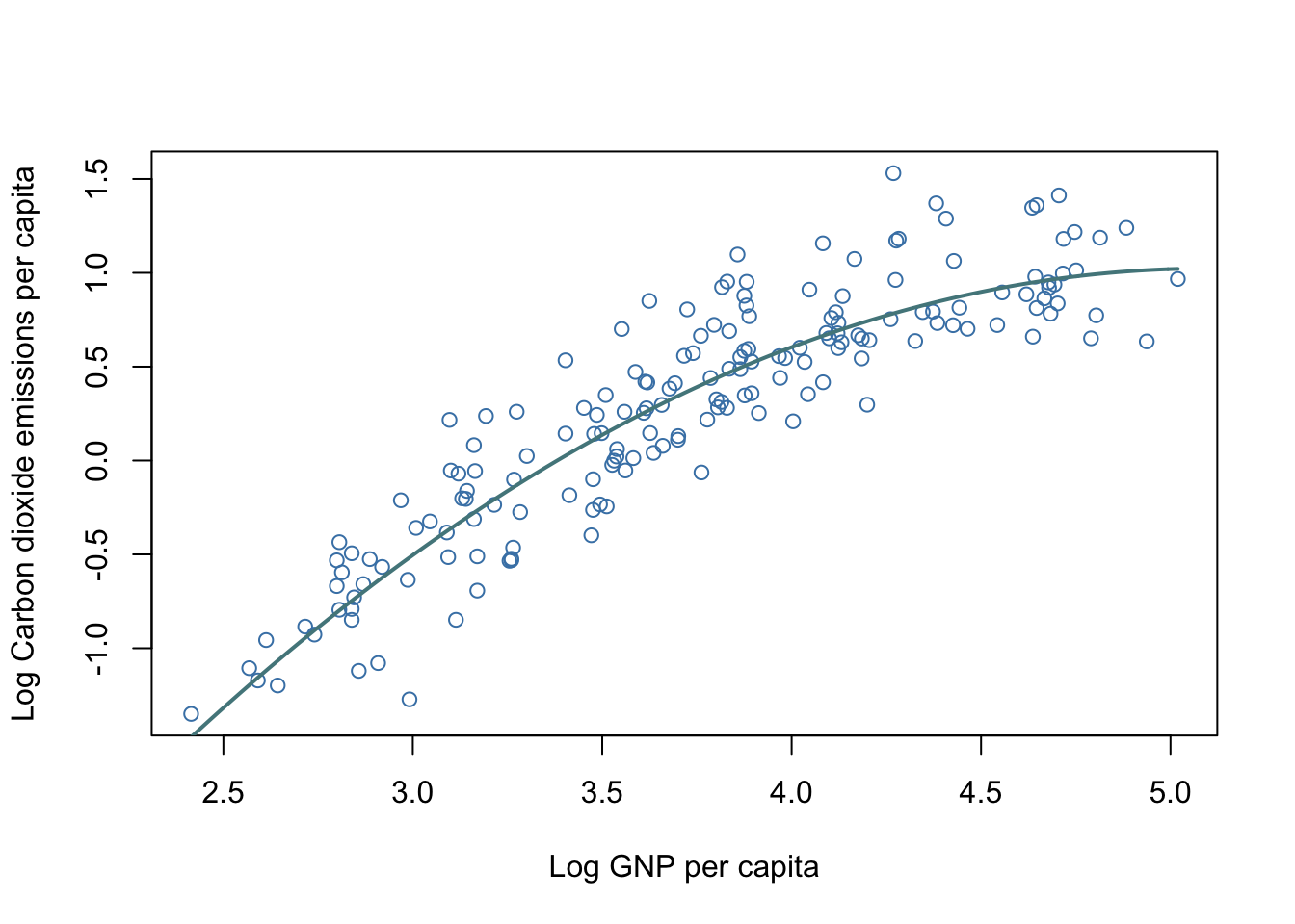
Figure 9.35: CO2 emissions per capita versus GNP per capita by country. Line shows a fitted quadratic curve
Quadratic curves are fairly simple beasts and in particular the rate at which the slope changes is constant across the whole thing, so the fit heere is really surprisingly good. Let’s look at that curve() function call in a bit more detail.
curve(-7.98 + 3.53 * x -0.346 * x^2,
      lwd = 2,
      col = "cadetblue4",
      add = TRUE)
The first argument is the actual formula of the curve we’d like to draw. This is only the right hand side of the equation: the y = bit is assumed to be there. It’s written out using the normal R arithmetic operators and is hopefully self explanatory. We then specify the width of the line as twice the default option lwd = 2 and set the colour. The last argument is an important one: add = TRUE. This is needed because curve() is not a function like lines() or text() that adds elements to existing graphs by default: rather it draws a new graph in the same way that plot() would unless we tell it to add what it’s drawing to an existing graph.
9.13.4.2 Adding a curve using lines() or points().
Here’s another data set. We’re moving from the world of CO2 emissions measured on a national scale to thinking about the weapons used by male beetles when they fight over females.
beetle<-read.table("Data/beetles.txt",header=T)The beetle dataset has horn length and body size (as measured across the pronotum, the first segment of the thorax) measurements for two species of dung beetle, Euoniticellus intermedius and Onthophagus taurus. We’ll look at the latter at the moment. O. taurus is an insect which has been heavily studied by behavioural ecologists because the males develop into two types: “minor” males with small or no horns, which acquire matings without aggression using what are called “sneaky” tactics, and “major” males which develop horns and who guard females and fight with other males in order to monopolise access to them. Whether a male develops into a minor or a major depends on its body size, and if we plot horn length against body size we get a sigmoid relationship.
plot(beetle$taurus_horn ~ beetle$taurus_pron,
     col = "aquamarine4",
     xlab = "Pronotum width (mm)",
     ylab = "Horn length (mm)")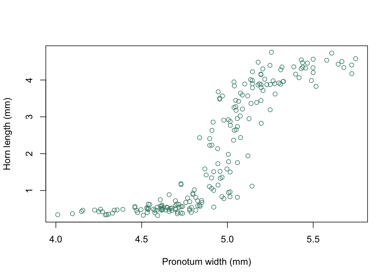
Figure 9.36: Horn length plotted against body size as indicated by pronotum width for male Onthophagus taurus
You can see that there is a “switchpoint” at a pronotum width of roughly 4.8mm, with beetles below this size having very reduced horns and beetles above this size having large horns. We’d like to draw a curve through these data to indicate the shape of the relationship. One option is to fit an equation of the form:
\[ horn \: length = y_{0} + \frac{a \times body \: size^{b}}{c^{b} + body \: size^{b}}. \]
To do this we need to carry out a non-linear fit, which we don’t need to go into the details of. Just trust me when I say that our fitted model gives a set of estimates for the coefficients of:
y0 = 0.41,
a = 3.99,
b = 45.76 &
c = 5.01,
giving us an equation for our curve of:
\[ horn \: length = 0.41 + \frac{3.99 \times body \: size^{45.76}}{5.01^{45.76} + body \: size^{45.76}}. \]
We could draw this in using curve() but instead we’re going to use a different method. We’ll start by setting up a dummy x-variable with a sequence of points running from the minimum and maximum points where you want the curve to run from and to, and then we’ll calculate the corresponding y-variables and draw them in with lines(). Previously we’ve used lines() to draw straight lines, but if you give it more than two x- and y- coordinates it will connect them together. Because we’re using 200 points what is drawn comes out looking like a smooth curve. Note that you can get the exact same result by using points(), with the type argument set to type="l"… which makes it draw lines.
Here is our dummy x-variable.
X1 <-
  seq(
    from = min(beetle$taurus_pron, na.rm = TRUE),
    to = max(beetle$taurus_pron, na.rm = TRUE),
    length = 200
  )
This will give us 200 evenly spaced numbers across the range of pronotum widths. Now we need to work out the corresponding y values.
Y1 <- 0.41 + (3.99 * (X1 ^ 45.76)) / (5.01 ^ 45.76 + (X1 ^ 45.76))Finally, we can re-plot our graph and draw in the curve using lines().
plot(beetle$taurus_horn ~ beetle$taurus_pron,
     col = "aquamarine4",
     xlab = "Pronotum width (mm)",
     ylab = "Horn length (mm)")

lines(X1,Y1)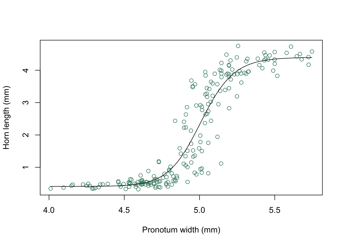
Figure 9.37: Horn length versus pronotum width for O. taurus with fitted curve
The first method we’ve seen for adding curves to a plot, using curve(), is simplest when you have a straightforward equation to describe your curve. The second comes in handy in lots of other situations though, such as when you have a complex model and you want to draw a line showing the fitted model. In this case you can use the predict() function to calculate your y values without having to worry about copying out all of the fitted model coefficients.
9.13.5 Text and arrows
Sometimes we want to add text to a plot, for example to indicate the identity of specific data points, or to show a specific event on a time series. Let’s take a break from our pinnipeds data and look at a different data set: this is the relative number of Google searches for the term “Springboks” carried out in South Africa during the period September 1st to December 1st during the year 2019. For those who don’t know, the Springboks are the South African rugby team and the Rugby World Cup was held in September, October and December of 2019. The data include dates, and we’re going to use the ymd() function from the lubridate package to convert the text which was downloaded from Google Trends into date formatted data for R.
# Load data
rugby <- read.csv("Data/SA_Springboks_searches.csv", stringsAsFactors = FALSE)

# Load lubridate package
library(lubridate)

# Convert Week data to Date format
rugby$Date <- ymd(rugby$Date)

str(rugby)
'data.frame':   91 obs. of  2 variables:
 $ Date    : Date, format: "2019-09-01" "2019-09-02" ...
 $ Searches: int  1 1 2 2 4 24 4 2 1 1 ...
All looks good. Let’s plot that out.
# Plot graph
plot(rugby$Searches ~ rugby$Date,
     type = "l",
     col = "steelblue",
     lwd = 2,
     xlab = "Date",
     ylab = "Search intensity on Google",
     ylim = c(0, 120))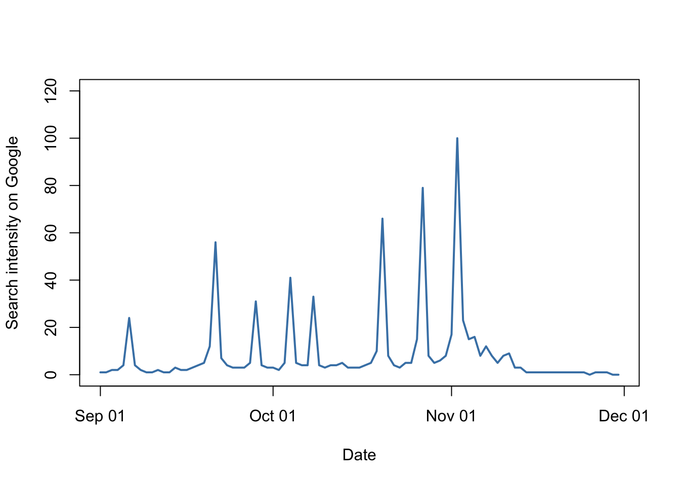
Figure 9.38: Google searches for “Springboks” in South Africa from September to the beginning of December 2019
There are some obvious peaks in these data. Is it possible that these correspond to match days in the 2019 Rugby World Cup? The days that the Springboks played were:
| Date | Match |
|---|---|
| 2019-09-06 | Japan (warm up) |
| 2019-09-21 | New Zealand |
| 2019-09-28 | Namibia |
| 2019-10-04 | Italy |
| 2019-10-08 | Canada |
| 2019-10-20 | Japan |
| 2019-10-27 | Wales |
| 2019-11-02 | England (Final) |
In case anyone doesn’t know, the final match against England was the World Cup final in which South Africa soundly beat England to become World Champions for the third time. Let’s see how that first date corresponds with the peaks on our graph: we’re going to use text() to add some text indicating that the match was against New Zealand, and we’re going to use arrows() to indicate the exact point on our line.
# Plot graph
plot(rugby$Searches ~ rugby$Date,
     type = "l",
     col = "steelblue",
     lwd = 2,
     xlab = "Date",
     ylab = "Search intensity on Google",
     ylim = c(0, 120))

# Add text
text(x = ymd("2019-09-21"),
     y = 115,
     labels = "South Africa\nvs.\nNew Zealand",
     cex = 0.6)

# Add arrow
arrows(x0 = ymd("2019-09-21"),
       y0 = 105,
       x1 = ymd("2019-09-21"),
       y1 = rugby$Searches[which(rugby$Date == "2019-09-21")] + 5,
       length = 0.08,
       lwd = 0.8)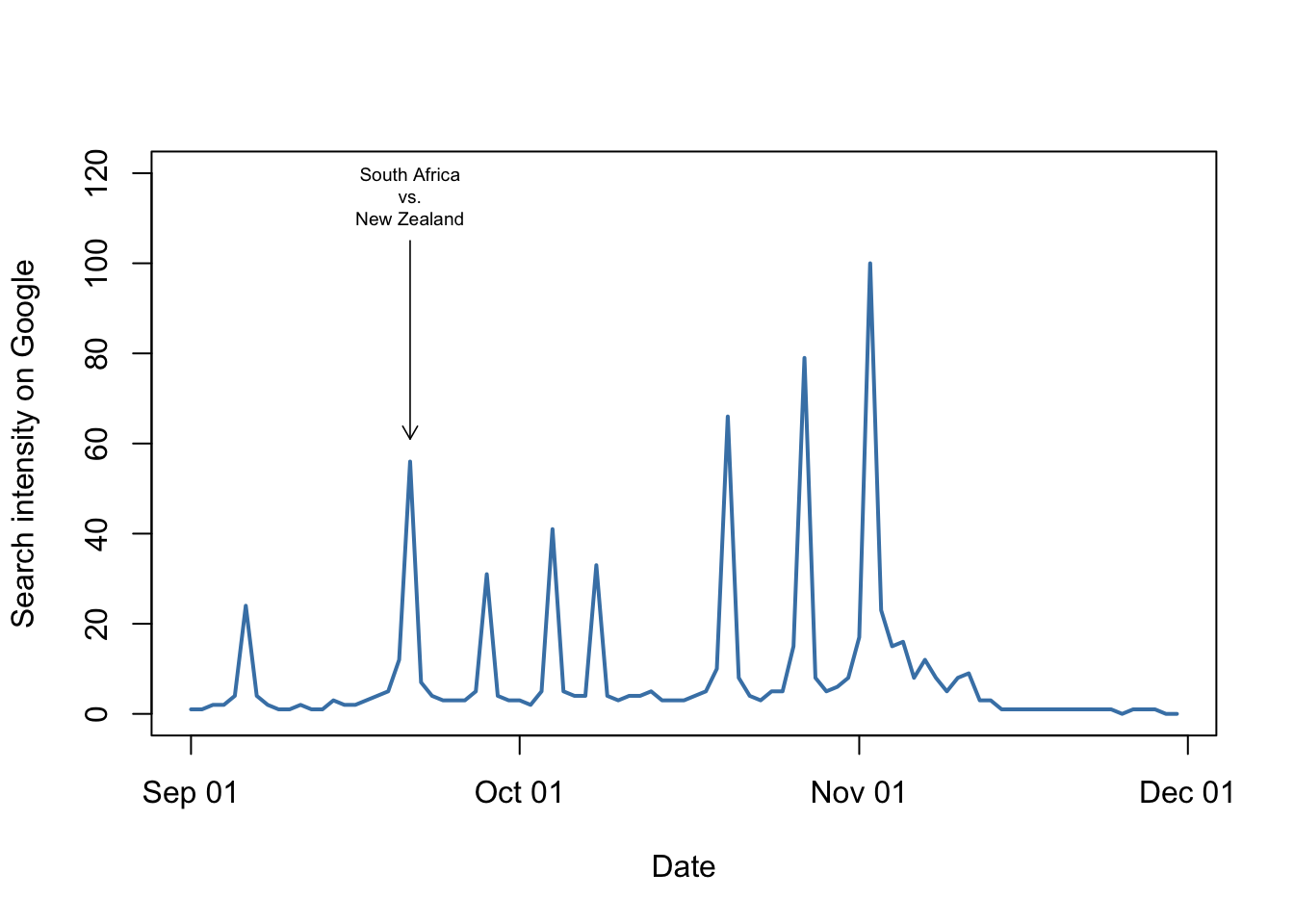
Figure 9.39: Google searches for “Springboks” in South Africa from September to the beginning of December 2019. The match versus New Zealand is indicated.
That looks pretty conclusive, at least in that case. Let’s look at the code we used to add the text and the arrow. Firstly, the text.
# Add text
text(x = ymd("2019-09-21"),
     y = 115,
     labels = "South Africa\nvs.\nNew Zealand",
     cex = 0.6)
This show us some important points about the text() function. Firstly, we have some coordinates: x = ymd(2019-09-21) and y = 115. These tells R where to put the text within the plot area. One useful thing to notice is that the coordinates are given in terms of the x- and y-axis scales. The y-axis goes from 0 to 120, and we want something close to the top, so I picked 115. For the x-axis we want the date of the match against New Zealand: I’ve given this in the same format that the dates in our original data file are in and then I’ve used the ymd() function again to convert this into date format. By default R will draw the text centred on the coordinates given, but you can change this if you wish by using the pos = argument, whereby values of 1,2,3 or 4 indicate that text should go below, to the left, above or to the right of the coordinates given. You can also use the adj = argument to change the way the text is aligned with the coordinates: adj = 0 will give text which is centred on the y-coordinate but which is left-justified to the x-coordinate, for example.
Following the coordinates we have the labels = argument which gives the text to be used. In this case I’ve made things more complicated than necessary again by including the \n character in the text. This indicates a new line within the text and is not read as straightforward text by R because of the use of the so-called “escape character,” \ which indicates the use of something that should not just be preocessed as a set of characters. If we didn’t have these two new lines indicated by \n, and replaced them with spaces, our text would be displayed as a single line. Finally I’ve used cex = 0.6 to make the text smaller than the default size.
How about those arrows then? Here’s the code.
# Add arrow
arrows(x0 = ymd("2019-09-21"),
       y0 = 105,
       x1 = ymd("2019-09-21"),
       y1 = rugby$Searches[which(rugby$Date == "2019-09-21")] + 5,
       length = 0.08,
       lwd = 0.8)
Whereas text() takes a single set of coordinates, arrows() takes two: the x- and y-coordinates to draw the arrow from, x0 = and y0 = and then the coordinates to draw it to, x1 = and y1 =. These are all reasonably straightforward if you recall that we need to use ymd() to convert text into date format, with the exception of the final one. What we’re doing with that bit of subscripting is extracting the value for the search intensity for that date, and then we’re adding 5 to it. This is because we want our arrow to extend down the plot and finish a little bit above the actual data point that we wish to indicate.
There are then two further arguments, length = 0.08, which does not have any effect on the length of the line — rather, it alters the length of the shorter lines that make up the arrowhead. The default value is 0.25 which gives a rather big arrowhead. We want a smaller one so we’ll use a smaller value. Finally we want the line to be drawn rather thin so that it’s not as intrusive, and we use the lwd = 0.8 argument to do this.
So far so good, but what if we want to indicate the other match dates on our graph as well? Do we need separate lines of code with text() and arrows() for each date? Fortunately not: both of these functions will draw multiple instances of text or arrows if we ask nicely. For text() we replace the single x- and y-coordinates with two vectors of coordinates, and the character data given for the text with a vector of character data. Similarly, for arrows() we use a vector of coordinates for each of x0, y0, x1 and y1. Let’s have a go.
# Vector of x-coordinates
match_dates <- ymd(c("2019-09-06", "2019-09-21",
                     "2019-09-28", "2019-10-04",
                     "2019-10-08", "2019-10-20",
                     "2019-10-27", "2019-11-02"))

# Vector of y-coordinates for text
text_y <- rep(115, times = 8)

# Vector of matches
matches <- c("Japan\nWarm up", "New\nZealand",
             "Namibia", "Italy",
             "Canada", "Japan",
             "Wales", "England\nFinal")

# Vector of upper x-coordinates for arrows
arrows_y0 <- rep(108, times = 8)

# Vector of lower x-coordindates for arrows
arrows_y1 <- rugby$Searches[which(rugby$Date %in% match_dates == TRUE)] +3
This has set up all of the data vectors we need to add our text and arrows. Some things are fairly obvious, so we’re using ymd() from the lubridate package to convert character data into dates again, we’re using the rep() function when we just need a vector with multiple elements which are the same and inn the matches vector we’re using the \n character when we want a new line for a particular piece of text. The code for the subscripts for the vector of lower x-coordinates for arrows is not, however, immediately clear. We’re using an operator which you might not have seen before, %in%. This matches one object against another, so here it will return TRUE if an element of the rugby$Date vector is also present in the match_dates vector, and FALSE otherwise. Feeding that into the which() function and asking which values are TRUE gives me the indices for the values in rugby$Searches which correspond to the match days, and then I can extract those values using a subscript and add 5 to each of them.
Just to show how that works let’s run through it in pieces.
# Just using the match operator returns a vector of TRUE and FALSE depending on whether the corresponding value of rugby$Date is also presnet in match_dates or not
rugby$Date %in% match_dates
 [1] FALSE FALSE FALSE FALSE FALSE  TRUE FALSE FALSE FALSE FALSE FALSE FALSE
[13] FALSE FALSE FALSE FALSE FALSE FALSE FALSE FALSE  TRUE FALSE FALSE FALSE
[25] FALSE FALSE FALSE  TRUE FALSE FALSE FALSE FALSE FALSE  TRUE FALSE FALSE
[37] FALSE  TRUE FALSE FALSE FALSE FALSE FALSE FALSE FALSE FALSE FALSE FALSE
[49] FALSE  TRUE FALSE FALSE FALSE FALSE FALSE FALSE  TRUE FALSE FALSE FALSE
[61] FALSE FALSE  TRUE FALSE FALSE FALSE FALSE FALSE FALSE FALSE FALSE FALSE
[73] FALSE FALSE FALSE FALSE FALSE FALSE FALSE FALSE FALSE FALSE FALSE FALSE
[85] FALSE FALSE FALSE FALSE FALSE FALSE FALSE
# Which of these elements are TRUE?
which(rugby$Date %in% match_dates == TRUE)
[1] 6 21 28 34 38 50 57 63# Use these as a vector of subscripts to extract the desired data from rugby$Searches and add 5 to each value
rugby$Searches[which(rugby$Date %in% match_dates == TRUE)] +5
[1] 29 61 36 46 38 71 84 105Now let’s draw our final plot.
# Plot graph
plot(rugby$Searches ~ rugby$Date,
     type = "l",
     col = "steelblue",
     lwd = 2,
     xlab = "Date",
     ylab = "Search intensity on Google",
     ylim = c(0, 120))

# Add text
text(x = match_dates,
     y = text_y,
     labels = matches,
     cex = 0.6)

# Add arrow
arrows(x0 = match_dates,
       y0 = arrows_y0,
       x1 = match_dates,
       y1 = arrows_y1,
       length = 0.05,
       lwd = 0.8)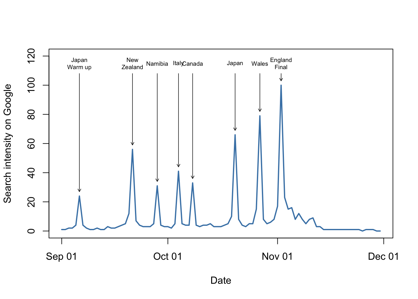
Figure 9.40: Google searches for “Springboks” in South Africa from September to the beginning of December 2019. Match dates and opponents for the South African rugby team are indicated
9.13.6 Confidence bands for fitted lines
9.13.6.1 Adding confidence bands using lines()
Warning This bit gets a bit advanced in places and is maybe not for the faint of heart. If you aren’t familiar with concepts like confidence intervals you might want to skip this, and the next, section. Alternatively, maybe read through it but don’t worry if some of it’s tending towards the incomprehensible.
When we fit a line to a set of data we’re generating an estimate of where the most likely values for our y-variable are given any value of the x-variable. In a world where sample sizes are often much smaller than we’d wish, we often have limited confidence in how accurate our estimation is. For this reason we often display fitted lines with an indication of how confident we are in their location, usually by showing the 95% confidence intervals. How can we add these to our plot of pinniped brain sizes (yes, after that excursion into Google searches for Southern Hemisphere rugby teams we’re back on the seals I’m afraid)? The first thing to do is to work out what these confidence intervals are. To do this we need to use the predict() function, which generates predicted values from a statistical model. predict() has an argument se.fit = and if we set this to TRUE it will calculate a standard error for each predicted point, and we can then use this to generate our 95% confidence intervals.
Let’s go back to our pinniped data. We have already fitted two statistical models, each giving us a fitted straight line relating log brain size to log body mass for males, one for harem and one for non-harem breeders. To generate our predicted values and standard errors we’ll need to produce some dummy data for our prediction and the use predict() on that.
# Generate dummy variable for harem breeders
harem_x_seq <-
  seq(
    from = min(pinniped$Male_mass[Mating_system == "Harem"]),
    to = max(pinniped$Male_mass[Mating_system == "Harem"]),
    length = 100
  )

#Generate dummy variable for non-harem breeders
non_harem_x_seq <-
  seq(
    from = min(pinniped$Male_mass[Mating_system == "Non harem"]),
    to = max(pinniped$Male_mass[Mating_system == "Non harem"]),
    length = 100
  )

#Generate predicted values and SEs for harem breeders
pred_harem <-
  predict(harem_mod,
          newdata = data.frame(Male_mass = harem_x_seq),
          se.fit = TRUE)
pred_harem <-
  predict(harem_mod,
          newdata = data.frame(Male_mass = harem_x_seq),
          se.fit = TRUE)

#Generate predicted values and SEs for non-harem breeders
pred_non_harem <-
  predict(non_harem_mod,
          newdata = data.frame(Male_mass = non_harem_x_seq),
          se.fit = TRUE)

#Structure of pred_harem
str(pred_harem)
List of 4
 $ fit           : Named num [1:100] 5.58 5.74 5.86 5.94 6.01 ...
  ..- attr(*, "names")= chr [1:100] "1" "2" "3" "4" ...
 $ se.fit        : Named num [1:100] 0.0826 0.0679 0.059 0.0534 0.0499 ...
  ..- attr(*, "names")= chr [1:100] "1" "2" "3" "4" ...
 $ df            : int 16
 $ residual.scale: num 0.197
Here, what I’ve done is to use the seq() function to generate two sequences of data each with 100 evenly spaced values, using the minimum and maximum body mass values for harem breeding and non-harem breeding males. I’ve used the untransformed data rather than the log-transformed minima and maxima that we used in the previous section here because that’s what we used in the original linear model: we did the log transformation within the model formula so we need to give predict() the untransformed data. I’ve then fed these sequences into the predict() function, with the appropriate fitted model specified for each. The data that we want to predict from are specified by the newdata = argument in predict(), but it will only work if we use a variable with the same name (or names for a more complex model) as the name of the explanatory variable in the original model. I don’t want to start generating variables in the workspace with the name Male_mass because it’s the same as the name in my data frame, and I would also need to generate one, use it for the prediction, delete it or change its name and then generate the next. Hence I’ve used the data.frame() function inside the predict() function call to generate a temporary data frame with one variable named Male_mass.
As we can see from the str(pred_harem) output, the object we’ve generated using predict() is a list with four components. Of these three are important to us: $fit which is the predicted fitted values — these will correspond to the values of the lines we’ve already plotted; $se.fit which are the standard errors for these fitted values, and $df which is the number of degrees of freedom. These are important because we need all three of them to calculate the 95% confidence intervals.
For any estimate we need an upper and a lower confidence interval. The upper and lower confidence intervals are calculated as:
\[ \mathrm{Upper \: CI} = \mathrm{Fitted \: value} + SE \times t_{df} \] \[ \mathrm{Lower \: CI} = \mathrm{Fitted \: value} - SE \times t_{df} \] where \(t_{df}\) is the critical value of the t-distribution at the appropriate number of degrees of freedom. If all of this sounds like total gibberish to you, don’t worry: it’s just some arithmetic we need to do to generate our confidence intervals.
How do we generate the critical values of t? There’s a function called qt() which will give us the quantiles of the t-distributoin and we can feed this the appropriate probability and degrees of freedom. For our harem breeders, therefore, we can calculate our upper and lower confidence values as:
#Upper CI
harem_upper_CI <- pred_harem$fit + pred_harem$se.fit * qt(p = 0.975, df = pred_harem$df)

#Lower CI
harem_lower_CI <- pred_harem$fit - pred_harem$se.fit * qt(p = 0.975, df = pred_harem$df)
This is all relatively straightforward aside from the qt(0.975, df = pred_harem$df) bit which is a little obscure. The df = pred_harem$df argument is giving it the degrees of freedom from the output of predict(), but what about p = 0.975? This is telling it the probability that we’re thinking about for our confidence intervals, but instead of p = 0.95 we have to use p = 0.975 because the t-distribution is a two-tailed distribution so we need to think about the upper tail as well as the lower tail. If you’re not very clear on your statistical theory yet this will, I realise, make no sense whatsoever… just take it at face value and if you want go and look up the difference between one-tailed and two-tailed tests.
Let’s generate our confidence intervals for the non-harem breeders as well.
#Upper CI
non_harem_upper_CI <-
  pred_non_harem$fit + pred_non_harem$se.fit * qt(p = 0.975,
  df = pred_harem$df)

#Lower CI
non_harem_lower_CI <-
  pred_non_harem$fit - pred_non_harem$se.fit * qt(p = 0.975,
  df = pred_harem$df)
OK. We now have, for each group of male pinnipeds:
- A sequence of dummy x-values, 100 numbers long, running from the lowest to the highest value for each group
- A set of fitted values, one for each of our dummy x-values, corresponding to where our fitted line would be
- A set of values, one for each of our 100 dummy x-values, with the calculated upper 95% confidence limit for the fitted value
- A set of values as above, but with the calculated lower 95% confidence limits.
Let’s use these to indicate the confidence intervals on our graph. We can do this using lines() if we just want a line to show our confidence intervals, or if you wish to be fashionable we can indicate them with a shaded area using polygon(). It’s easiest with lines() so let’s do that: we’re doing exactly what we did in the last section by giving the lines() function a series of points to link together, and because we’re using lots of them what gets drawn will look like a curve.
# Plot the data
plot(
  log(pinniped$Male_brain) ~ log(pinniped$Male_mass),
  xlab = "Log body mass (Kg)",
  ylab = "Log brain mass (g)",
  pch = 16,
  col = colours[Mating_system]
)

# Add regression line for harem breeders
lines(
  x = log(harem_x_seq),
  y = pred_harem$fit,
  lwd = 2,
  col = colours[1]
)

# Add upper 95% CI line
lines(
  x = log(harem_x_seq),
  y = harem_upper_CI,
  lwd = 0.8,
  col = colours[1]
)

# Add lower 95% CI line
lines(
  x = log(harem_x_seq),
  y = harem_lower_CI,
  lwd = 0.8,
  col = colours[1]
)


# Add regression line for non-harem breeders
lines(
  x = log(non_harem_x_seq),
  y = pred_non_harem$fit,
  lwd = 2,
  col = colours[2]
)

# Add upper 95% CI line
lines(
  x = log(non_harem_x_seq),
  y = non_harem_upper_CI,
  lwd = 0.8,
  col = colours[2]
)

# Add lower 95% CI line
lines(
  x = log(non_harem_x_seq),
  y = non_harem_lower_CI,
  lwd = 0.8,
  col = colours[2]
)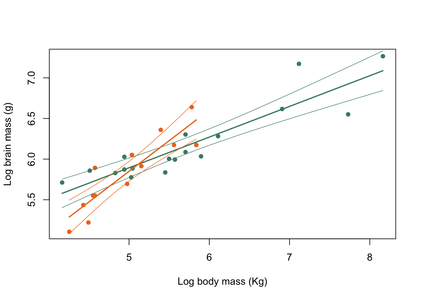
Figure 9.41: Brain mass versus body mass for 33 species of male pinniped plotted on log scaled axes, colour coded for mating system
There we have it. A few things to point out are firstly that I’ve drawn the 95% confidence intervals in using much thinner lines than the fitted straight lines to make it clear which is which. You could equally well use dashed or dotted lines to achieve the same effect. Secondly, I had to log transform the dummy x-values for the plot because, as you might remember, we needed the untransformed data to feed into predict() because the log transformation was done within the lm() function call. This whole business of what to log and when has made this all rather complicated, but this is the sort of issue that you have to cope with when you’re dealing with real data.13
9.13.6.2 Adding confidence intervals to fitted lines using polygon()
polygon() is, as you might expect, a function that will draw a shape onto a plot. It takes a vector of x-coordinates and a vector of y-coordinates, and draws the shape defined by the series of xy values defined by those two vectors. Here’s a simple example: we’ll plot a graph with no data and then draw in a square using polygon(). To make a specific point I’ll add the coordinates of each of the corners (“vertices”) using text(): more on this in the next section.
# Plot empty graph
plot(1:4, 1:4,
     type = "n",
     xlab = "",
     ylab = "")

# Add polygon
polygon(x = c(2,3,3,2),
        y = c(2,2,3,3),
        col = "aquamarine4")

# Add coordinates to the bottom of the square
text(x = c(1.9,3.1),
        y = c(1.9,1.9),
        labels = c("2,2", "3,2"))

# Add coordinates to the top of the square
text(x = c(3.1,1.9),
        y = c(3.1,3.1),
        labels = c("3,3", "2,3"))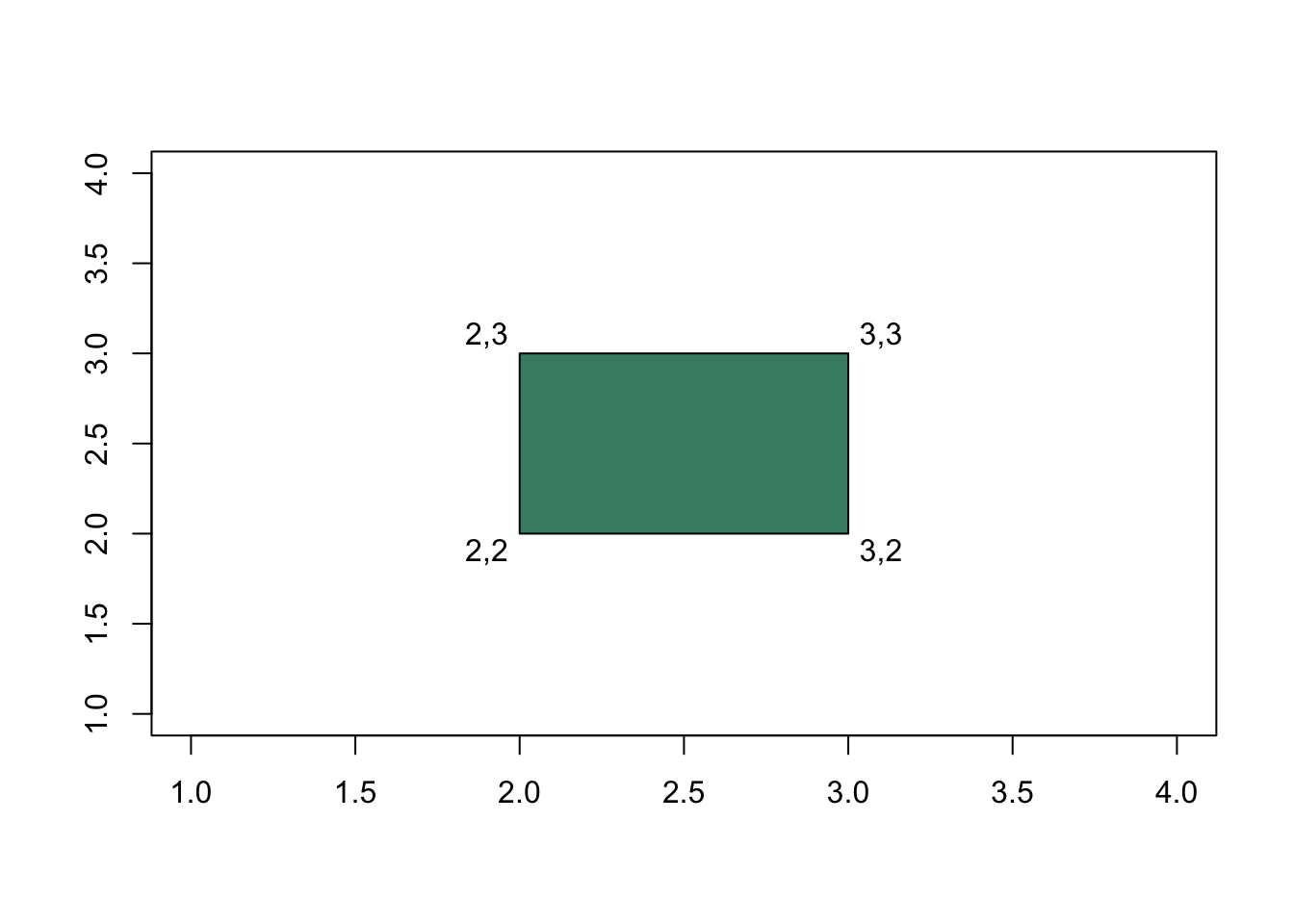
Figure 9.42: Example of drawing a simple polygon
This is likely to look more lke a rectangle, but in terms of the scales on the x-and y-axes this is a square. We’ve filled it with the aquamarine4 colour using the col = argument just to stop it being so dreary.
The important thing to notice here is that we need to think about the order in which our x- and y- coordinates are given to polygon() because it joins them together in order. Here I’ve started with the bottom left vertex and then gone bottom right, top right and then back to the top left: if you take the first, second, third and fourth x-values and y-values form the function call and put them together you get 2,2 3,2 3,3 and 3,2. You don’t need to go all the way back to the starting point because polygon() will just link up the first vertex with the last. What happens if we put the x- and y-values in a different order?
# Plot empty graph
plot(1:4, 1:4,
     type = "n",
     xlab = "",
     ylab = "")

# Add polygon
polygon(x = c(2,3,3,2),
        y = c(2,3,2,3),
        col = "aquamarine4")

# Add coordinates to the bottom of the square
text(x = c(1.9,3.1),
        y = c(1.9,1.9),
        labels = c("2,2", "3,2"))

# Add coordinates to the top of the square
text(x = c(3.1,1.9),
        y = c(3.1,3.1),
        labels = c("3,3", "2,3"))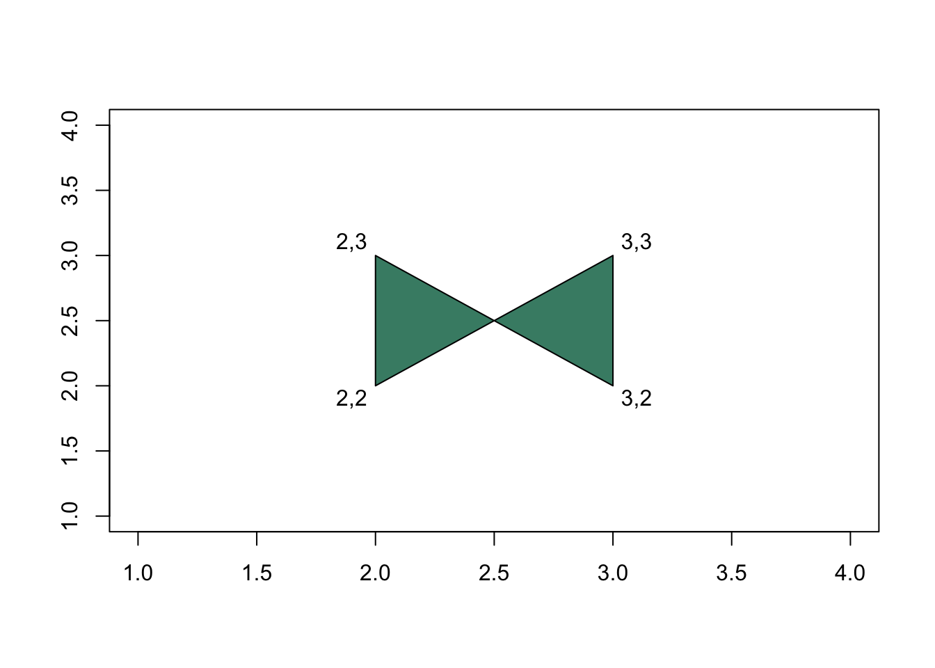
Figure 9.43: Example of drawing a simple polygon
In this case we can put our x = c(2,3,3,2) and y = c(2,3,2,3) arguments together and we get 2,2 — bottom left, 3,3 — top right, 3,2 — bottom right and 2,3 — top left, so polygon() joins the vertices in that order and we get a different shape. This is important if you want to use polygon() to draw more complicated shapes because you need to think about the order of x- and y-values. When you try to draw something wth polygon() and it comes out messed up, chances are you’ve not got this bit right.
Back to our confidence intervals for the relationship between log brain mass and log body mass in various species of harem- and non-harem breeding pinnipeds, in the last section we calculated a series of x-values and then generated three sets of y-values for each: lower and upper 95% confidence intervals and the fitted values. The latter we can ignore for the present, but we want to use the former two to draw the confidence intervals in as a polygon which we can shade. For this we’ll need x- and y- values for the vertices of the curve that makes up the lower 95% CIs, and then the same for the upper CIs, but in reverse order because we’re going to start in the bottom left hand corner, join up all the vertices for the lower 95% CIs going from left to right, then jump to the furthest right vertex for the upper CIs, and join together all those vertices coming back right-to-left.
Here’s an attempt to illustrate this in a simple way using the 95% CIs for harem breeders only. The arrows indicate the direction in which polygon() “joins the dots,” and I’ve indicated the start point.
Figure 9.44: Drawing a complex polygon illustrated
Here’s that polygon() function call again:
polygon(x = c(log(harem_x_seq), rev(log(harem_x_seq))),
        y = c(harem_lower_CI, rev(harem_upper_CI)))
We start with x = c(log(harem_x_seq), rev(log(harem_x_seq))),. This constructs the x-values for the whole polygon into a single vector using the c() function. We start with the (log transformed) sequence from the minimum to the maximum values for this set of data: this gives the x-values for all of the vertices on the lower 95% CI. Once we get to the maximum x-value we want polygon() to go up to the highest value of the upper 95% CI, in the top right hand corner, and come all the way back to the lowest value for the upper 95% CI. These have the same x-coordinates as the lower 95% CIs, but we want to put them in in reverse order because we’re coming back across the graph. Hence, we use the rev() function, which reverses things, to add the same values but in reverse order for the second half of our vector of x-values.
Once we get this, the expression for the y-values becomes easier to understand. We want to start with the y-values for the lower 95% CIs in increasing order, then we want the values for the upper 95% CI in reverse order, so we put them together using c(harem_lower_CI, rev(harem_upper_CI)).
Let’s plot our graph properly now.
# Plot the data
plot(log(pinniped$Male_brain) ~ log(pinniped$Male_mass),
     xlab = "Log body mass (Kg)",
     ylab = "Log brain mass (g)",
     pch = 16,
     col = colours[Mating_system])

# Add regression line for harem breeders
lines(x = log(harem_x_seq), y = pred_harem$fit, lwd = 2, col = colours[1])

# Add polygon for harem breeders confidence intervals
polygon(x = c(log(harem_x_seq), rev(log(harem_x_seq))),
        y = c(harem_lower_CI, rev(harem_upper_CI)),
        border  = NA,
        col = adjustcolor(colours[1], alpha = 0.5))


# Add regression line for non-harem breeders
lines(x = log(non_harem_x_seq), y = pred_non_harem$fit, lwd = 2, col = colours[2])

# Add polygon for non-harem breeders confidence intervals
polygon(x = c(log(non_harem_x_seq), rev(log(non_harem_x_seq))),
        y = c(non_harem_lower_CI, rev(non_harem_upper_CI)),
        border  = NA,
        col = adjustcolor(colours[2], alpha = 0.5))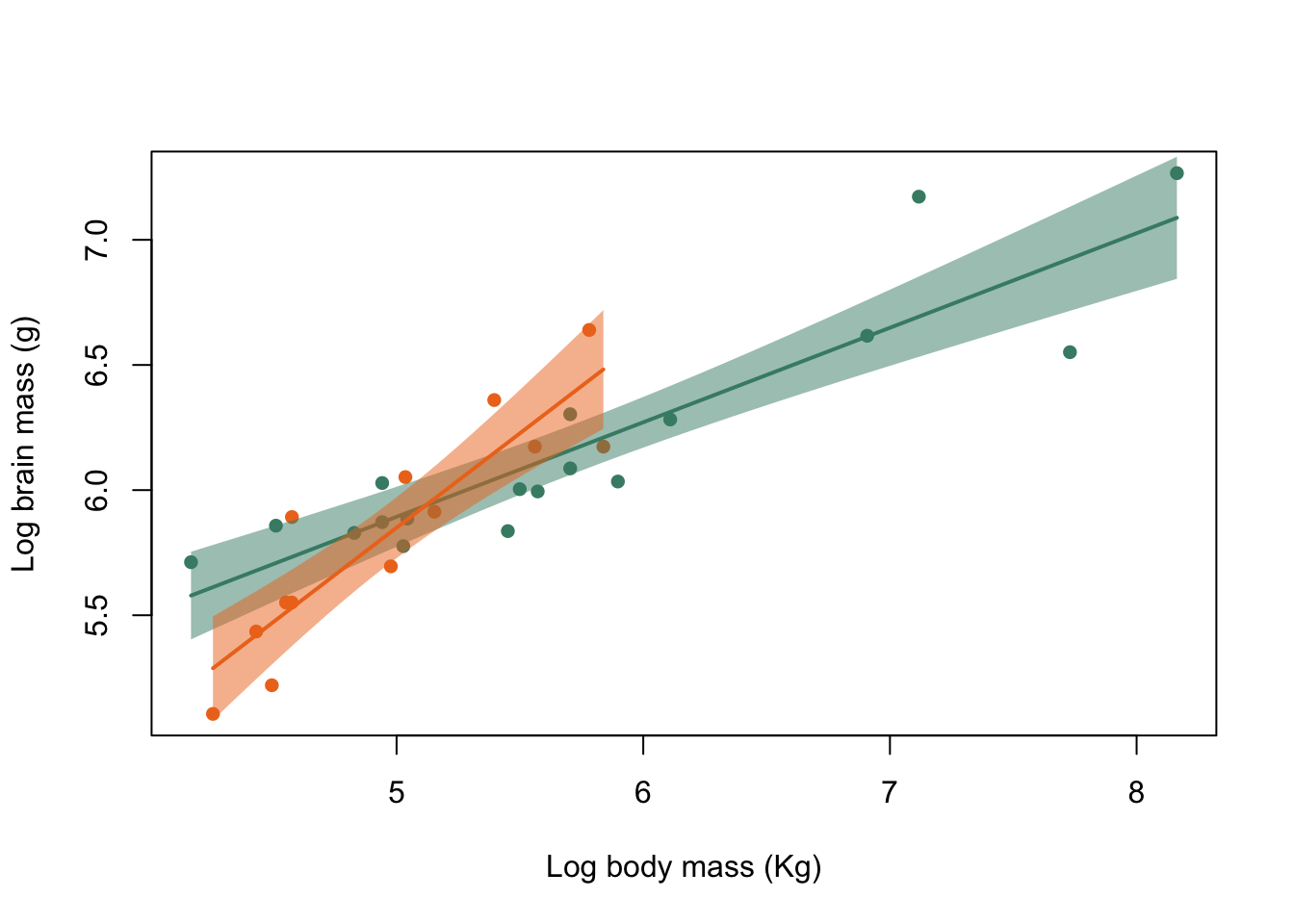
Figure 9.45: Brain mass versus body mass for 33 species of male pinniped plotted on log scaled axes, colour coded for mating system
I’ve added a few arguments to the polygon() function calls to pretty things up. border = NA means that the polygon is drawn without a border. col = adjustcolor(colours[1], alpha = 0.5) sets the colour for the fill of our polygon to be the same as the colour that we’re using for everything else associated with harem breeders. The adjustcolor() function is a function that lets you tweak colours, and in this case I’m using it to make the fill translucent by setting alpha = 0.5. More on this in the section on using transparency.
I mentioned at the start of the previous chapter that there are some things that ggplot2 does rather easier than base graphics… adding shaded polygons as confidence intervals is one of them. In the chapter on ggplot2 we’ll redraw this graph using rather less code than was needed here.
9.13.7 Error bars
9.13.7.1 Adding error bars using arrows()
Error bars are a simple way of showing how much uncertainty there is in your estimates when when you are dealing with point estimates (means, medians etc.), and you’ve most probably seen many graphs with them in your reading. Error bars are not, however, completely straightforward in R. If you wish to add, say, 95% confidence intervals to a plot of means, you need to calculate what these intervals are and then draw them onto your plot, usually using arrows(). Yes, you read that right, arrows(), the function we met in section 10.5 that draws arrows onto an existing plot. Let’s go back to the World Bank data which we were using to generate boxplots and barplots in the previous chapter.
WB <- read.csv("Data/World_bank_data_2014.csv")
WB$Region <- as.factor(WB$Region)
WB$Income_group <- as.factor(WB$Income_group)

str(WB)
'data.frame':   186 obs. of  22 variables:
 $ Country_Name              : chr  "Afghanistan" "Angola" "Albania" "Andorra" ...
 $ Country_Code              : chr  "AFG" "AGO" "ALB" "AND" ...
 $ Region                    : Factor w/ 7 levels "East Asia & Pacific",..: 6 7 2 2 4 3 2 3 1 2 ...
 $ Income_group              : Factor w/ 4 levels "High income",..: 2 3 4 1 1 4 4 1 1 1 ...
 $ Population                : int  33370794 26941779 2889104 79213 9214175 42669500 2912403 92562 23475686 8546356 ...
 $ Land_area                 : num  652860 1246700 27400 470 71020 ...
 $ Forest_area               : num  2.07 46.51 28.19 34.04 4.53 ...
 $ Precipitation             : int  327 1010 1485 NA 78 591 562 1030 534 1110 ...
 $ Population_density        : num  51.1 21.6 105.4 168.5 129.7 ...
 $ Capital_lat               : int  33 -13 41 43 24 -34 40 17 -35 47 ...
 $ GNP_per_Cap               : int  630 5010 4540 NA 44330 12350 4140 12730 65150 50370 ...
 $ Population_growth         : num  3.356 3.497 -0.207 -1.951 0.177 ...
 $ Cereal_yield              : num  2018 888 4893 NA 12543 ...
 $ Under_5_mortality         : num  73.6 92.9 10 3.4 7.9 12 15.1 7.6 4 3.8 ...
 $ Renewables                : num  19.314 50.797 38.69 19.886 0.146 ...
 $ CO2                       : num  0.294 1.29 1.979 5.833 22.94 ...
 $ PM25                      : num  59 33 18.9 10.8 38 ...
 $ Women_in_parliament       : num  27.7 36.8 20 50 17.5 36.6 10.7 11.1 26 32.2 ...
 $ GINI_index                : num  NA NA NA NA NA 41.7 31.5 NA 35.8 30.5 ...
 $ Govt_spend_education      : num  3.7 NA NA 3 NA ...
 $ Secondary_school_enrolment: num  52.6 NA 97.7 NA NA ...
 $ School_gender_parity      : num  0.654 NA 0.977 NA NA ...
Let’s say that we’re interested in how PM25 pollution varies between income groups. We can calculate the mean PM25 pollution and also the 95% Confidence intervals of the means using tapply():
# Put levels of income group in order
WB$Income_group <- factor(
  WB$Income_group,
  levels = c(
    "Low income",
    "Lower middle income",
    "Upper middle income",
    "High income"
  )
)

#means
meanPM25 <- tapply(WB$PM25, WB$Income_group, mean)

names(meanPM25) <- c("Low", "Lower middle", "Upper middle", "High")

#function to calculate 95% CIs
meanci <- function(X1) {
    lenX1 <- length(X1)
    X195 <- qt(0.975, df = lenX1 - 1) * sqrt(var(X1))/sqrt(lenX1)
    output <- c(Lower.CI = mean(X1) - X195, Upper.CI = mean(X1) + X195)
    return(output)
}


#95% CIs
PM25CIs <- tapply(WB$PM25, WB$Income_group, meanci)


#Generate matrix from list
PM25CIs2 <- matrix(unlist(PM25CIs), nrow = 2)
rownames(PM25CIs2) <- c("Lower", "Upper")
colnames(PM25CIs2) <- names(meanPM25)

#Check data
meanPM25
         Low Lower middle Upper middle         High
      37.421       32.298       24.477       17.677
PM25CIs2
         Low Lower middle Upper middle   High
Lower 31.215       27.242       21.553 13.973
Upper 43.628       37.354       27.401 21.381
R doesn’t have a built in function to calculate confidence intervals so I’ve put in a bit of code to do this. Don’t worry about this too much: the whole thing is explained in the chapter on programming in R. For the moment you just need to know that it’s calculating the 95% confidence intervals. There’s some other code there as well: firstly, at the start, the bit where we specify the levels of WB$Income_group in order from poorer to richer. YOu saw this in the last chapter and it just makes the final graph make more sense. Secondly there is some code towards the end to convert the output of the second tapply() to a matrix from the list which tapply() generates. What we end up with is a vector of our mean values (meanPM25) and a matrix of our upper and lower confidence intervals (PM25CIs2). We can use the first of these to draw our barplot and the second to add error bars. Let’s do that.
#Generate locations of the centres of the bars
ticks <- barplot(meanPM25, plot = FALSE)

#Plot the graph
barplot(meanPM25,
        col = "cadetblue4",
        ylim = c(0, 45),
        xlab = "Income group",
        ylab = "Mean PM25 pollution",
        font.lab = 2,
        xaxt = "n")

#Add error bars
arrows(x0 = ticks,
       y0 = PM25CIs2[1,],
       x1 = ticks,
       y1 = PM25CIs2[2,],
       length = 0.05,
       angle = 90,
       code = 3)

#Add x axis
axis(side = 1,
     at = ticks,
     labels = c("Low\n", "Lower\nmiddle","Upper\nmiddle","High\n"),
     padj = 0.3)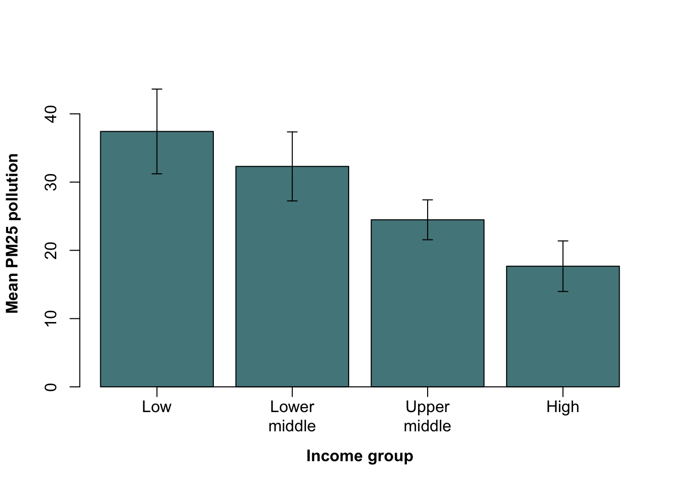
Figure 9.46: Barplot of mean PM25 data with 95% confidence interval error bars drawn using arrows()
There’s a goodly amount of code going into generating this graph, so let’s go through it and see what it all does.
#Generate locations of the centres of the bars
ticks <- barplot(meanPM25, plot = FALSE)
You might remember that when we’re plotting a bar graph the locations of the centres of the bars are not usually obvious. We need to know these locations for when we tell R to draw our error bars, and we also need to know them because we’re going to make something nicer and neater than the default x axis. This line saves these locations in an object called ticks.
#Plot the graph
barplot(meanPM25,
        col = "cadetblue4",
        ylim = c(0, 45),
        xlab = "Income group",
        ylab = "Mean PM25 pollution",
        font.lab = 2,
        xaxt = "n")
This draws the bar graph itself using the barplot() function. Most of this should be familiar but there are a few important points to look at.Firstly ylim = c(0,45): if we didn’t specify the y-axis limits then the graph swould be plotted so that the bars fitted nicely, meaning that the tops of our error bars would go outside the plot area and be lost. Secondly font.lab = 2 means that the axis labels will be in a bold font. Finally, xaxt = "n" means that the graph will be plotted without anything for the x-axis — we’ll add all of that later.
#Add error bars
arrows(x0 = ticks,
       y0 = PM25CIs2[1,],
       x1 = ticks,
       y1 = PM25CIs2[2,],
       length = 0.05,
       angle = 90,
       code = 3)
This is where the magic happens… or at least where we add the error bars. The trick here is to take advantage of the flexibility of arrows(), which lets us draw arrows with heads at each end of the line and to specify the angle of the lines making the arrowhead as well. If we draw a vertical line with an arrowhead at each end, and we make the angle between the lines making the arrow and the main line 90^o, that will look like a traditional error bar with a straight “cap” at each end. Let’s go through this in more detail.
arrows(x0 = ticks,
       y0 = PM25CIs2[1,],
       x1 = ticks,
       y1 = PM25CIs2[2,],
This is telling arrows() where to draw the arrows from and to. As we saw in section 10.6, arrows() takes four arguments which give it the x- and y- coordinates in the plot area where the arrows being drawn should start and finish. These are x0, y0, x1 and y1. For our purposes here we want the arrows to be vertical so the x0 and x1 values are the same: the midpoints of the bars which we extracted earlier and saved as the object ticks. The y-coordinates of the bottom of the error bars are the values for the lower 95% confidence intervals and we have these as the top row of the matrix PM25CIs2 which we extract using a subscript. The y-coordinates for the tops of the error bars are the second row of that matrix and we get those values using a subscript as well.
       length = 0.05,
       angle = 90,
       code = 3)
These three arguments finish off our arrows() function call and make sure that we have nice looking error bars. length = 0.05 specifies the length of the lines making up the arrowhead (not the length of the arrow overall) and here we’re making them rather short to give small ‘caps’ on the ends of the error bars. angle = 90 sets the angle between the lines making up the arrowheads and the main line. By sepcifying 90o we’re making sure that the “cap” on the error bar is a straight line perpendicular to the main error bar line. Finally code = 3 tells arrows() to draw an arrowhead (or in this case a “cap”) at each end of the line.
#Add x axis
axis(side = 1,
     at = ticks,
     labels = c("Low\n", "Lower\nmiddle","Upper\nmiddle","High\n"),
     padj = 0.3)
Here, we draw in the x-axis which we asked to be left out in the barplot() call. side = 1 tells axis() to draw it on the bottom side of the plot, and at = ticks tells it where to put things: in this case both the tickmarks and the axis text. labels = gives it a vector of character data to be written in at the tickpoints. The actual character vector needs a little explanation. Rathed than turn the text on its side to fit it in, like we did in section 9.8, here I’m splitting the text over multiple lines. That’s what the \n text in the vector does: \ is an escape character meaing that it isn’t processed as normal text in a character vector but does something else, and \n means “put a new line in here.” This is what gives us the nicely formatted text on the x-axis of our plot. You might wonder why we need these \n characters in the elements that only need a single line such as "Low\n": the answer is that without them these words get written on the bottom of the two lines we’re using and it doesn’t look so nice. Try it. padj = 0.3 (perpendicular adjustment) moves the text down a little because otherwise it gets mixed up with the tick marks.
9.13.7.2 Plotting means and error bars using plotmeans()
A second option to plot means and confidence intervals is to is to install the package called gplots (see the chapter on R packages for more on this), which has a handy function called plotmeans(). This makes things a fair
install.packages("gplots")
library(gplots)
This is what the default output looks like: plotmeans will calculate means and confidence intervals for you so you just need to feed it the raw data.
plotmeans(WB$PM25~WB$Income_group)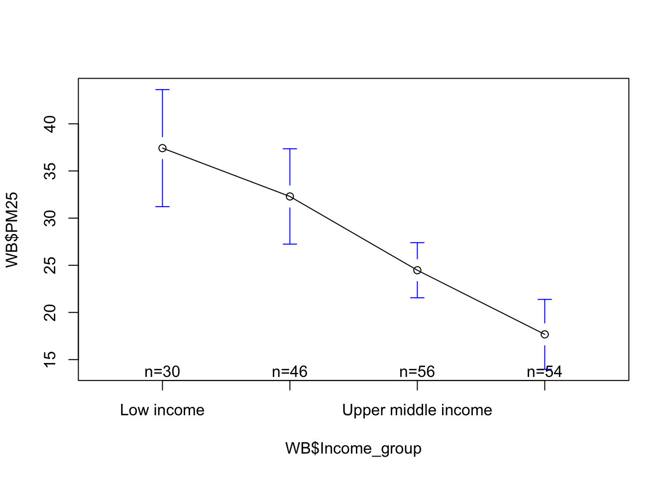
Figure 9.47: Default output from plotmeans().
OK, it’s plotted the means and the 95% confidence limits, and this is a useful plot to just have a look at our data with. Nevertheless, we could improve quite a few things before we start thinking about adding this particular graphic to our latest submission to Nature. The helpful indicators of sample size and the line connecting the means could do with being lost. The points for the means might be better if they were bigger, and the error bars could go in black instead of blue. To find out how to sort all of these issues out, take a look at the help file.
plotmeans(WB$PM25 ~ WB$Income_group,
          connect=FALSE,
          barcol='black',
          pch=16,
          cex=1.5,
          n.label=FALSE,
          ylab="Mean PM25 pollution",
          xlab = "Income group")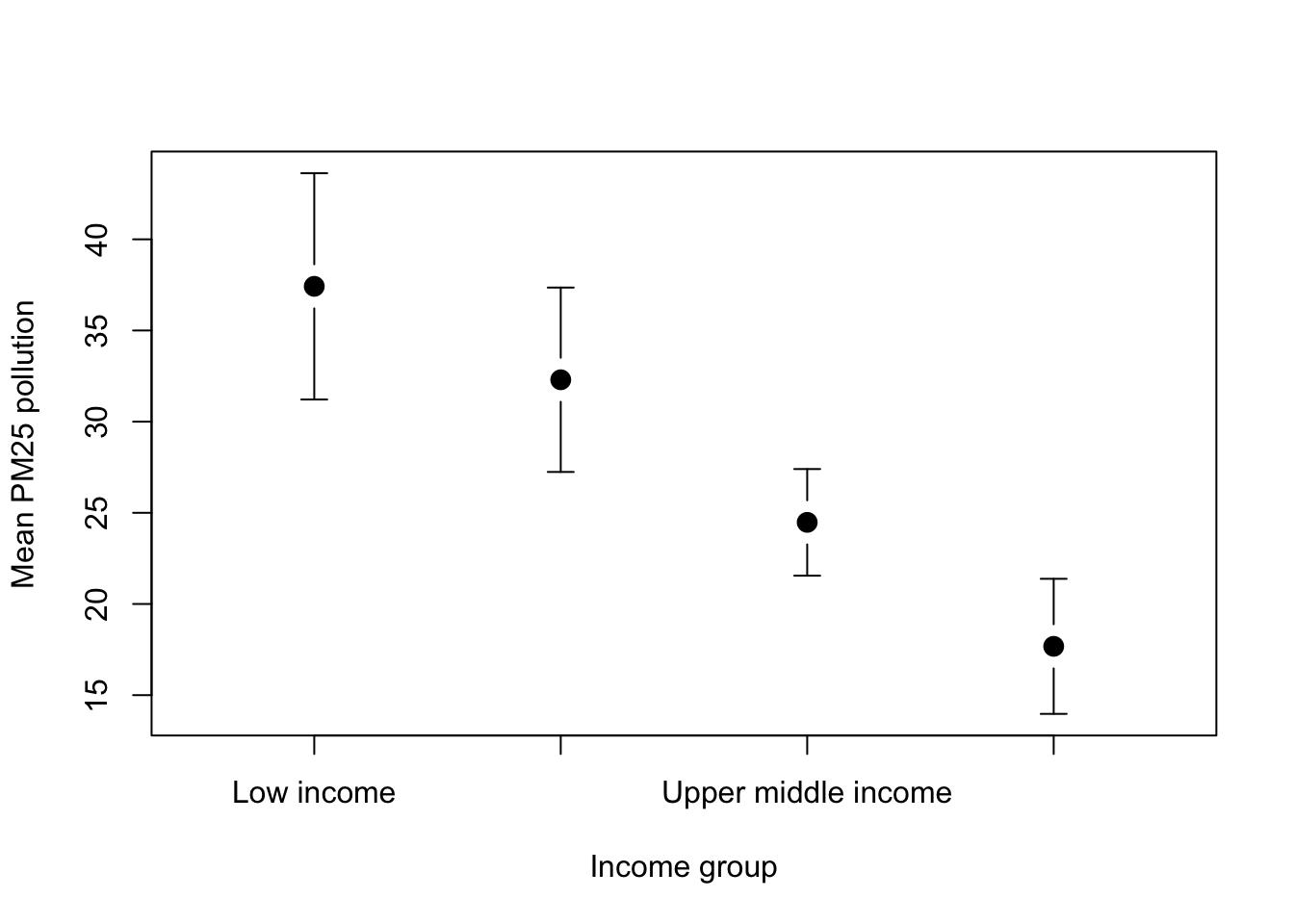
Figure 9.48: Nicer looking graph with 95% CIs
Still needs a bit of a tweak: the x-axis labels are not working so let’s fix that using axis() as we did previously, and we can make the axis titles bold as well.
plotmeans(WB$PM25 ~ WB$Income_group,
          connect=FALSE,
          barcol='black',
          pch=16,
          cex=1.5,
          n.label=FALSE,
          ylab="Mean PM25 pollution",
          xlab = "Income group",
          xaxt = "n",
          font.lab = 2)

axis(side = 1,
     at = 1:4,
     labels = c("Low\n", "Lower\nmiddle","Upper\nmiddle","High\n"),
     padj = 0.3)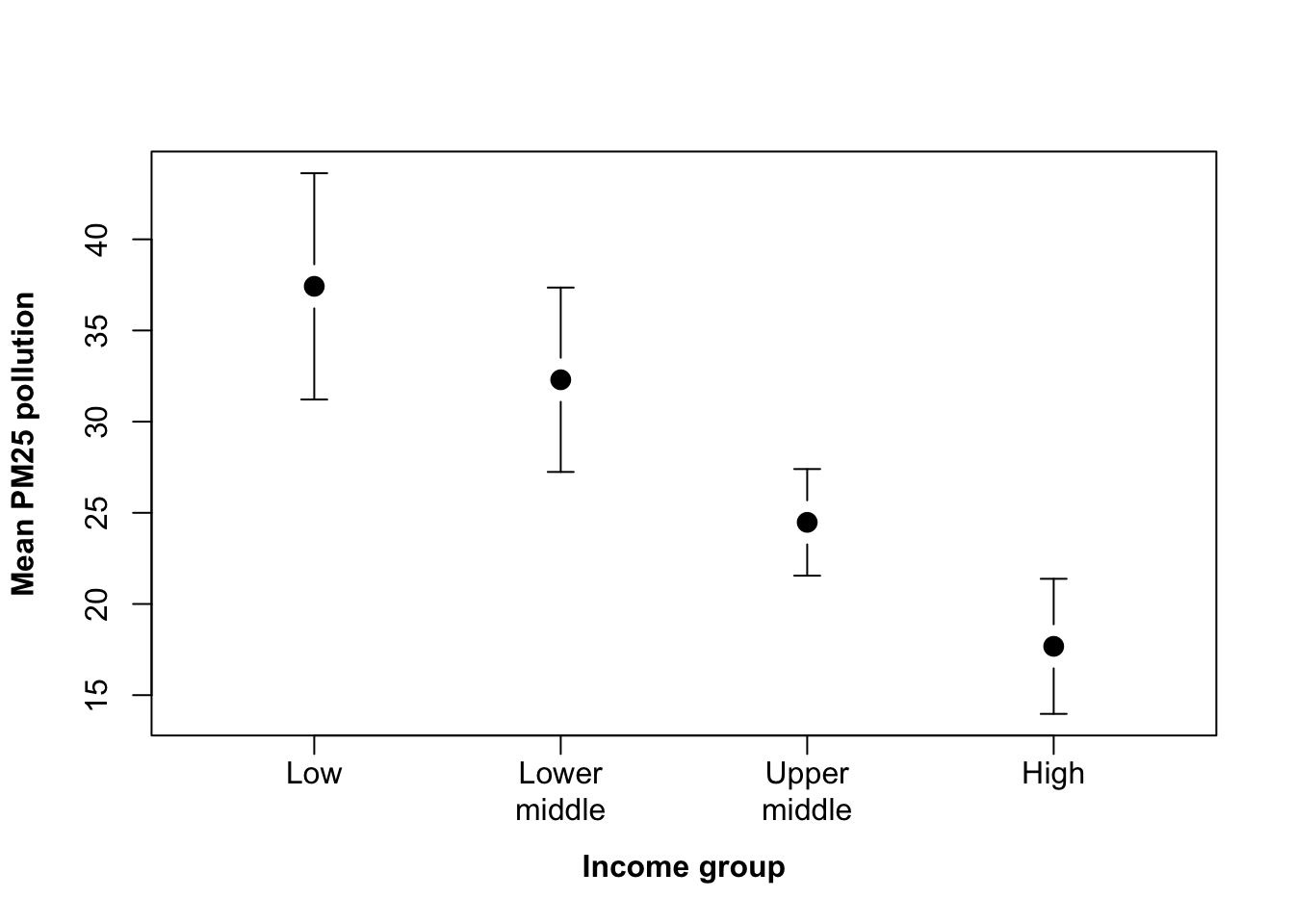
Figure 9.49: Nicer looking graph with 95% CIs
What I’ve done here is add xaxt = "n" and font.lab = 2 to the plotmeans() function call, suppressing the x-axis and making the axis titles bold. I’ve then used the same axis() code as before except because the at = argument which tells it where the ticks go now just needs 1:4 because things in that respect at least are a bit more sensible with this plot.
9.14 Exporting Graphics
There are lots of different image formats, and R runs on a number of different platforms that use different graphics formats in different ways. It shouldn’t surprise you then to find out that there are lots of different options for exporting your graphics from R. If you’re using Windows or a Mac then there is an easy way that doesn’t give you much control, or there is a hard way that gives you more control. In Linux there’s only the hard way.
9.14.1 The easy way
If you’re using either Windows or a Mac, then draw your graph and select the window that it’s drawn in. You can then use the “Save as” option from the “File” pull-down menu to save your graph. If you’re exporting a graph in Windows, you get a variety of choices of format, the best one of which may be a .wmf (Windows meta-file). This is a vector graphics format so you can import it to another package and do things like resizing it without any trouble. On a Mac running OS X, R automatically exports graphs as pdfs. This is what it should do: pdf is the default graphics filetype in OS X, and gives nice crisp vector graphics again. The only problem is that if you’re using MS Word it may well not import your pdfs nicely - the results vary by version but in general it makes them into pixellated bitmaps. If you’re using a Mac and want to import your graphs to Word, you might have to do something like open them in Photoshop and save them as a high-res GIF or similar. Recent releases of Word are better at coping with pdfs but still not perfect.
9.14.2 The hard way
Using the pull-down menus as described above is easy but you don’t have much control over things like the size of the saved image. The other option for saving graphs, using the command line (surprise!) gives you a lot more control over these details. If you want to export to one of the common graphic formats you can use one of these functions:
-png()
-jpeg()
-tiff()
-bmp()
-pdf()
The first four of these all work in very similar ways. pdf() is a bit more complex but works in basically the same way. To save a graphic with all of these functions it’s a good idea to start by having your graph drawn nicely to your satisfaction and the code saved and accessible: either in the script editor or in a text editor somewhere. What you do might seem a bit strange if you’re not used to it but there is some internal logic to the process, somewhere.
First, you use the command you’ve chosen to specify the filename to save the graph to. If you’ve decided to save to a .png, for example, you might type
png(filename=“Figure1.png”)If you’ve got it right then all you’ll get when you hit return is the command prompt again. What you do now is paste in your code for drawing your figure. You can use as many lines of code as you need. Press enter again. If all is still well, you’ll just get a command prompt again.
plot(xvariable, yvariable, pch=16, xlab=“X axis”, ylab=“Y axis”)
abline(-2, 3,lty=2)
Now you type the function dev.off(), which might cause some cryptic messages to appear
dev.off()
quartz
    2
That’s it. If all is well you can now look in your working directory (or another directory if you specified a file path rather than just a name) and you should find your graphics file there. What’s going on? Why don’t you see your graph, and what do these strange functions do? To understand this process you need to know that R draws graphs in things it calls “devices.” There is an active, current device and any graphics functions called will draw what they’re told to draw in that device. Normally this will be a window, and the graphics code you use will draw things in the window where you can see it, but when you use a function like png() you tell R to open a new device, which is effectively the graphics file that you’re writing to. When you put in your graphics code after opening a new device that isn’t a graph window, you don’t see the new graph because it’s not being written to the window. Then, when you type dev.off() that closes whichever device is the active device and in the case of your graphics file write the file to the appropriate directory. See? I said there was some logic. If that doesn’t make any sense to you then don’t worry.
Why should you go through the trouble and confusion of saving your graphics in this apparently baroque and perverse fashion? Because it gives you a huge amount of control over the final graphics file. You can add arguments to functions like png() that will determine precisely the size of the image, the size of the text, the colour of the background and even whether there’s a background at all. Let’s say that you want a graph with dimensions 560 by 340 pixels with 24 point text as the default (which can be altered by the cex… arguments in plot() etc). Let’s also go for a transparent background so that you can use your graph in your latest powerpoint presentation with some bad-taste background image showing through in the hope of distracting your audience from noticing how dodgy your correlation is.
png(filename=“Figure1.png”, width=560, height=340, bg="transparent", pointsize=24)Will ensure that figure 1 comes out exactly how you want it.
Fitzpatrick, J.L., Almbro, M., Gonzalez-Voyer, A., Hamada, S., Pennington, C., Scanlan, J. & Kolm, N. (2012) Sexual selection uncouples the evolution of brain and body size in pinnipeds. Journal of evolutionary biology, 25, 1321–1330.↩︎
Yes, we can do this, and we can also tell
lines()to draw points — both of them take thetype =argument and can produce the full range of options: you can read about these in the help file forplot.default.↩︎This is me trying to make the fact that I’ve used an unnecessarily complicated example seem a virtue.↩︎